I’m running the new iPhone software on my personal device, and it’s quite stable; I haven’t encountered many issues so far. However, since it’s still in the early stages of development, you should be cautious about running it on your device. For those in a hurry, here is our guide on how to install the iOS 18 Developer Beta on any iPhone.
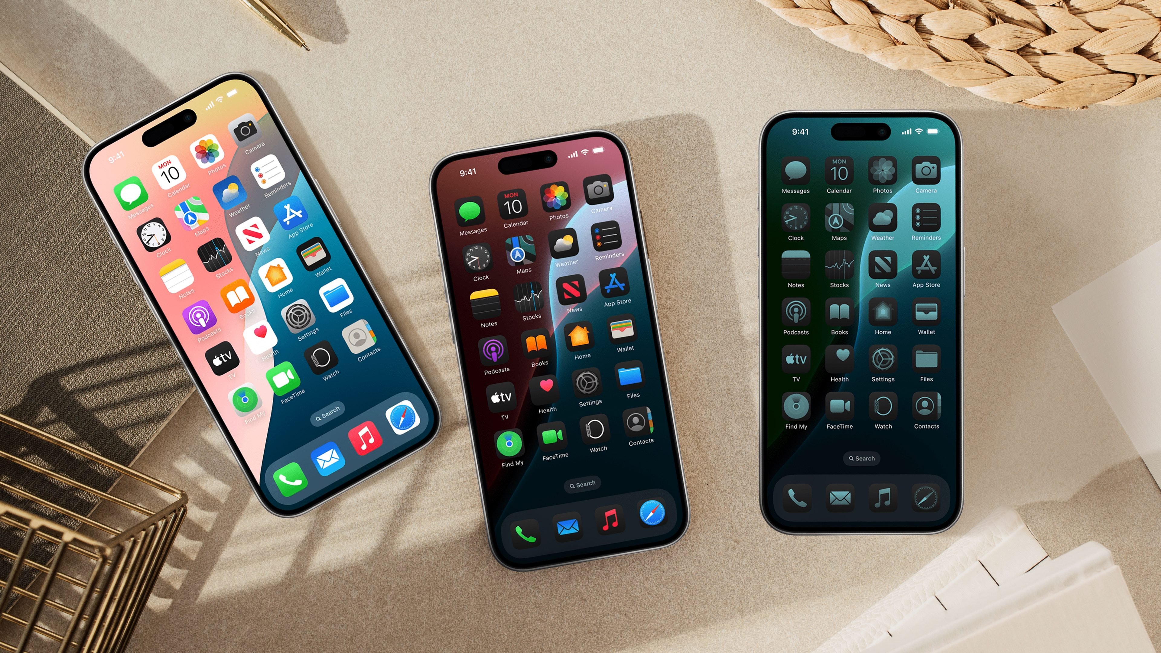
That said, one of the first things I wanted to try out was definitely the new Dark Mode themes and new icon designs. One of the best features of Android has always been the freedom to personalize the home screen and move app icons around freely. I’m thrilled that Apple has finally given us this option.
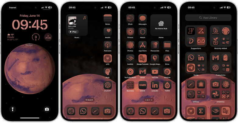
Before talking about the pros and cons of this new customization option, let’s look at how Dark Mode themes work on iOS 18.
How to change app icons’ appearance in Dark Mode on iOS 18:
As mentioned, iOS 18 introduces the ability to customize your app icons for better visibility and aesthetics in Dark Mode. Here’s a step-by-step guide to help you change the look of your app icons:
- On the home screen, press and hold an empty area until the icons start to wiggle.
- In the top-left corner, tap the Edit button to access customization options.
- Tap Customize in the menu to adjust icon appearance settings.
- Choose the Theme:
- Automatic: Icons switch between light and dark with the system setting.
- Dark: Icons stay in dark mode.
- Light: Icons stay in light mode.
- Tinted: Applies a tinted overlay to icons and the screen.
- Use the Sun icon on the left to drag and adjust brightness or dim the light.
- Tap the dropper icon to match icon colors with your wallpaper.
- If using Tinted mode, select colors from the palette to change icon appearance.
- Tap any empty area of the screen to exit and save your settings.
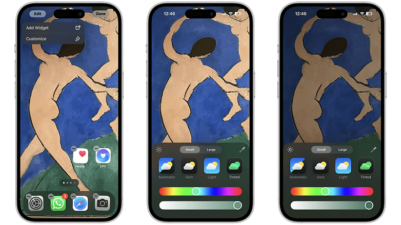
By following these steps, you can personalize your app icons to match your preferred mode and create a more visually appealing home screen experience in iOS 18.
Pros & Cons of the new Dark Mode theme
The first thing to notice here is that Apple has taken Dark Mode to a new level by darkening even the app icons and widgets. This means apps like Notes and the new Password app will also adopt a dark theme. Why is this important? Well, I’ve been using Dark Mode by default since its release in 2019, and I’ve become accustomed to it. Now, with these changes, I’m experiencing some initial strangeness with the early development of iOS 18.
Additionally, we can now customize the colors and contrast of app icons. Moreover, the ability to freely move app icons around introduces significant change. As creatures of habit, many people might initially feel overwhelmed by these new possibilities. However, with a bit of dedication and creativity, you can discover some truly appealing new layouts for your iPhone.
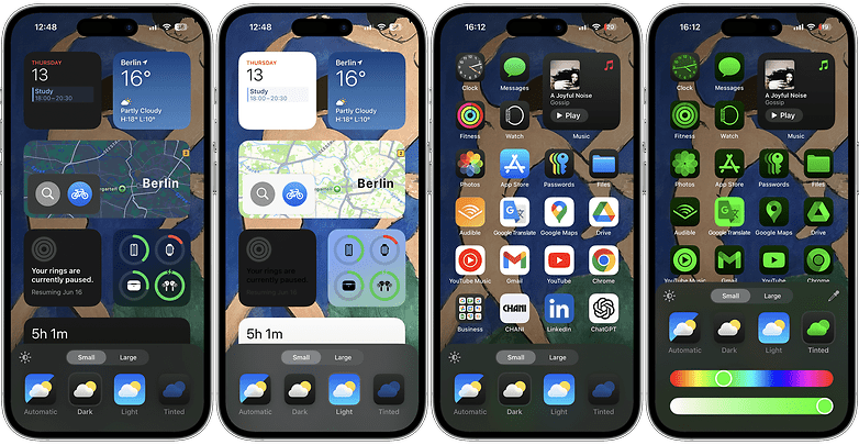
Furthermore, since this feature is still in development, many developers haven’t yet optimized their app icons for the new themes. While in Dark Mode, all Apple apps will appear darker by default. However, as shown in the image above, apps from other developers, like Google, will retain their white backgrounds. Hopefully, this will be addressed by the time the stable version is released, most likely in September.
Meanwhile, here are some extra tips for Dark Mode on iOS 18:
- Experiment with different modes to see which best suits your daily usage and aesthetic preference.
- Use the dropper tool to ensure a harmonious look between your wallpaper and icons.
- Adjust brightness levels using the sun icon for a balance that reduces eye strain in low-light conditions.
Last but not least, after experimenting with this new feature, I hope Apple introduces predefined styles, similar to what we have for the Lock Screen and Wallpaper options. The benefit is that Apple provides these in a ready-to-use format, which can be easily swapped. However, with the ability to move icons around now, some setups may not fit well with the background image.
For example, the setup below is in honor of my nephew’s birthday month. I created it to remember him and to try out the tinted mode on my iPhone. But when I switch to the wallpaper shown in the first image of this tutorial, the positions of the app icons don’t align properly. It will be great if the stable version includes the option to use predefined styles for a seamless experience.
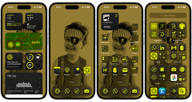
In conclusion, I believe Apple should continue to improve its new Dark Mode theme and Home Screen customization features. However, despite some initial hiccups, I find myself enjoying the Dark Mode much more now—even though I disliked it initially. With further refinement, these new options could be great additions to the iOS experience.


