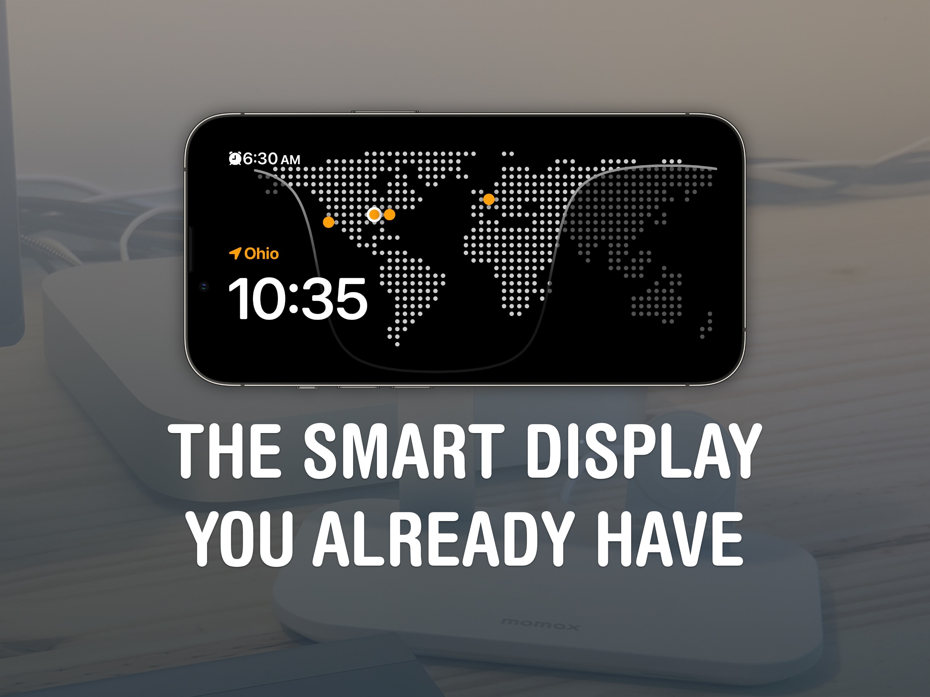
StandBy mode is a headline iOS 17 feature that turns your iPhone into a smart display on your nightstand, at your desk or in the kitchen. It’s an attractive way to put your phone to work as a small information board or digital clock when you’re not using it.
Of course, it works best if you have a phone with an always-on display like the iPhone 14 or 15 Pro. However, it works on any iPhone with MagSafe running iOS 17. Best of all, StandBy remembers different preferences for different rooms, so you can set it up as a bedside clock in the bedroom, a digital photo frame in the living room, or a music controller in the kitchen. Here’s everything you can do with StandBy on your iPhone.
How to use iPhone StandBy mode in iOS 17
StandBy is one of those great iPhone features that you should definitely play around with. It turns your phone into a dedicated info board that you can customize to show widgets, photos or your favorite clock face. Plus, while you’re using StandBy mode, your Live Activities show up full-screen, so it’s easy to control music and podcast playback or keep an eye on a food delivery. And your alarms and notifications will look good, too.
As mentioned, Apple added StandBy in iOS 17. So, if you’re not already running iOS 17, you should go to Settings > General > Software Update to get it. Upgrading may take about 20 minutes after downloading, so make sure you don’t start it at a bad time.
If you’re already running iOS 17, you can find out all about using your iPhone in StandBy mode with the article and video below.
Table of contents: How to use iPhone StandBy in iOS 17
How to put your iPhone in StandBy mode
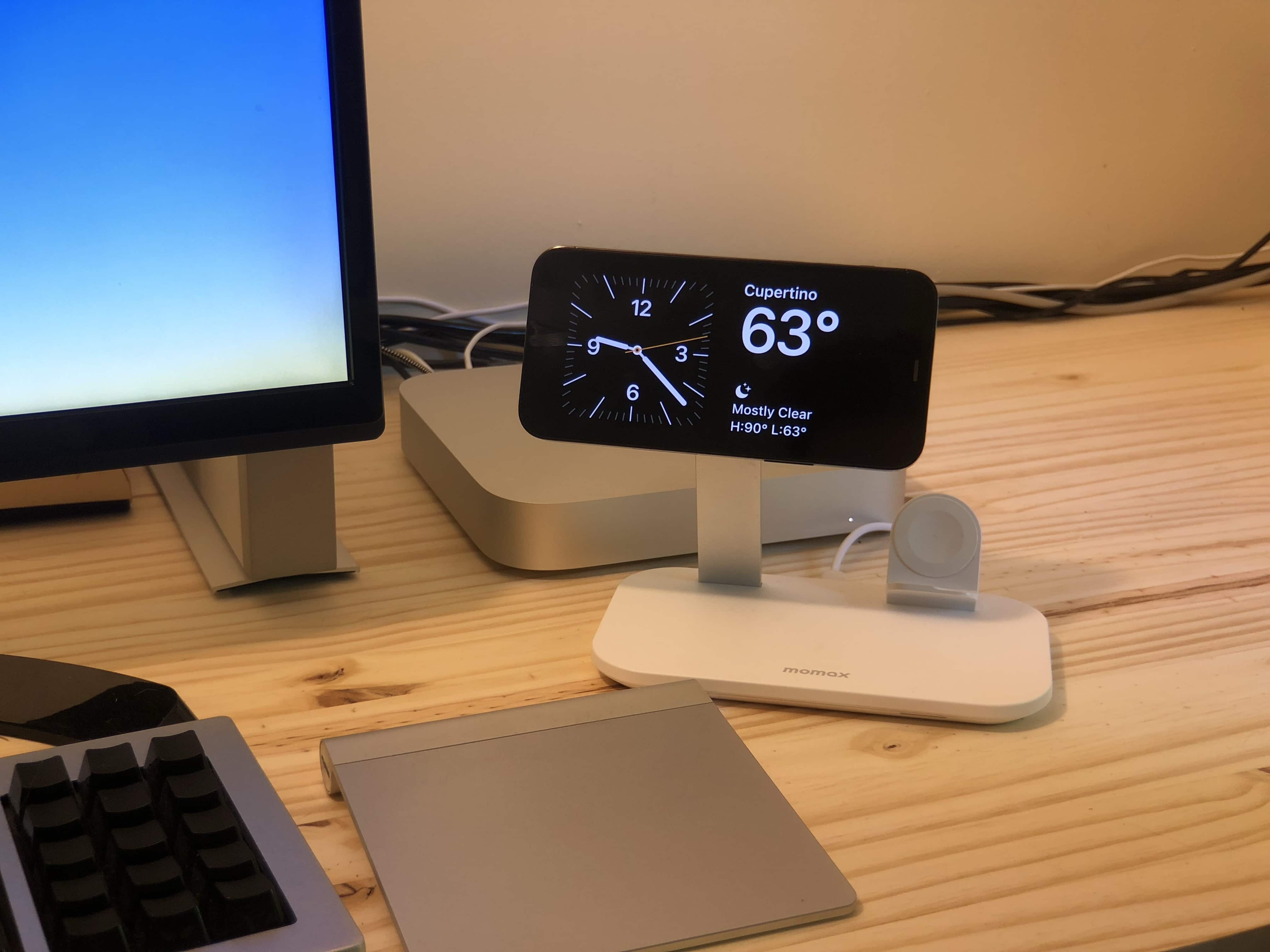
Photo: D. Griffin Jones/Cult of Mac
To use StandBy mode, your iPhone needs to be (a) charging (b) horizontal and (c) held steady in place. The feature works best if you own a MagSafe stand you can plop your iPhone onto. Otherwise, you can simply plug in your phone with a cable and lean it on something. To get StandBy started, just lock your screen and place your iPhone horizontally. Make sure it’s charging. StandBy should kick in almost immediately.
If you place your phone on different MagSafe stands, it’ll bring up the last view you had open on each one. My phone always shows the Clock view on my nightstand and the dual widget view on my desk.
How to customize StandBy mode
After StandBy mode is on, you have three different views you can access by swiping left and right: a dual widget screen, a photo slideshow and a full-screen clock.
Tap and hold anywhere on the screen to customize a particular StandBy view. You can change out the widgets for things you find useful, specify which picture categories are allowed, and customize the color of the clock. Note: You can only customize StandBy mode while the feature is active; there’s nowhere else in Settings it can be edited.
StandBy mode only works when your iPhone is placed horizontally. That complicates things on iPhone 12 models, where Face ID only works vertically. So to edit your widgets or bring up the Photos screen, you’ll either need to type in your passcode or unlock your phone before turning on StandBy.
Set up the dual widget view

Screenshot: D. Griffin Jones/Cult of Mac
The dual widget view is one of the best iPhone StandBy modes. In this view, you can put two Home Screen widgets side by side to keep an eye on things like news and weather. You can group Music and Podcasts, so you have a quick way to get something playing. On your nightstand, you can put Clock and Batteries together.
Each widget is its own stack; swipe up or down to cycle between them. Tap and hold to add another widget to the stack or remove them.
You’re limited to two of the small-size widgets; you can’t have one medium widget fill the screen. A few common widgets are missing, too, like Shortcuts. (Just imagine if you could fill an iPad in StandBy with dozens of Shortcut widgets, like a control board!)
If you use third-party apps that support the feature, you may see some more, but here’s the list of StandBy widgets you can get from Apple: App Store, Batteries, Books, Calendar, Clock, Contacts, Find My, Game Center, Home, Maps, Music, News, Notes, Photos, Podcasts, Reminders, Safari, Screen time, Stocks, TV, Wallet and Weather.
Use the photos view

Screenshot: D. Griffin Jones/Cult of Mac
The photos view in the iPhone’s StandBy mode looks very similar to the Photos Lock Screen — it rotates between intelligently chosen pictures it finds in your library. It’s like a digital picture frame. (This one would also be excellent on an iPad, Apple!)
You can swipe up and down between different categories: featured, nature, pets, cities and people. Tap the photo to see the location and date or to open the picture inside the Photos app.
I don’t use this one too often because it’s clearly meant for an always-on display.
Use StandBy as a desk clock

Screenshot: D. Griffin Jones/Cult of Mac
StandBy’s clock view consists of one big clock that fills the screen. Clock view is handy for bedtime. If you wake up in the middle of the night, the Clock view makes it easy to glance over to see what unholy hour it is and how long until the dreaded alarm goes off.
I actually prefer StandBy’s Clock view to the dual widget view. The clock is more prominent and offers all the same information I’d want from a widget anyway.
You can choose from a few different clock styles by swiping up and down between them. The Digital clock, shown above, gives you a little bit of extra information to the side of the time: the date, the temperature and tomorrow morning’s alarm. Tap and hold to customize the primary color.
Analog clock view

Screenshot: D. Griffin Jones/Cult of Mac
If you want a rectangular, American midcentury-style clock, the Analog clock is for you. You don’t get any weather info with this one, but it’s my personal favorite based on looks alone. Tap the circle in the lower right corner to change the color of the second hand and other accents.
World clock view

Screenshot: D. Griffin Jones/Cult of Mac
The next clock view, World, shows a large dotted map of the world (a la Larry King) with a current view of where the sun is shining. Time zones you set in the Clock app show up as orange dots on the map. In the upper left corner, you once again see your alarm, and below that, your current location.
Solar clock view

Screenshot: D. Griffin Jones/Cult of Mac
StandBy mode’s Solar view shows a digital clock with a pleasant, gradient-ish background. Tap the circle in the lower right to pick from a small selection of colors, but you can’t specify your own.
Float clock view

Screenshot: D. Griffin Jones/Cult of Mac
This one’s the most colorful of all of StandBy mode’s clock views on iPhone. Called “Float,” it shows the time in giant, bubbly letters. As each minute goes by, you’ll see a fun animation. To customize the Float view, tap the circle in the lower right corner to switch between colors, including two-tone options. This view also shows your alarm info.
How to view full-screen Live Activities in iPhone’s StandBy mode

Screenshot: D. Griffin Jones/Cult of Mac
If you have music playing, a timer running, a DoorDash delivery on the way or some other Live Activity running, you’ll see a little icon on the top of the screen when your iPhone’s in StandBy mode. Tap on it to show the Live Activity full screen. To get back, just swipe up from the Home Screen.
Maybe you have your phone on a stand while you’re playing music on your HomePod — this is a perfect way to control it remotely with big, obvious buttons. It’s like CarPlay for your desk or your kitchen counter.
Full-screen alarms and notifications

Screenshot: D. Griffin Jones/Cult of Mac
When your iPhone alarm goes off in the morning, have you ever confused the Snooze button for the Stop Alarm button? It’s easy to mix up. That problem is mitigated if you leave your iPhone in StandBy mode overnight. Then, when your alarm goes off, this is what you will see. The Snooze and Stop buttons are side-by-side and given equal prominence. I find it much easier to distinguish between the two.

Screenshot: D. Griffin Jones/Cult of Mac
All iPhone notifications get a similar sort of treatment in StandBy mode. You first see the icon pop up front and center on the display. Then, after just a moment, the text fills in to the side. It’s much like the notification animation on the Apple Watch, except of course it’s on your big iPhone screen. If you use your phone at work (and especially if you work on a PC), this will be a much more pleasant way to field notifications.
Just like with Live Activities, you can dismiss the notification by swiping up.
How is it using StandBy overall?
A lot of people really love using the iPhone’s StandBy mode. This one feature alone seems to be boosting the market for MagSafe charging stands.
Making your phone useful even when you’re not using is an attractive feature. If you work at a computer, your iPhone need not be relegated to sitting idly in your pocket or on your desk — it can become a handy display board, a digital picture frame or a beautiful clock.
It might even push people to upgrade to a new iPhone prematurely so they can experience StandBy as it’s really meant to be experienced: with an always-on screen.
See our master list of other great iOS 17 features here.
We originally published this story on how to use StandBy mode on iPhone on September 22, 2023. We updated the information.


