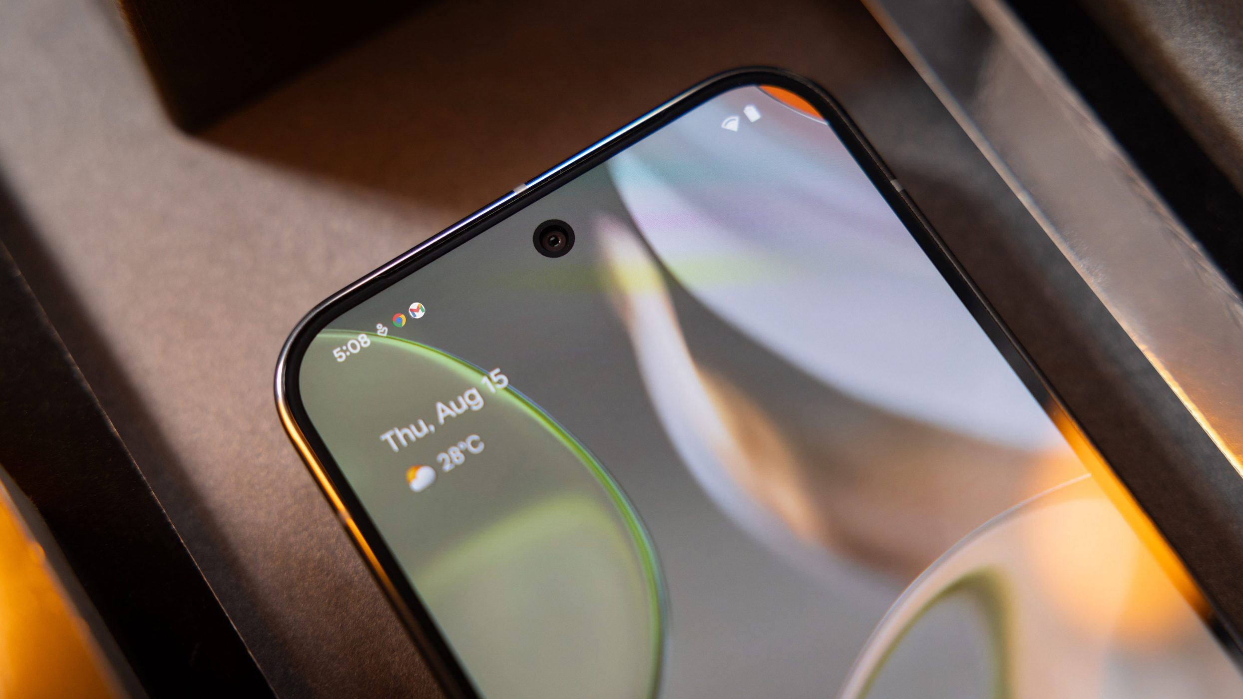
For most skinned Android OS versions, app notification icons on the status bar and lock screen are shown in white glyph icons, with very few apps and tools being colored. However, with the latest Android developments, Google may bring full-color and dynamic icons back in one of the future Android 15 updates.
Depending on the device brand, you’ll have app and service notification icons colored in white. This has the advantage of being simpler and cleaner, but this requires memorizing what the equivalent glyphs are or entirely checking the notification drawer to see more details about the items. This might change soon.
New possible design changes to app notification icons on Android 15
As discovered by Android Authority in the source code of Android 15, Google might be testing colored app icons on the status bar, notification drawer, and lock screen including the always-on display. Through developer Mishaal Rahman, the outlet managed to show what Google has been brewing and that may be implemented through one of the builds of Android 15.
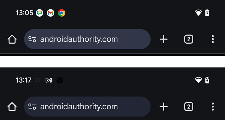
Accordingly, the notification icons will come in a circular shape and they will be colored, mirroring the app design found in the home screen. At the same time, monochrome icons will be applied if the themed icons option is applied. In the case here, the black and gray colored icons are even overlaid, which is non-practical if dark mode or a blacker theme is enabled.
Of course, this change appears in a rough state and the design may be different in the definitive version. However, it may also happen that this won’t make at all.
More than the app notification icons, Google has also revamped the status bar icons on Android 15 which covers the battery, Wi-Fi, and cellular icons. But even so, OEMs like Xiaomi and Samsung may go with a different design on both notification and status icons after all.
Which app notification design do you prefer having on your Android device? Tell us your preference.
Source:
Android Authority


