Europe
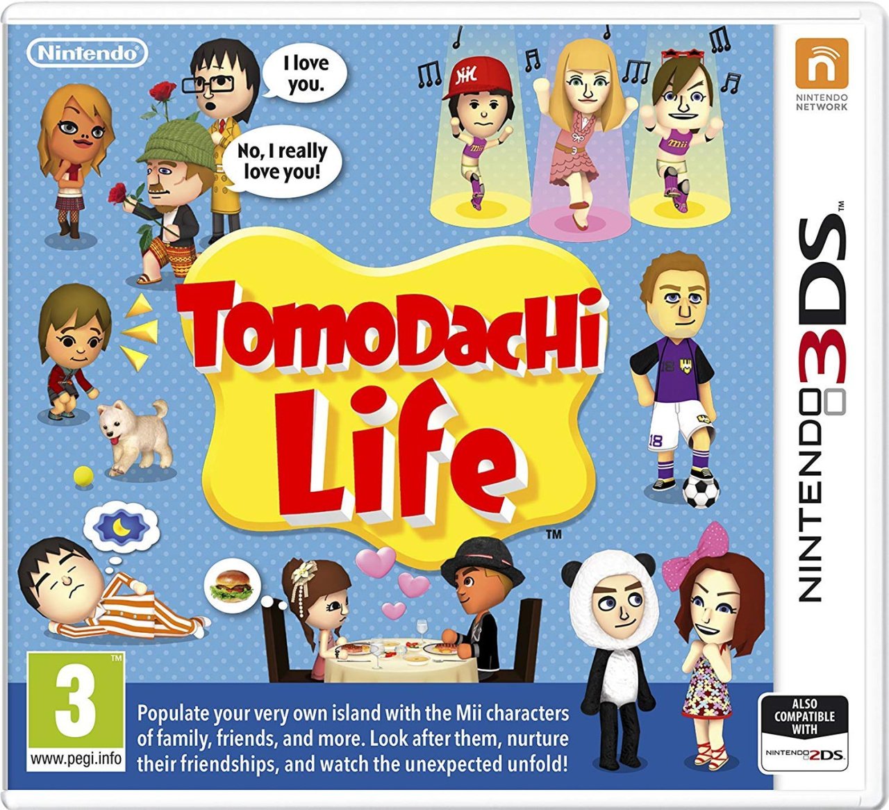
The European design for Tomodachi Life shows, well, life. A bunch of Miis stand against a spotty blue background, going about daily tasks like playing with the dog, sports, eating dinner… uhh, dressing up as a panda? Maybe not the most applicable example, but it certainly gives a good idea of what the game’s all about — and even if it didn’t there’s a whopping great summary at the bottom.
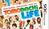
North America
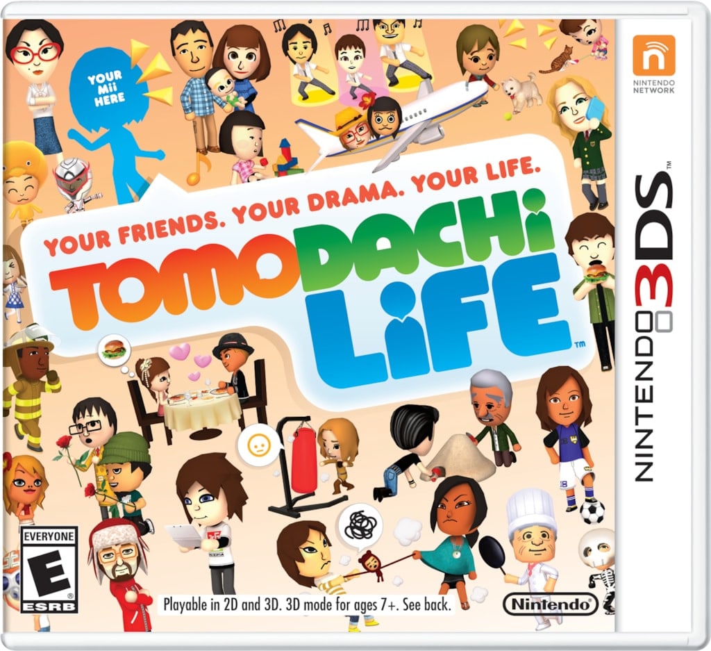
The North American design takes the same principle as the EU one, but dials it up to 11. There are more Miis, more activities, more space dedicated to the logo. While we’re not convinced that we like the new icon more than the one used in Europe — it gives the vibes of an early social media messaging service — we are fans of the increased Mii numbers.
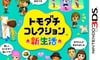
Japan
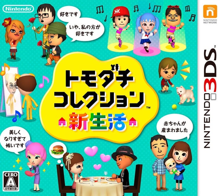
At an initial glance, the Japanese cover appears much the same as Europe, but some noteworthy differences convinced us it deserves an entry of its own. A handful of the Mii activities have changed, with painting, applying makeup and having a baby now included. The previous blue background has been subbed out for more of a teal, and the logo now includes some tiny house and character icons. Subtle changes, but pretty sweet.
Thanks for voting! We’ll see you next time for another round of Box Art Brawl.
Europe
The European design for Tomodachi Life shows, well, life. A bunch of Miis stand against a spotty blue background, going about daily tasks like playing with the dog, sports, eating dinner... uhh, dressing up as a panda? Maybe not the most applicable example, but it certainly gives a good idea of what the game's all about — and even if it didn't there's a whopping great summary at the bottom.
North America
The North American design takes the same principle as the EU one, but dials it up to 11. There are more Miis, more activities, more space dedicated to the logo. While we're not convinced that we like the new icon more than the one used in Europe — it gives the vibes of an early social media messaging service — we are fans of the increased Mii numbers.
Japan
At an initial glance, the Japanese cover appears much the same as Europe, but some noteworthy differences convinced us it deserves an entry of its own. A handful of the Mii activities have changed, with painting, applying makeup and having a baby now included. The previous blue background has been subbed out for more of a teal, and the logo now includes some tiny house and character icons. Subtle changes, but pretty sweet.
Thanks for voting! We'll see you next time for another round of Box Art Brawl.