
Be sure to cast your votes in the poll below; but first, let’s check out the box art designs themselves.
North America
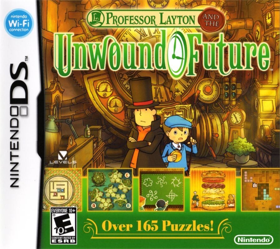
One look at the North American cover for the Unwound Future and you know exactly what the game has in store. Layton and Luke stand front and centre (as they should) while the bottom third is taken up by screenshots of some of the in-game puzzles on a bright green banner. It might not be the neatest cover we have ever seen (the screenshots make it look something like an ad pop-up, in our opinion), but at least it’s clear what the game has to offer.
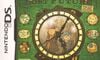
Europe
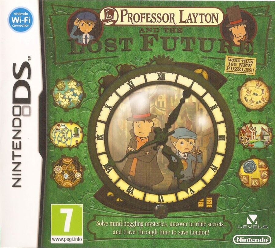
Okay, now this one is taking a different approach. The European cover looks more like an old book, with the clock logo taking centre stage surrounded by smaller pictures of some of the puzzles. Our detective duo still sit in the background of the central logo (and above in the comparatively smaller title) and there’s even a neat little plot summary to be read along the bottom.
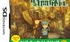
Japan
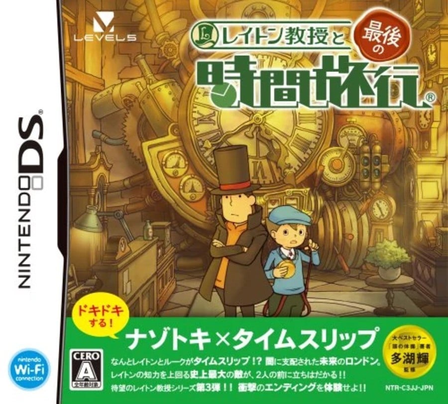
The Japanese cover borrows much of the same format that we saw with NA, though there are a couple of noticeable differences. The title font is a lot smaller and less centralised, leaving a much clearer view of Luke and Layton, and what happened to all those puzzle screenshots? There’s no indication of the puzzles in-store on this one, though a little plot summary once again sits across the bottom banner.
Thanks for voting! We’ll see you next time for another round of the Box Art Brawl.
Be sure to cast your votes in the poll below; but first, let’s check out the box art designs themselves.
North America
One look at the North American cover for the Unwound Future and you know exactly what the game has in store. Layton and Luke stand front and centre (as they should) while the bottom third is taken up by screenshots of some of the in-game puzzles on a bright green banner. It might not be the neatest cover we have ever seen (the screenshots make it look something like an ad pop-up, in our opinion), but at least it’s clear what the game has to offer.
Europe
Okay, now this one is taking a different approach. The European cover looks more like an old book, with the clock logo taking centre stage surrounded by smaller pictures of some of the puzzles. Our detective duo still sit in the background of the central logo (and above in the comparatively smaller title) and there’s even a neat little plot summary to be read along the bottom.
Japan
The Japanese cover borrows much of the same format that we saw with NA, though there are a couple of noticeable differences. The title font is a lot smaller and less centralised, leaving a much clearer view of Luke and Layton, and what happened to all those puzzle screenshots? There’s no indication of the puzzles in-store on this one, though a little plot summary once again sits across the bottom banner.
Thanks for voting! We’ll see you next time for another round of the Box Art Brawl.

")