Soapbox features enable our individual writers and contributors to voice their opinions on hot topics and random stuff they’ve been chewing over. Today, Nathan goes mapping the pixels…
What is your greatest video game pet peeve? That one thing that, when present, ruins your experience, no matter how good the game is otherwise? For me, it’s a bad in-game map.
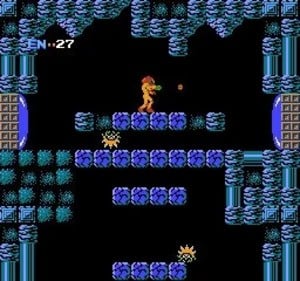
Take the original Metroid, for example. I do not like that game. Never have. And that’s not a product of my playing it for the first time decades after its first release. No, I was there in 1986 and still have my original copy. I was blown away by its gameplay (four-direction scrolling!?) and theme, but I could not deal with its labyrinthine design for one simple reason: it had no map.
I’ve always had a thing for maps. And not just in the virtual world. In college I studied Geography. It was my goal to become a GIS (Geographic Information Systems) specialist – a map maker.
Even now, maps — real and video game — play a prominent role in my day-to-day life. Map posters are plastered on my home office and game room walls and the background on my work computer cycles through images from VGMaps. It’s fun to see a coworker’s face light up when they recognize a map while I share my screen in a Teams meeting. Such is the power of a recognizable, useful map. It transports you to a place you’ve once visited.
What is a Map? A Miserable Little Pile of Secrets?
At the risk of being pedantic, what is a map, exactly?
It’s a representation of a world. A rendering. It might be pure text (as from a dungeon master), a 2D visual (a view from above), or a 3D model (like that globe at grandma’s house). Regardless of its format, a map is only useful if it provides value to its readers. It has to convey information, and above all, it must be accurate. As they say, a map should match the terrain.
Yoshi’s Horror Story
I learned this lesson while working on the Nintendo Power magazine staff in the late ’90s. One of my primary tasks was to make sure that the printed maps were accurate, with particular emphasis on the placement of callouts for power-ups and items.
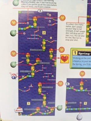
The most challenging assignment I had was the Yoshi’s Story player’s guide. For those who haven’t played it, Yoshi’s Story is a 2.5D platformer where the objective in each stage isn’t to find the exit, but rather to find and eat 30 fruits. The game has 24 stages and within each stage are 60 fruits, for a grand total of 1,440 fruits. Keep that number in mind.
During the guide’s production, Nintendo’s Japanese HQ would often send a new build of the still-under-development game. There was the occasional build with a drastic change, but more often than not, the only changes were a handful of fruits that had been moved within a stage. Naturally, I was never told what to look for. Instead, I had to play the entire game, and confirm or correct the location of every single one of those one-thousand four-hundred and forty melons, watermelons, apples, bananas, and grapes.
Two solid months of fruit-finding cured me of wanting a career in map-making. However, Yoshi’s fruits taught me a deep appreciation for the value of a well-made map.
Metroid: A Quick Case Study
Going back to Metroid, navigating planet Zebes absolutely, positively requires a map.
In fact, the entire Metroid series is a case study in the utility of in-game maps. The first Metroid (and to a lesser degree, its sequel) are lauded as pioneers in their genre, but the absence of a map is perhaps their most common criticism. The third entry in the franchise, Super Metroid, is quite the opposite. Its in-game map undoubtedly set the standard for the genre and perhaps the entire medium.
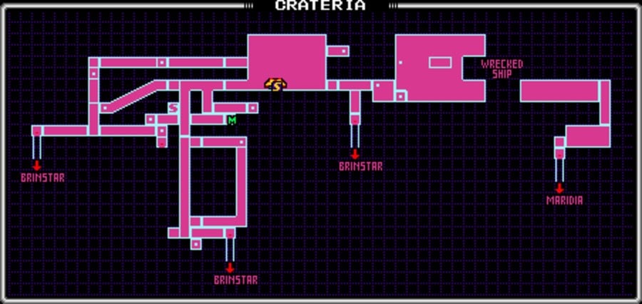
Beyond simply existing (which is great), Super Metroid’s pause screen map provides layers of value:
- It communicates progression by filling in as you explore
- It encourages exploration by filling in only those grid squares that you have actually touched, rather than full rooms that you’ve visited (looking at you Hollow Knight)
- It rewards exploration and discovery by omitting hidden areas, even if you choose to visit the optional Map Rooms, and
- It aids you, the player, in identifying areas for further exploration
With only a grid, two colors, and a handful of symbols, Super Metroid’s map provides one of the seminal game’s most important features.
A Few More Examples
If we can venture outside of Samus’ orbit, here are a few other game maps that I find interesting.
The Hub World Map
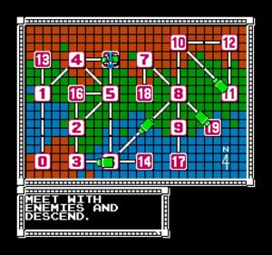
The first game I recall featuring an interactive overworld was Bionic Commando for the NES. The overworld in Super Mario Bros. 3 is perhaps more well-known, but Super Joe’s game arrived in the West a full two years earlier.
Bionic Commando’s hub world allowed players to see and explore (by flying a friggin’ helicopter!) the branching paths between stages and optional areas. The map displayed the game world’s interconnectedness, while also providing interactivity that was previously unseen in game maps.
The In-Game, In-Game Map
Is there anything more definitively ‘video game’ than a pause button? They say that “Time stops for no one,” so you know you’re in a virtual world when you can literally stop time with the press of a button.
Yoshi’s fruits taught me a deep appreciation for the value of a well-made map.
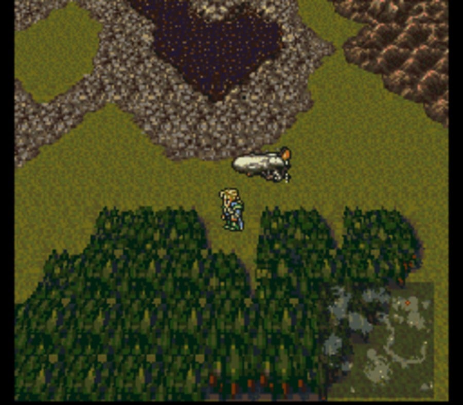
Most in-game maps are accessible only from a Pause screen, which means that you can either look at the map or explore the world. You can’t do both. Final Fantasy VI (aka Final Fantasy 3 in the West) broke that paradigm by allowing you to display the world map as an overlay. This blew my mind at the time. I could explore both the world and the map – at the same time! In fact, I could navigate the world by looking exclusively at that little map. Please don’t do that while driving your car, but I highly recommend it when flying an airship to Narshe.
And yes, Far Cry 2 and Minecraft took this concept further by showing your in-game avatar holding up the map. That’s full-on map immersion for you.
The Perfect Use of a Dual Screen
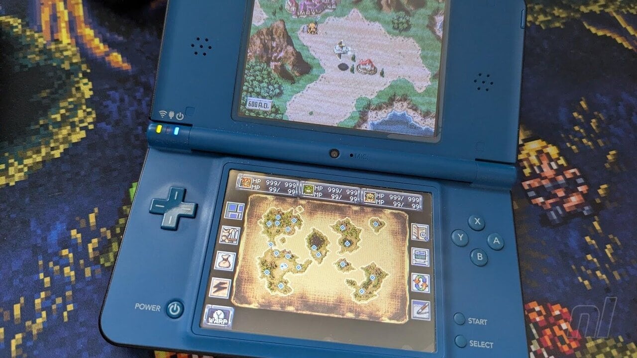
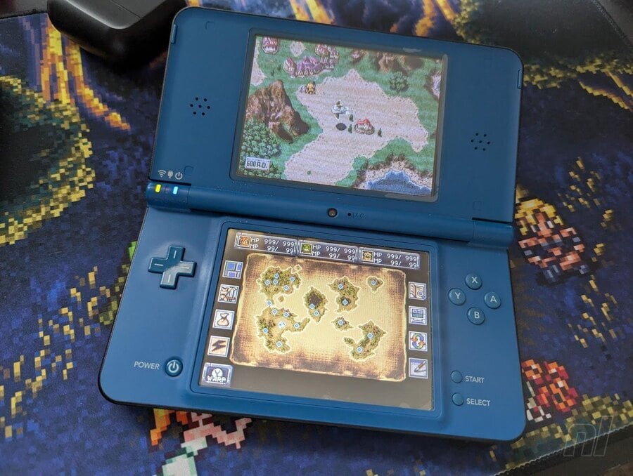
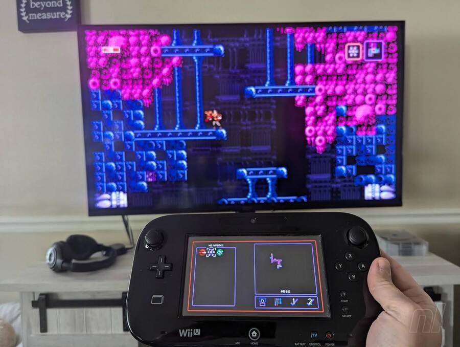
Chrono Trigger first appeared in 1995 on the SNES, but the DS port is, for me, the definitive version. And not just because of the added content and FMV scenes. No, it’s because your map is ever-present on the second screen. It’s the in-game map, taken to its logical conclusion on the map lover’s perfect console. Axiom Verge on the Wii U is another example of a game whose best version is trapped on an aging, dual-screen platform.
Waypoints and Symbols
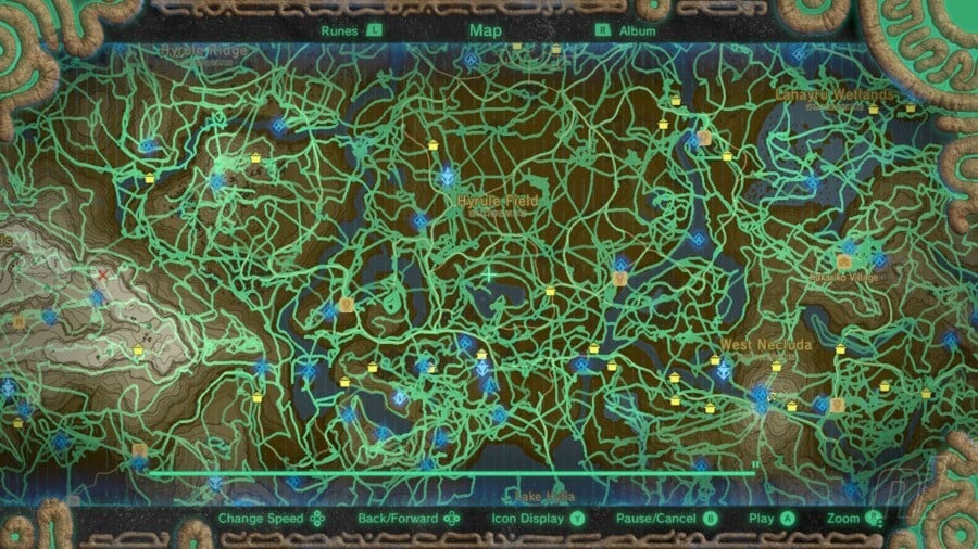
Let’s take a look at one more. Like Super Metroid, the map in The Legend of Zelda: Breath of the Wild is arguably the game’s greatest feature.
Not only does it incorporate every element mentioned thus far (tracking progression, encouraging exploration, communicating the rules of the game world, and constant availability) but it also ups the ante with incredible interactivity. You can mark the map with waypoints, using symbols or colors to infuse personalized meaning. Furthermore, the line between map and game world is blurred by allowing Link to simply look at a spot on the ground and drop a pin. Hyrule isn’t simply represented by the map; it is the map.
From Metroid to Breath of the Wild and beyond, I continue to be fascinated by video game maps. They shape our exploration and communicate a thousand words in a single picture, especially when we’re allowed to draw on the canvas ourselves.
Lucy Fellowes, a Smithsonian curator, once said, “Every map is someone’s way of getting you to look at the world his or her way.” I’m no map maker — Yoshi’s Story saw to that — but I hope I’ve painted a picture of how I see the world – as a pixelated little pile of secrets.
What do you look for in an in-game map? Do you have a favorite? Let us know in the comments.

Soapbox features enable our individual writers and contributors to voice their opinions on hot topics and random stuff they've been chewing over. Today, Nathan goes mapping the pixels...
What is your greatest video game pet peeve? That one thing that, when present, ruins your experience, no matter how good the game is otherwise? For me, it’s a bad in-game map.

Take the original Metroid, for example. I do not like that game. Never have. And that’s not a product of my playing it for the first time decades after its first release. No, I was there in 1986 and still have my original copy. I was blown away by its gameplay (four-direction scrolling!?) and theme, but I could not deal with its labyrinthine design for one simple reason: it had no map.
I’ve always had a thing for maps. And not just in the virtual world. In college I studied Geography. It was my goal to become a GIS (Geographic Information Systems) specialist - a map maker.
Even now, maps — real and video game — play a prominent role in my day-to-day life. Map posters are plastered on my home office and game room walls and the background on my work computer cycles through images from VGMaps. It’s fun to see a coworker's face light up when they recognize a map while I share my screen in a Teams meeting. Such is the power of a recognizable, useful map. It transports you to a place you’ve once visited.
What is a Map? A Miserable Little Pile of Secrets?
At the risk of being pedantic, what is a map, exactly?
It’s a representation of a world. A rendering. It might be pure text (as from a dungeon master), a 2D visual (a view from above), or a 3D model (like that globe at grandma’s house). Regardless of its format, a map is only useful if it provides value to its readers. It has to convey information, and above all, it must be accurate. As they say, a map should match the terrain.
Yoshi’s Horror Story
I learned this lesson while working on the Nintendo Power magazine staff in the late '90s. One of my primary tasks was to make sure that the printed maps were accurate, with particular emphasis on the placement of callouts for power-ups and items.

The most challenging assignment I had was the Yoshi’s Story player's guide. For those who haven’t played it, Yoshi’s Story is a 2.5D platformer where the objective in each stage isn’t to find the exit, but rather to find and eat 30 fruits. The game has 24 stages and within each stage are 60 fruits, for a grand total of 1,440 fruits. Keep that number in mind.
During the guide’s production, Nintendo's Japanese HQ would often send a new build of the still-under-development game. There was the occasional build with a drastic change, but more often than not, the only changes were a handful of fruits that had been moved within a stage. Naturally, I was never told what to look for. Instead, I had to play the entire game, and confirm or correct the location of every single one of those one-thousand four-hundred and forty melons, watermelons, apples, bananas, and grapes.
Two solid months of fruit-finding cured me of wanting a career in map-making. However, Yoshi’s fruits taught me a deep appreciation for the value of a well-made map.
Metroid: A Quick Case Study
Going back to Metroid, navigating planet Zebes absolutely, positively requires a map.
In fact, the entire Metroid series is a case study in the utility of in-game maps. The first Metroid (and to a lesser degree, its sequel) are lauded as pioneers in their genre, but the absence of a map is perhaps their most common criticism. The third entry in the franchise, Super Metroid, is quite the opposite. Its in-game map undoubtedly set the standard for the genre and perhaps the entire medium.

Beyond simply existing (which is great), Super Metroid’s pause screen map provides layers of value:
- It communicates progression by filling in as you explore
- It encourages exploration by filling in only those grid squares that you have actually touched, rather than full rooms that you’ve visited (looking at you Hollow Knight)
- It rewards exploration and discovery by omitting hidden areas, even if you choose to visit the optional Map Rooms, and
- It aids you, the player, in identifying areas for further exploration
With only a grid, two colors, and a handful of symbols, Super Metroid’s map provides one of the seminal game’s most important features.
A Few More Examples
If we can venture outside of Samus’ orbit, here are a few other game maps that I find interesting.
The Hub World Map

The first game I recall featuring an interactive overworld was Bionic Commando for the NES. The overworld in Super Mario Bros. 3 is perhaps more well-known, but Super Joe’s game arrived in the West a full two years earlier.
Bionic Commando’s hub world allowed players to see and explore (by flying a friggin’ helicopter!) the branching paths between stages and optional areas. The map displayed the game world’s interconnectedness, while also providing interactivity that was previously unseen in game maps.
The In-Game, In-Game Map
Is there anything more definitively 'video game' than a pause button? They say that “Time stops for no one,” so you know you’re in a virtual world when you can literally stop time with the press of a button.
Yoshi’s fruits taught me a deep appreciation for the value of a well-made map.
Most in-game maps are accessible only from a Pause screen, which means that you can either look at the map or explore the world. You can’t do both. Final Fantasy VI (aka Final Fantasy 3 in the West) broke that paradigm by allowing you to display the world map as an overlay. This blew my mind at the time. I could explore both the world and the map - at the same time! In fact, I could navigate the world by looking exclusively at that little map. Please don’t do that while driving your car, but I highly recommend it when flying an airship to Narshe.

And yes, Far Cry 2 and Minecraft took this concept further by showing your in-game avatar holding up the map. That’s full-on map immersion for you.
The Perfect Use of a Dual Screen
Chrono Trigger first appeared in 1995 on the SNES, but the DS port is, for me, the definitive version. And not just because of the added content and FMV scenes. No, it’s because your map is ever-present on the second screen. It’s the in-game map, taken to its logical conclusion on the map lover's perfect console. Axiom Verge on the Wii U is another example of a game whose best version is trapped on an aging, dual-screen platform.

Waypoints and Symbols
Let’s take a look at one more. Like Super Metroid, the map in The Legend of Zelda: Breath of the Wild is arguably the game’s greatest feature.
Not only does it incorporate every element mentioned thus far (tracking progression, encouraging exploration, communicating the rules of the game world, and constant availability) but it also ups the ante with incredible interactivity. You can mark the map with waypoints, using symbols or colors to infuse personalized meaning. Furthermore, the line between map and game world is blurred by allowing Link to simply look at a spot on the ground and drop a pin. Hyrule isn’t simply represented by the map; it is the map.
From Metroid to Breath of the Wild and beyond, I continue to be fascinated by video game maps. They shape our exploration and communicate a thousand words in a single picture, especially when we’re allowed to draw on the canvas ourselves.

Lucy Fellowes, a Smithsonian curator, once said, “Every map is someone’s way of getting you to look at the world his or her way.” I’m no map maker — Yoshi’s Story saw to that — but I hope I’ve painted a picture of how I see the world - as a pixelated little pile of secrets.
What do you look for in an in-game map? Do you have a favorite? Let us know in the comments.


