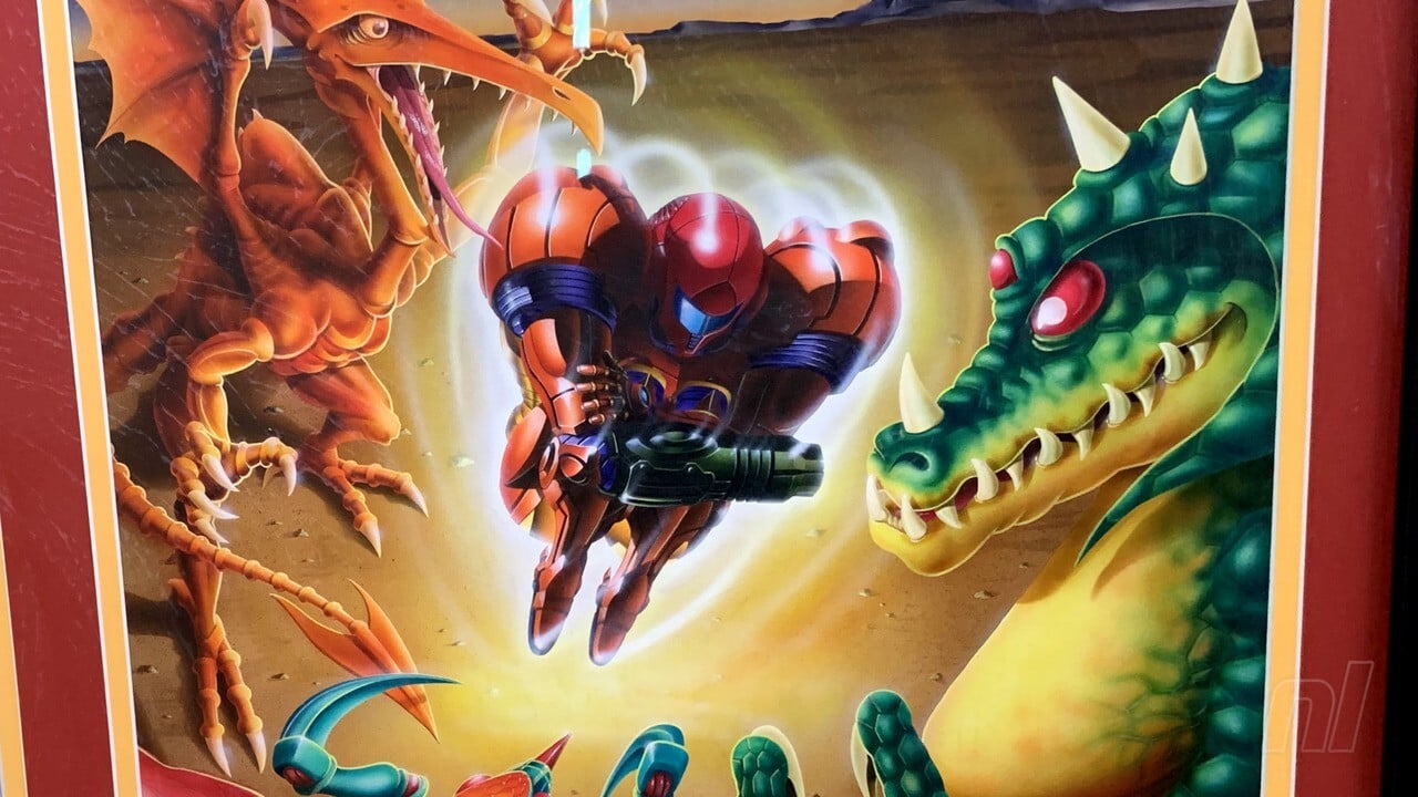
Have you ever seen an original Contra up close? What about an original Mario Kart?
For Stephan Reese, organizer and showrunner for the non-profit Interactive Art Collection (and a Senior Producer at video game developer Bungie when he’s not busy doing that), it’s his life’s mission that you might have the pleasure of seeing pop-culture history outside of the confines of your TV screens and old magazines.
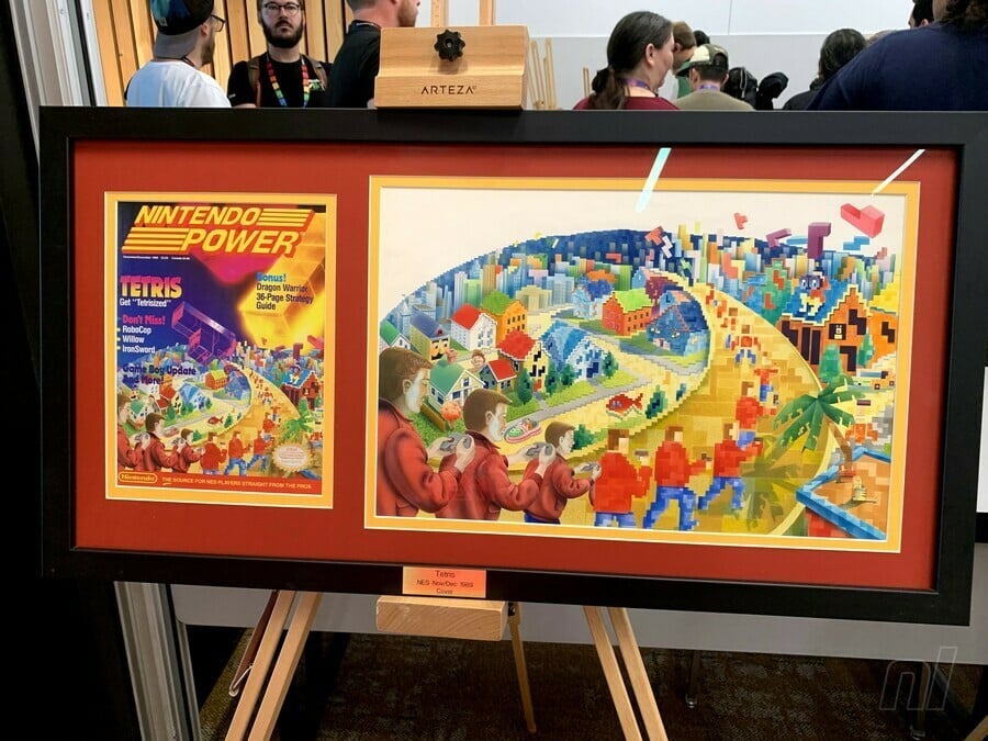
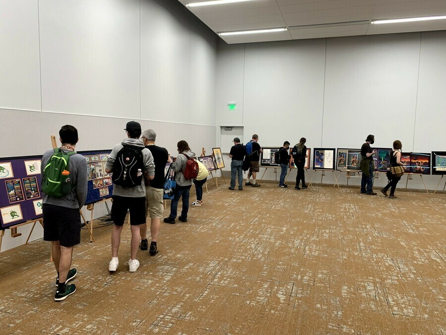
His team’s latest exhibit is the aptly titled “The Art of Nintendo Power,” a traveling art show that most recently exhibited at PAX West 2023 in Seattle. For four days, attendees could walk a room and bask in original Nintendo Power prints, line art, posters, 3D models, and much more. The exhibit features all original art with zero replications, stemming from the earliest points in the history of the 1980s print magazine, which was originally crafted and written for kids, as well as for all of us kid-like adults who now fondly remember its technicolor, off-the-wall pages.
Nintendo Life caught up with Reese at this year’s PAX and asked him to highlight choice pieces from the non-profit’s collection, hoping to gain a little insight into one of the most quintessential eras in retro media…
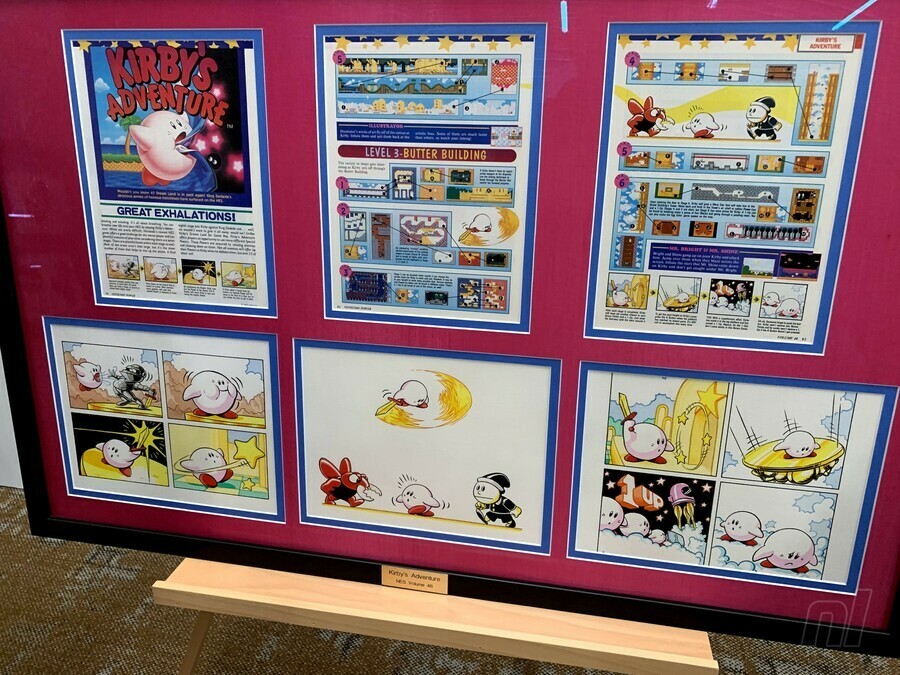
Stephan Reese: This is a number of panels by an artist named Kev Brockschmidt who’s most notably known for his Magic: The Gathering cards.
A lot of artists who had worked for Nintendo Power were also moonlighting doing other things, either working for the magazine and moonlighting or just contract artists who were also doing many other things. This is actually one of my favorite images of Kirby, this little chubby-cheeks Kirby in the upper right-hand corner of that first frame…I used him for my profile picture for a long time.
Kevin is just an absolutely amazing artist, and they used him for a lot of internal pages for first-party. This is an amazing example of his work.
Alan Lopez for Nintendo Life: Do you have any knowledge if this informed the eventual style guide for Kirby?
It was definitely an earlier depiction. But for Nintendo Power magazine, oftentimes, especially for first-party [games], this was the first time a lot of this had been drawn by hand. I think they did what they could…and he is already pink in these, which I think is interesting. [Editor’s note: Kirby was originally colored white on the cover of his debut game, Kirby’s Dream Land.]
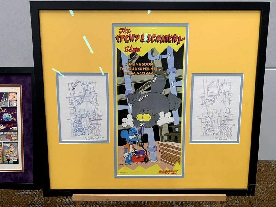
This piece is an example of what is often referred to as ‘blue line.’ These would have been preliminary sketches for the eventual poster. This is Bill Morrison’s work, despite the fact that it says ‘Matt Groening’ on the finished product. That was common with Simpsons stuff; Matt would put his name on anything Simpsons, but almost all of the commercial work for The Simpsons, be it t-shirts, board games, advertisements, almost all of it was Bill Morrison’s work. These were purchased directly from Bill.
That method [of obtaining pieces] is common for us. Almost nothing [in the exhibit] was bought through auctions. Almost all of it is working directly with the artist’s estate, or sometimes, very seldomly, private collectors. I just knew, already, offhand, that Bill Morrison draws almost everything product-related for The Simpsons, so I just went to Bill Morrison and showed him this piece and asked him if he had it, and he had the blue lines.
Does this stuff get shared very frequently, stuff from The Simpsons?
No.
How does that make you feel?
I mean, it’s great! The whole mission is to share the work. This show in particular has been very validating for us. It’s very clear that people care about the work.
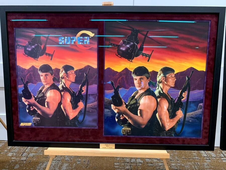
So this is a piece by Lee MacLeod. Actually, The Lost Vikings, the Demon’s Crest, and the Super C pieces here are all Lee MacLeod.
Super C in particular is a paint-over of a photograph. So underneath the paint is a photo of those two gentlemen holding guns and then he painted in, of course, the rest of the mountains, and the helicopter. So yes, it’s a paint-over of a photograph.
In fact, the painting is so exact, that I was able to find one of the actor’s Facebook profiles just by doing a Google image search with the painting.
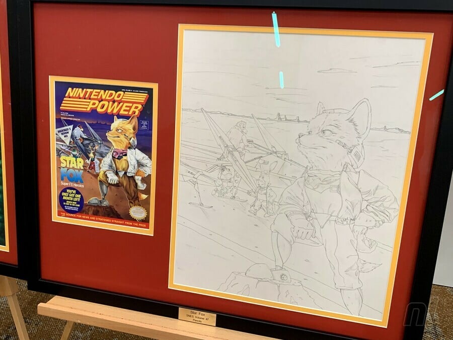
These were the pencils that were used for the stencil for the final. The way that airbrush art works — and most of these covers are acrylic airbrush — it starts as a pencil sketch like this, and then it’s used to make a stencil out of a material called frisket tape. And then at that point, it’s basically paint-by-numbers. You peel off a piece of tape, you paint it, you put it back down, you peel off a piece of tape, you paint it, you put it back down…
And so that’s why these pencils, unlike the Itchy and Scratchy piece, you can clearly tell the difference between the sketch, and the final. They look different. [But] these pencils on the Star Fox are identical line for line to the finished painting because these lines were used to make the stencil for the final work.
Who made this?
David Harto. Almost all the covers came from U.S. artists. The covers and the posters are almost exclusively U.S. artists.
Do you have any insight on the back-and-forth between the Japanese creators and Nintendo Power?
Early on it was Gail Tilden and Howard Phillips flying to Japan once a month to work on the magazine with the Japanese team, both were members of a publishing company called Tokuma Shoten and Work House Japan. And then, over the years, they established Work House U.S. as a U.S. company, so it became kind of a hybrid.
There were almost always Japanese artists working on the magazine to some extent, but it did become more of a hybrid situation.
This is also another David Harto, [and] he also did the Darkwing Duck right next to it.
Between the two pieces you can sort of see the entire [creation] process, where Dave would have done the ink lines, printed those on a piece of acetate, and used airbrush to do the colors underneath.
These lines on Mario Kart are much thicker, yeah.
So the Mario Kart, that’s the lines that would be printed on the acetate. On the Darkwing, you can see where he’s printed those lines on a piece of plastic and then painted in the background.
Nintendo Power envelopes and letters
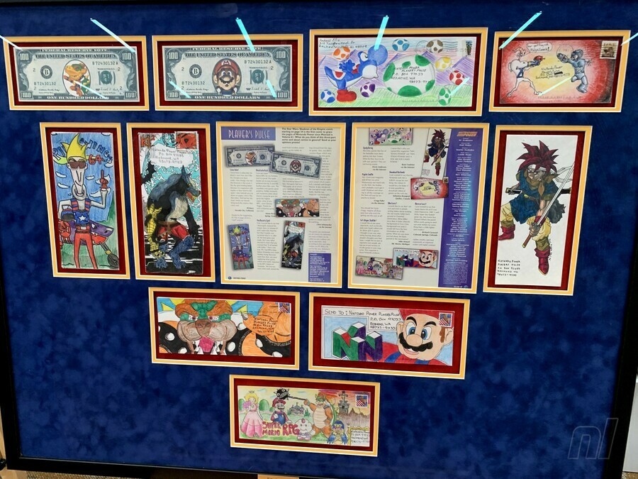
How did you obtain these envelopes?
These are all children’s envelopes that they would have drawn on and mailed in.
These came from an ex-Nintendo employee who had taken them off the wall in the call center. The original Redmond building was bulldozed in 2010, and when they were gonna bulldoze that, this employee came in and just took some art off the wall, and then years later connected with me.
We have about 125 pieces of envelope art, altogether. They’re very expensive to frame in a frame like that [laughs]. So it takes some time. But we’re really happy to have what we have. It’s just tough. It’s great that we saved so many, but at the same time, there’s tens, and tens, and tens of thousands that we didn’t save.
Did you ever submit any?
I did not! No. I didn’t write Nintendo at all. I called the Nintendo gameplay counselors once, for Mega Man 2.
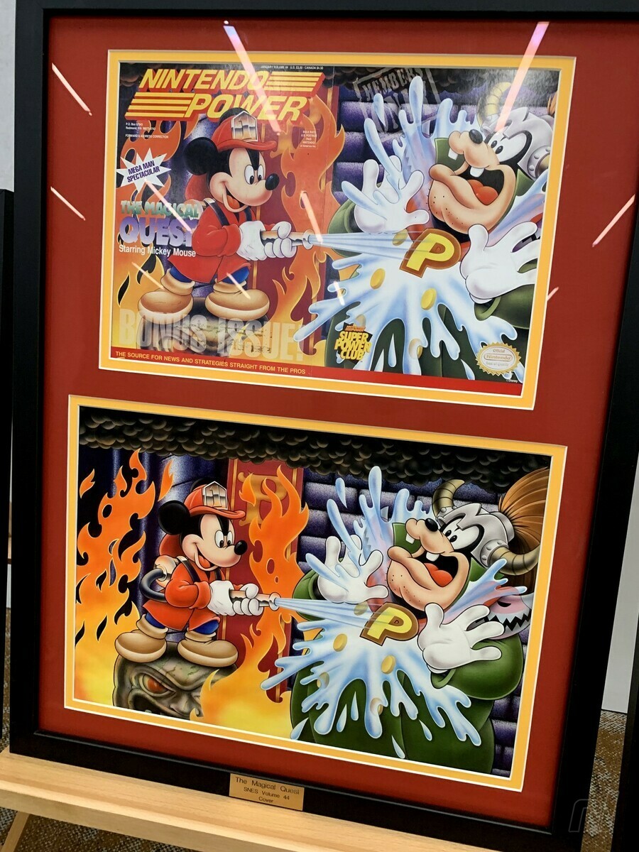
This is the work of Dan McGowan. He was an incredible artist. Basically, most of the covers [at the exhibit] were either painted by Dan McGowan or David Harto. But Dan is no longer with us, he passed away about a decade ago from cancer. But we worked with his estate to be able to save a number of his paintings.
What I love about this piece in particular is that it really shows really bold talent on behalf of Dan in that, it’s painted to scale, or very close to scale. If you notice, a lot of these paintings are painted much larger than the covers, and that is, honestly, to be able to easily fix mistakes in the event that there are mistakes. And so when I see a painting that’s painted basically the size of the cover, it really shows bold talent.
It looks indistinguishable from a typical Disney depiction of Mickey.
Yeah, I worked for Disney Interactive for years, and before I had any of these Disney covers I thought, ‘I should be able to find these!’ And so I looked for them, and it turns out none of them were painted by official Disney artists. Dan McGowan also painted the [Road Runner] cover [in the exhibit], and he was not a Warner Bros. artist either. Nintendo just got really talented contract artists.
Nintendo Power “Top” lists
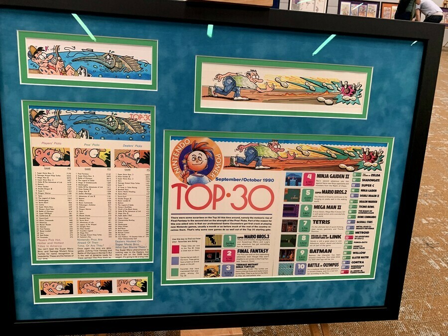
All of this work is painted by an artist named Orange Nakamura. This is some of the Japanese origin art in the room. He painted under a pseudonym, so we don’t know who he is. “Orange” is definitely not his first name. [laughs]
So this iconic Nintendo Power art style…is anonymous?
Well, he wasn’t [fully] anonymous at the time. If you look at Japanese credits in the magazine, most of them did paint under pseudonyms, not using their real names.
Why?
Just a cultural thing. There may be a little bit of the fact that they were artists working for Tokuma Shoten, a very established manga company. So, you would have people like Shotaro Ishinomori who created Super Sentai, [he] was the artist who drew The Legend of Zelda: A Link to the Past comic for Nintendo Power. Katsuya Terada was another one, an absolutely prolific artist who was ‘slumming it’ in Nintendo Power. There may have been a little been of that, I’m not sure. But mostly it was a cultural thing. A lot of Japanese artists just painted under pseudonyms.
What is your opinion on their art direction?
I love that, I mean, not that there wasn’t art direction, there absolutely was…but it was so varied from page to page. It made the publication feel like it was something that me and my friends could have made. I think that added to the charm of the magazine on the whole. And I love how Orange Nakamura’s work in particular really kind of bound all of the issues together, made it feel like a more coherent product.
It reminds me very much of EarthBound in that it was a Japanese artist’s interpreting American culture, and so these were the most American kids ever. It’s really incredible work, and we’re so lucky to have them because Japanese art is just so difficult to source.
Howard and Nester
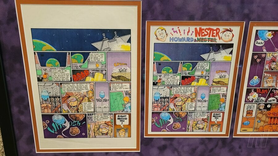
The Howard and Nester work that we have is by Shuji Imai, who was the first Howard and Nester artist. And he was of Japanese origin. Shuji at the time did not read or speak any English, which was interesting because he lettered the English directly onto the pages, which you don’t necessarily see with comic art, especially of that age. Usually, the lettering is done separately, but he lettered the page directly. He basically interpreted those letters artistically…he was drawing them instead of writing them, if that makes sense? It’s an interesting distinction.
There have been about four or five artists who drew Howard and Nester, depending on who you ask, but he was the very first.
I feel like a lot of people might not even know this was real.
I think most of this work, you know, nobody really stopped to think about someone having to create any of it. It’s similar to how, as kids, we didn’t really think about there being a voice actor behind characters that we loved. We just didn’t stop to think that somebody had to create a thing.
I decided I wasn’t gonna try to restore him. I think it would have made it less ‘the thing.’
Most of these, with the exception of the cover for Nintendo Power #1, most of these are made out of polymer clay. It’s bakable clay that then hardens, so that’s why they’re in reasonably good shape, because they last.
Unfortunately, the cover for the first issue was made out of oil clay…it was made by the Will Vilton artists, the people who did the California Raisins and the Moonwalker video, and stuff like that. So, oil clay is made to never dry, and so when the model was unfortunately dropped, instead of shattering like one of these would do, making it repairable, the oil clay just flattened. And you can’t resculpt flattened clay like that.
I see this Mario is missing an ear.
Yeah, that’s just, you know, 35 years. Guy’s had a hard time. Early on I decided I wasn’t gonna try to restore him. I think it would have made it less ‘the thing.’ It doesn’t matter what kind of condition these are in, what matters is that they are ‘the thing.’ And so, I did ask the original artist, who doesn’t want to be named, I asked them if they would be interested in resculpting it themselves, and they declined.
So at that point, I was like, okay, if it isn’t going to be the original artist resculpting him, then I’m not going to bother trying to resculpt him. He can be missing an ear. That’s fine.
You got it directly from the artist?
I did.
Was that process difficult?
Yes, it was. Because with the exception of maybe Dan McGowen and maybe one other artist, none of the artists were credited. They were only credited under the agency name. And oftentimes that agency, Griffith’s Advertising, would also sub-contract other agencies. So it wasn’t necessarily even as easy as finding out who Griffith’s was representing, it was often deeper layers.

The Dr. Wily, the Dr. Mario, the Mario Paint, the Contra, and the Mario 3-Mario were all the same artist.
Did you get all of the 3D pieces at the same time?
The shoes came in separately. I’m not sure who the artist is of the shoes, but the shoes are basically just stickers and glue on a regular pair of Converse high-tops. But the Dr. Mario came in separately because he had fallen behind a bookcase for 25 years.
[laughs]
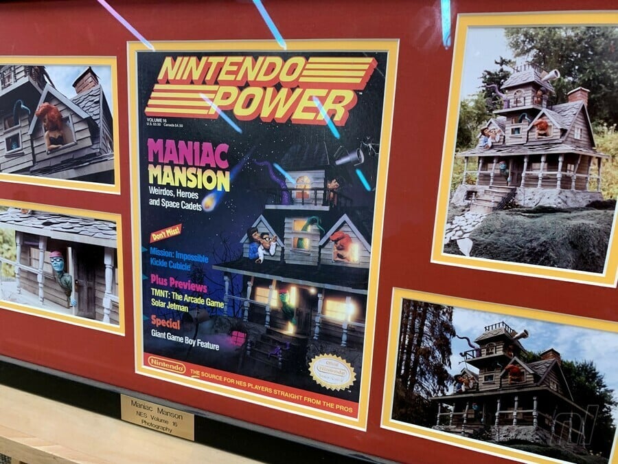
He was rediscovered when they were remodeling their office. When most of this stuff was sculpted…we have photographs of the Maniac Mansion mansion. That mansion was destroyed right after the photographs were done being taken, because it was a 300-pound piece of polymer clay, why would someone keep that? Nintendo wasn’t Nintendo at the time and it was just a job to a lot of these artists. They had no reason to keep it.
[It’s] the same thing with the METAL STORM robot. It’s a Gundam kitbash. At some point, I’d love to sit down with someone who really specializes in 1980s Gundam kits and try to pick apart exactly what went into that model, because I’d love to build one. We just have that one Poloraid of it, and that’s all that’s left.
Have you witnessed any of the creators’ reactions to these pieces?
I sent [Maniac Mansion creator Ron Gilbert] photos of the mansion, because he hadn’t seen it either. Oftentimes, they didn’t view approvals for Nintendo Power, they were just like, “It’s free advertising!” It was very fast and loose back then. So he had never seen the Maniac Mansion mansion that they had done for the cover. The first time that he had seen it was for the photos.
[How did he react?]
Well. [laughs] He was very surprised.
Mario mascot costume
This was built in 1989, first used in 1990. This is the 1989 Mario mascot costume for Nintendo. We have a photo here of him as he was in 1990 at the Nintendo World Championships, and then another photo of how he was re-discovered; the structure of his head had completely collapsed, and he was missing his eyes.
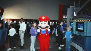
There was a gentleman who found him before us, he was found in a storage locker that hadn’t been paid for, and so it was auctioned off. The same people who built him built all the miniatures, so I already had an existing relationship with them, so I was able to confirm that he was what I thought he was. And they had told me that he was beyond repair, and I was like, “Okay, well we’re gonna try anyway.” [laughs]
The gentleman who found him before us started a restoration and they did some things that probably we might not have chosen to do ourselves, and were kind of irreversible. So we had to finish the work that was started rather than redo the work that was started. He’s probably about 85%, I would say, the way how he looked originally. Originally, he had a plastic skull under him, and now he’s mostly stuffed. He’s basically the difference between a hard plastic doll head and a teddy bear. He’s more teddy bear than plastic doll head.
Do you have fishing lines out? How do people know to reach out to you for these kinds of items?
We make ourselves very findable. The phrase ‘Art of Nintendo Power’ is very good SEO. You type in ‘Nintendo Power art’ into Google and we will sort higher than Nintendo does — that’s not a mistake. Sometimes some things come to us, but we still hunt every day.
Every day?
Every day.
Who is “we”?
Well, mostly me. [laughs] We’re a 501(c)(3) non-profit art museum. And The Art of Nintendo Power is our flagship exhibit…
Contract artists, unless Nintendo paid them extra, they were contractually obligated to return the art to the artists. So like, none of this has been archived by Nintendo, it was all sent back to the artist. (Presumably, sometimes it didn’t happen for whatever reason, because things happen.) So these pieces were not a collection that was maintained by Nintendo at all. So there’s no paper trails, there’s no nothing.
All of the roads that we’re forging, we’re forging them brand new. It’s quite a challenge.
This interview has been lightly edited for clarity.
Many thanks to Stephan. You can follow him on Twitter X @ArtofNP and Instagram, you can see where the Art of Nintendo Power show will be next on their website.

Have you ever seen an original Contra up close? What about an original Mario Kart?
For Stephan Reese, organizer and showrunner for the non-profit Interactive Art Collection (and a Senior Producer at video game developer Bungie when he’s not busy doing that), it’s his life’s mission that you might have the pleasure of seeing pop-culture history outside of the confines of your TV screens and old magazines.
His team’s latest exhibit is the aptly titled “The Art of Nintendo Power,” a traveling art show that most recently exhibited at PAX West 2023 in Seattle. For four days, attendees could walk a room and bask in original Nintendo Power prints, line art, posters, 3D models, and much more. The exhibit features all original art with zero replications, stemming from the earliest points in the history of the 1980s print magazine, which was originally crafted and written for kids, as well as for all of us kid-like adults who now fondly remember its technicolor, off-the-wall pages.
Nintendo Life caught up with Reese at this year’s PAX and asked him to highlight choice pieces from the non-profit’s collection, hoping to gain a little insight into one of the most quintessential eras in retro media…

Stephan Reese: This is a number of panels by an artist named Kev Brockschmidt who’s most notably known for his Magic: The Gathering cards.
A lot of artists who had worked for Nintendo Power were also moonlighting doing other things, either working for the magazine and moonlighting or just contract artists who were also doing many other things. This is actually one of my favorite images of Kirby, this little chubby-cheeks Kirby in the upper right-hand corner of that first frame…I used him for my profile picture for a long time.
Kevin is just an absolutely amazing artist, and they used him for a lot of internal pages for first-party. This is an amazing example of his work.
Alan Lopez for Nintendo Life: Do you have any knowledge if this informed the eventual style guide for Kirby?
It was definitely an earlier depiction. But for Nintendo Power magazine, oftentimes, especially for first-party [games], this was the first time a lot of this had been drawn by hand. I think they did what they could…and he is already pink in these, which I think is interesting. [Editor’s note: Kirby was originally colored white on the cover of his debut game, Kirby’s Dream Land.]

This piece is an example of what is often referred to as ‘blue line.’ These would have been preliminary sketches for the eventual poster. This is Bill Morrison’s work, despite the fact that it says ‘Matt Groening’ on the finished product. That was common with Simpsons stuff; Matt would put his name on anything Simpsons, but almost all of the commercial work for The Simpsons, be it t-shirts, board games, advertisements, almost all of it was Bill Morrison’s work. These were purchased directly from Bill.
That method [of obtaining pieces] is common for us. Almost nothing [in the exhibit] was bought through auctions. Almost all of it is working directly with the artist’s estate, or sometimes, very seldomly, private collectors. I just knew, already, offhand, that Bill Morrison draws almost everything product-related for The Simpsons, so I just went to Bill Morrison and showed him this piece and asked him if he had it, and he had the blue lines.
Does this stuff get shared very frequently, stuff from The Simpsons?
No.
How does that make you feel?
I mean, it’s great! The whole mission is to share the work. This show in particular has been very validating for us. It’s very clear that people care about the work.

So this is a piece by Lee MacLeod. Actually, The Lost Vikings, the Demon’s Crest, and the Super C pieces here are all Lee MacLeod.
Super C in particular is a paint-over of a photograph. So underneath the paint is a photo of those two gentlemen holding guns and then he painted in, of course, the rest of the mountains, and the helicopter. So yes, it’s a paint-over of a photograph.
In fact, the painting is so exact, that I was able to find one of the actor’s Facebook profiles just by doing a Google image search with the painting.

These were the pencils that were used for the stencil for the final. The way that airbrush art works — and most of these covers are acrylic airbrush — it starts as a pencil sketch like this, and then it’s used to make a stencil out of a material called frisket tape. And then at that point, it’s basically paint-by-numbers. You peel off a piece of tape, you paint it, you put it back down, you peel off a piece of tape, you paint it, you put it back down…

And so that’s why these pencils, unlike the Itchy and Scratchy piece, you can clearly tell the difference between the sketch, and the final. They look different. [But] these pencils on the Star Fox are identical line for line to the finished painting because these lines were used to make the stencil for the final work.
Who made this?
David Harto. Almost all the covers came from U.S. artists. The covers and the posters are almost exclusively U.S. artists.
Do you have any insight on the back-and-forth between the Japanese creators and Nintendo Power?
Early on it was Gail Tilden and Howard Phillips flying to Japan once a month to work on the magazine with the Japanese team, both were members of a publishing company called Tokuma Shoten and Work House Japan. And then, over the years, they established Work House U.S. as a U.S. company, so it became kind of a hybrid.
There were almost always Japanese artists working on the magazine to some extent, but it did become more of a hybrid situation.
This is also another David Harto, [and] he also did the Darkwing Duck right next to it.
Between the two pieces you can sort of see the entire [creation] process, where Dave would have done the ink lines, printed those on a piece of acetate, and used airbrush to do the colors underneath.
These lines on Mario Kart are much thicker, yeah.
So the Mario Kart, that’s the lines that would be printed on the acetate. On the Darkwing, you can see where he’s printed those lines on a piece of plastic and then painted in the background.
Nintendo Power envelopes and letters

How did you obtain these envelopes?
These are all children’s envelopes that they would have drawn on and mailed in.
These came from an ex-Nintendo employee who had taken them off the wall in the call center. The original Redmond building was bulldozed in 2010, and when they were gonna bulldoze that, this employee came in and just took some art off the wall, and then years later connected with me.
We have about 125 pieces of envelope art, altogether. They’re very expensive to frame in a frame like that [laughs]. So it takes some time. But we’re really happy to have what we have. It’s just tough. It’s great that we saved so many, but at the same time, there’s tens, and tens, and tens of thousands that we didn’t save.
Did you ever submit any?
I did not! No. I didn’t write Nintendo at all. I called the Nintendo gameplay counselors once, for Mega Man 2.

This is the work of Dan McGowan. He was an incredible artist. Basically, most of the covers [at the exhibit] were either painted by Dan McGowan or David Harto. But Dan is no longer with us, he passed away about a decade ago from cancer. But we worked with his estate to be able to save a number of his paintings.
What I love about this piece in particular is that it really shows really bold talent on behalf of Dan in that, it’s painted to scale, or very close to scale. If you notice, a lot of these paintings are painted much larger than the covers, and that is, honestly, to be able to easily fix mistakes in the event that there are mistakes. And so when I see a painting that’s painted basically the size of the cover, it really shows bold talent.
It looks indistinguishable from a typical Disney depiction of Mickey.
Yeah, I worked for Disney Interactive for years, and before I had any of these Disney covers I thought, ‘I should be able to find these!’ And so I looked for them, and it turns out none of them were painted by official Disney artists. Dan McGowan also painted the [Road Runner] cover [in the exhibit], and he was not a Warner Bros. artist either. Nintendo just got really talented contract artists.
Nintendo Power “Top” lists

All of this work is painted by an artist named Orange Nakamura. This is some of the Japanese origin art in the room. He painted under a pseudonym, so we don’t know who he is. “Orange” is definitely not his first name. [laughs]

So this iconic Nintendo Power art style…is anonymous?
Well, he wasn’t [fully] anonymous at the time. If you look at Japanese credits in the magazine, most of them did paint under pseudonyms, not using their real names.
Why?
Just a cultural thing. There may be a little bit of the fact that they were artists working for Tokuma Shoten, a very established manga company. So, you would have people like Shotaro Ishinomori who created Super Sentai, [he] was the artist who drew The Legend of Zelda: A Link to the Past comic for Nintendo Power. Katsuya Terada was another one, an absolutely prolific artist who was ‘slumming it’ in Nintendo Power. There may have been a little been of that, I’m not sure. But mostly it was a cultural thing. A lot of Japanese artists just painted under pseudonyms.
What is your opinion on their art direction?
I love that, I mean, not that there wasn’t art direction, there absolutely was…but it was so varied from page to page. It made the publication feel like it was something that me and my friends could have made. I think that added to the charm of the magazine on the whole. And I love how Orange Nakamura’s work in particular really kind of bound all of the issues together, made it feel like a more coherent product.
It reminds me very much of EarthBound in that it was a Japanese artist’s interpreting American culture, and so these were the most American kids ever. It’s really incredible work, and we’re so lucky to have them because Japanese art is just so difficult to source.
Howard and Nester

The Howard and Nester work that we have is by Shuji Imai, who was the first Howard and Nester artist. And he was of Japanese origin. Shuji at the time did not read or speak any English, which was interesting because he lettered the English directly onto the pages, which you don’t necessarily see with comic art, especially of that age. Usually, the lettering is done separately, but he lettered the page directly. He basically interpreted those letters artistically…he was drawing them instead of writing them, if that makes sense? It’s an interesting distinction.
There have been about four or five artists who drew Howard and Nester, depending on who you ask, but he was the very first.
I feel like a lot of people might not even know this was real.
I think most of this work, you know, nobody really stopped to think about someone having to create any of it. It’s similar to how, as kids, we didn’t really think about there being a voice actor behind characters that we loved. We just didn’t stop to think that somebody had to create a thing.
I decided I wasn’t gonna try to restore him. I think it would have made it less ‘the thing.’
Most of these, with the exception of the cover for Nintendo Power #1, most of these are made out of polymer clay. It’s bakable clay that then hardens, so that’s why they’re in reasonably good shape, because they last.
Unfortunately, the cover for the first issue was made out of oil clay…it was made by the Will Vilton artists, the people who did the California Raisins and the Moonwalker video, and stuff like that. So, oil clay is made to never dry, and so when the model was unfortunately dropped, instead of shattering like one of these would do, making it repairable, the oil clay just flattened. And you can’t resculpt flattened clay like that.
I see this Mario is missing an ear.
Yeah, that’s just, you know, 35 years. Guy’s had a hard time. Early on I decided I wasn’t gonna try to restore him. I think it would have made it less ‘the thing.’ It doesn’t matter what kind of condition these are in, what matters is that they are ‘the thing.’ And so, I did ask the original artist, who doesn’t want to be named, I asked them if they would be interested in resculpting it themselves, and they declined.
So at that point, I was like, okay, if it isn’t going to be the original artist resculpting him, then I’m not going to bother trying to resculpt him. He can be missing an ear. That’s fine.
You got it directly from the artist?
I did.
Was that process difficult?
Yes, it was. Because with the exception of maybe Dan McGowen and maybe one other artist, none of the artists were credited. They were only credited under the agency name. And oftentimes that agency, Griffith’s Advertising, would also sub-contract other agencies. So it wasn’t necessarily even as easy as finding out who Griffith’s was representing, it was often deeper layers.

The Dr. Wily, the Dr. Mario, the Mario Paint, the Contra, and the Mario 3-Mario were all the same artist.
Did you get all of the 3D pieces at the same time?
The shoes came in separately. I’m not sure who the artist is of the shoes, but the shoes are basically just stickers and glue on a regular pair of Converse high-tops. But the Dr. Mario came in separately because he had fallen behind a bookcase for 25 years.
[laughs]
He was rediscovered when they were remodeling their office. When most of this stuff was sculpted…we have photographs of the Maniac Mansion mansion. That mansion was destroyed right after the photographs were done being taken, because it was a 300-pound piece of polymer clay, why would someone keep that? Nintendo wasn’t Nintendo at the time and it was just a job to a lot of these artists. They had no reason to keep it.
[It’s] the same thing with the METAL STORM robot. It’s a Gundam kitbash. At some point, I’d love to sit down with someone who really specializes in 1980s Gundam kits and try to pick apart exactly what went into that model, because I’d love to build one. We just have that one Poloraid of it, and that’s all that’s left.

Have you witnessed any of the creators’ reactions to these pieces?
I sent [Maniac Mansion creator Ron Gilbert] photos of the mansion, because he hadn’t seen it either. Oftentimes, they didn’t view approvals for Nintendo Power, they were just like, “It’s free advertising!” It was very fast and loose back then. So he had never seen the Maniac Mansion mansion that they had done for the cover. The first time that he had seen it was for the photos.
[How did he react?]
Well. [laughs] He was very surprised.
Mario mascot costume
This was built in 1989, first used in 1990. This is the 1989 Mario mascot costume for Nintendo. We have a photo here of him as he was in 1990 at the Nintendo World Championships, and then another photo of how he was re-discovered; the structure of his head had completely collapsed, and he was missing his eyes.

There was a gentleman who found him before us, he was found in a storage locker that hadn’t been paid for, and so it was auctioned off. The same people who built him built all the miniatures, so I already had an existing relationship with them, so I was able to confirm that he was what I thought he was. And they had told me that he was beyond repair, and I was like, “Okay, well we’re gonna try anyway.” [laughs]
The gentleman who found him before us started a restoration and they did some things that probably we might not have chosen to do ourselves, and were kind of irreversible. So we had to finish the work that was started rather than redo the work that was started. He’s probably about 85%, I would say, the way how he looked originally. Originally, he had a plastic skull under him, and now he’s mostly stuffed. He’s basically the difference between a hard plastic doll head and a teddy bear. He’s more teddy bear than plastic doll head.
Do you have fishing lines out? How do people know to reach out to you for these kinds of items?
We make ourselves very findable. The phrase ‘Art of Nintendo Power’ is very good SEO. You type in ‘Nintendo Power art’ into Google and we will sort higher than Nintendo does — that’s not a mistake. Sometimes some things come to us, but we still hunt every day.
Every day?
Every day.
Who is “we”?
Well, mostly me. [laughs] We’re a 501(c)(3) non-profit art museum. And The Art of Nintendo Power is our flagship exhibit…
Contract artists, unless Nintendo paid them extra, they were contractually obligated to return the art to the artists. So like, none of this has been archived by Nintendo, it was all sent back to the artist. (Presumably, sometimes it didn’t happen for whatever reason, because things happen.) So these pieces were not a collection that was maintained by Nintendo at all. So there’s no paper trails, there’s no nothing.
All of the roads that we’re forging, we’re forging them brand new. It’s quite a challenge.

This interview has been lightly edited for clarity.
Many thanks to Stephan. You can follow him on Twitter X @ArtofNP and Instagram, you can see where the Art of Nintendo Power show will be next on their website.

