Has it sunk in yet that almost every single mainline Final Fantasy game between I and XII is now available on the Switch? That’s thanks to this week’s release of the Final Fantasy Pixel Remaster series, which was long, long overdue.
Back when the games launched on Steam and mobile between 2021 and 2022, lots of people were happy that the classic six Final Fantasy games were finally being made more accessible. But there was one big talking point that swept across the world when it came to the Pixel Remasters — the font.
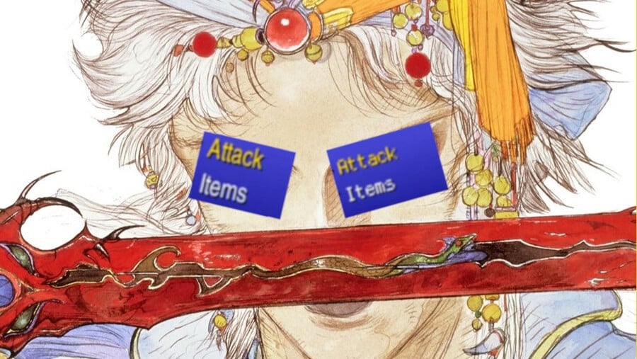
The font in the original Pixel Remaster releases was not popular, at least in the west. To many, it clashed with the retro pixel art visuals, and the thin, sterile style isn’t the most pleasant on the eyes when playing on a PC screen.
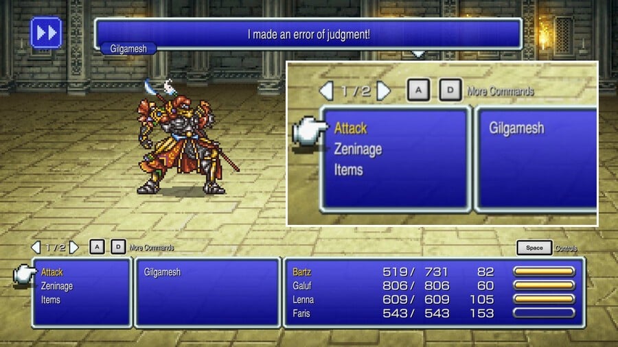
Fans took to creating mods to “fix” the font, using variations from Final Fantasy I & II: Dawn of Souls on GBA to Final Fantasy: Mystic Quest’s chunky pixel typeface. Various guides, including this one from RPG Site, detailed the many ways you could get a “better” font and improve your experience with these classics.
It soon became apparent, however, that Japan didn’t have the same issue. While not sporting a pixel-style font, the Japanese font was much cleaner, a bit thicker, and — most importantly — was much easier to read.
When Square Enix announced the console versions last year (in the middle of the night, mind you…), fans were hopeful that the gap between the games’ releases on PC and consoles would give Square enough time to “fix” that font for good. And, luckily, the developer delivered.
Alongside a host of other additions like an interchangeable soundtrack and EXP, gil, and ability point modifiers, the console versions of the Pixel Remasters let you change between the original PC font, called ‘Modernized’, and a new ‘Classic’ font, which is pixel-based. You can swap between these in the menu at any point in all six games.

Has it sunk in yet that almost every single mainline Final Fantasy game between I and XII is now available on the Switch? That’s thanks to this week’s release of the Final Fantasy Pixel Remaster series, which was long, long overdue.
Back when the games launched on Steam and mobile between 2021 and 2022, lots of people were happy that the classic six Final Fantasy games were finally being made more accessible. But there was one big talking point that swept across the world when it came to the Pixel Remasters — the font.
The font in the original Pixel Remaster releases was not popular, at least in the west. To many, it clashed with the retro pixel art visuals, and the thin, sterile style isn’t the most pleasant on the eyes when playing on a PC screen.

Fans took to creating mods to “fix” the font, using variations from Final Fantasy I & II: Dawn of Souls on GBA to Final Fantasy: Mystic Quest’s chunky pixel typeface. Various guides, including this one from RPG Site, detailed the many ways you could get a “better” font and improve your experience with these classics.
It soon became apparent, however, that Japan didn’t have the same issue. While not sporting a pixel-style font, the Japanese font was much cleaner, a bit thicker, and — most importantly — was much easier to read.
After playing the game in English, I switched it to Japanese and my party members’ names stayed in English. This is what the English font looks like when played in Japanese!
Final Fantasy IV Pixel Remaster pic.twitter.com/0NA6MKZ0UM
— Toshi とし@ドラクエ10 (@RetroToshi) October 25, 2021
When Square Enix announced the console versions last year (in the middle of the night, mind you…), fans were hopeful that the gap between the games’ releases on PC and consoles would give Square enough time to “fix” that font for good. And, luckily, the developer delivered.
Alongside a host of other additions like an interchangeable soundtrack and EXP, gil, and ability point modifiers, the console versions of the Pixel Remasters let you change between the original PC font, called ‘Modernized’, and a new ‘Classic’ font, which is pixel-based. You can swap between these in the menu at any point in all six games.
Here’s a comparison between the two different types from Final Fantasy III:

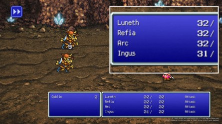


The Japanese version has also received the same retro love and has its own version of the pixel font, which looks pretty close to our own.
These look the same across all six games, and while some are happy that a new option has been added to these remasters, others still don’t think it’s enough. The pixel font is admittedly still rather thin, particularly in battle and on certain commands, and many are just more nostalgic for that chunky SNES font.
We can make our own judgements about the font, of course, but we want to hear what you think so far. Have you had a chance to play the Pixel Remasters on Switch? Do you think the ‘Classic’ font is an improvement over the original? Vote in our poll below and let us know what you think in the comments.
- Related Games


