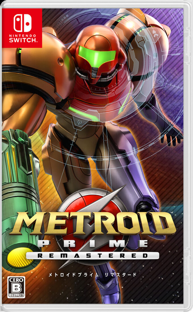
Be sure to cast your votes in the poll below; but first, let’s check out the box art designs themselves.
Europe / North America

This is the box art that we were always expecting for a Metroid Prime remaster. Why? Well, because it’s practically identical to the original GameCube design only, uh, remastered.
Of course, this isn’t to the detriment of the overall design. Samus still stands there looking cool as heck, and the extra shine on her armour thanks to the improved visuals is enough to send a shiver of excitement up our spines.
Japan

Now this is something a little more dynamic! Yeah, Samus has every right to be standing proud, surveying the space corridor of her choosing; but this is a series all about action, and the Japanese cover does a much better job of conveying that.
Itself a remaster of the original’s Japanese cover, this one similarly nods to the game gone by while showing off some of that remastered flare. From Samus’ running pose to the Visor filter over her helmet, this is selling a different kind of game. Less epic, sure, but more action-based.
Thanks for voting! We’ll see you next time for another round of the Box Art Brawl.


