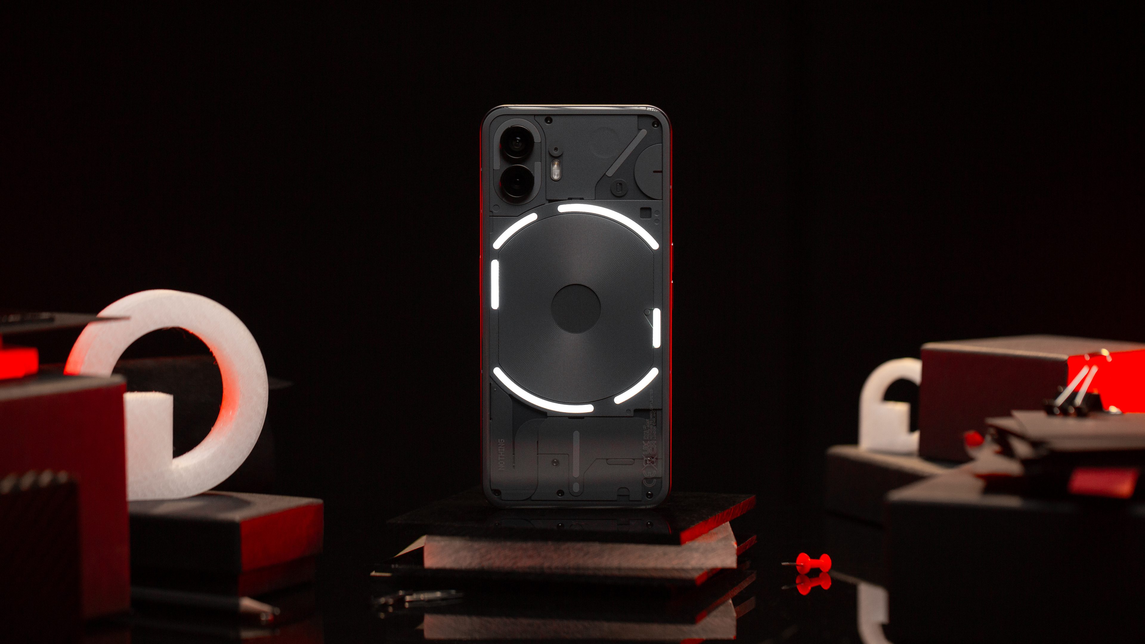
The Nothing Phone (2) has just been released, and I’ve already had a chance to check out Carl Pei’s pseudo-flagship. The smartphone marks a step-up in the market with a more powerful SoC, but will also come with an accompanying increase in price, starting at $599. Find out what my first impressions of the Nothing Phone (2) were in this hands-on.
The Nothing Phone (2) in a nutshell
The Nothing Phone (2) has been officially unveiled on July 11, 2023, with it going on sale officially a couple of days later on July 13. The smartphone will arrive in two colors: black and white, just like before. It also comes in three configurations: 8 GB/128 GB for $599; the other two are 12/256 GB and 12/512 GB, and will be priced at $699 and $799, respectively.
The Nothing Phone (2) has every intent of occupying a more premium space than its predecessor, the Nothing Phone (1) (review). The manufacturer included a more powerful SoC in the form of the Snapdragon 8+ Gen 1. However, many of the components listed in the technical specifications remained the same, at least in terms of how they look.
Is the Nothing Phone (2) a genuine Android flagship? How does it stack up against rivals like the Samsung Galaxy S23, Google Pixel 7, and iPhone 14? I will shed some light on those questions in this first review of the Nothing Phone (2).
TL;DR: Please note that for this hands-on, I wasn’t allowed to share photos/videos taken of the smartphone, nor run any performance and battery life benchmark scores. All these elements will be included in the full review that will be released later this week.
Design & display
The design of the Nothing Phone (2) has not evolved much from that of the Nothing Phone (1).
Pros:
- Corning Gorilla Glass 5 in front and at the back rear.
- Aluminum chassis.
- Flat display.
- Stereo speakers.
- OLED LTPO display at 120 Hz refresh rate.
- Maximum brightness of 1,600 nits.
Cons:
- IP54 certification only.
- No design improvement.
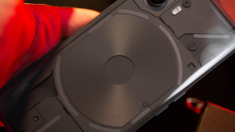
The Nothing Phone (2) essentially carries the same design as the Nothing Phone (1). I guess you can safely say that Nothing did not try too hard to change it, but one cannot help but wonder just how else the manufacturer could have tweaked the design.
I still love the transparent look. The smartphone is protected by Corning Gorilla Glass 5 in front and at the back. The Nothing Phone (2)’s chassis is made of recycled aluminum for that added elegance.
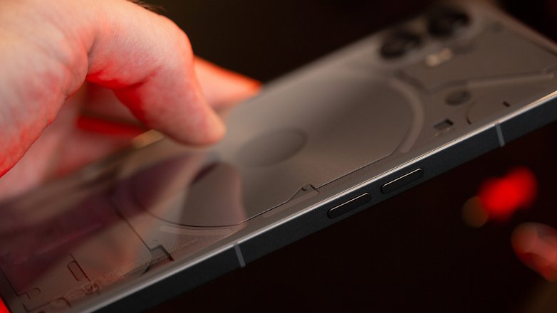
The smartphone is slightly thinner than its predecessor with a slightly more rounded back accompanied by a hint of curved edges. This design evoked the impression of having a transparent shell. I preferred the flat side of the Nothing Phone (1) because it felt like a showcase of sorts when viewed from behind, letting you see the different components used within.
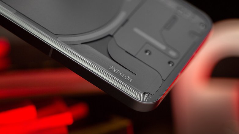
This slightly more rounded back also carries a more premium and mature look. Nothing claimed to have increased the detail resolution of each visible component while reducing the “empty” spaces between each of them. Honestly, no one will actually notice these details unless they hold up a magnifying glass.
The Nothing Phone (2) has a 6.7-inch OLED panel at 2412 x 1080p resolution. It incorporates LTPO technology, allowing you to vary the refresh rate between 1 and 120 Hz, depending on the scenario.
With a maximum brightness is 1,600 nits, you should not have any issues using it under bright sunlight. In reality, it will surely be less than the number stated. I have a small regret of how the Nothing Phone (1) is only IP54 certified for water and dust resistance. A true flagship should be IP67 or even IP68 certified at the very least.
The Glyph interface
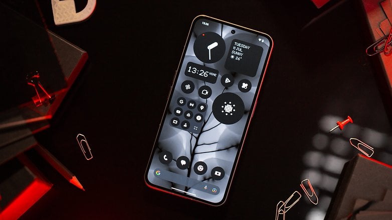
The Nothing Phone (2) still features the famous Glyph interface, sporting LEDs at the back that create different visual notifications.
The manufacturer reduced the number of components for this interface this round, offering more combinations of sounds and animations instead.
However, the primary new feature is the ability to create your own Glyphs. It makes you wonder why Nothing didn’t offer this from the beginning on the Nothing Phone (1).
With the Glyph Composer function, you can create your own patterns. You can choose from five types of sound, with each offering five types of rhythm and key variations.
You then have ten seconds to record your composition live. You can combine this composition with a corresponding light animation associated with said Glyph, connecting it to a contact or application.
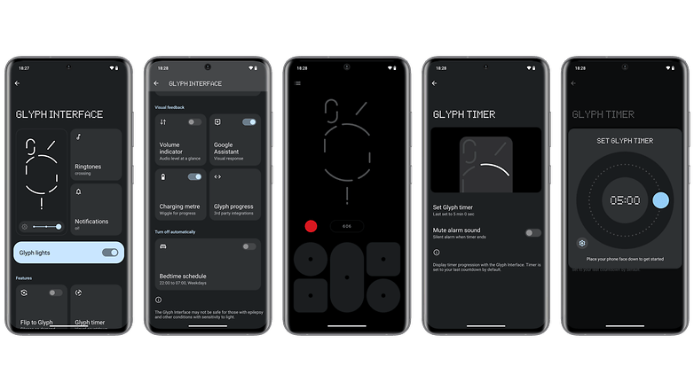
It is silly but brilliant at the same time. I spent an hour during my review trying to reproduce the opening notes of Mario’s theme song. You need to understand the different variations of each type of sound in order to combine them effectively.
Personally, I love the concept of gamifying a simple setting in the parameters. It all sounds very silly, but it added an enormous amount of depth to the user experience. Apart from that, it is just plain fun. My only regret is that I cannot combine different types of sound at the moment.
Another interesting new feature is how Nothing will be offering a new pack of ringtones and animations every quarter in collaboration with artists. The first pack was produced by Swedish House Mafia. Every three months, a new pack will be launched. I think that is an excellent idea on paper, especially when these packs will be added to the Glyph Composer, allowing you to bring more variation to your creations.
Interface/OS
The Nothing Phone (2) is powered by Nothing OS 2.0, which is a skin based on Android 13.
Nothing guarantees up to three major Android updates and four years of security updates.
Pros:
- 3 major Android upgrades and 4 years of security updates.
- New, more comprehensive widgets.
- More extensive Nothing theme than ever before.
- No bloatware included.
Cons:
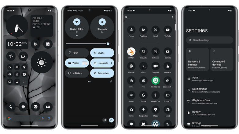
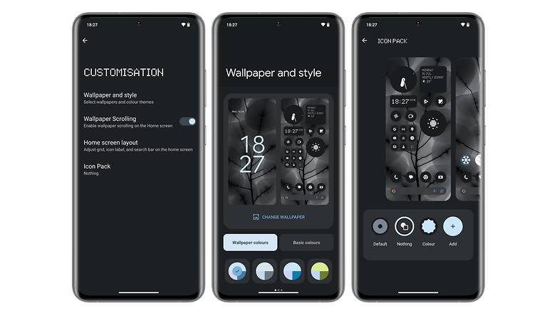
Nothing has gone to a little more trouble this year to offer a more themed-centric interface that is in line with the brand’s design language. The Nothing theme is applied to the entire interface and to application icons (with the exception of a few third-party applications).
Nothing also included the full range of Android 13 customization options, with dynamic themes that apply the dominant background color to the entire interface.
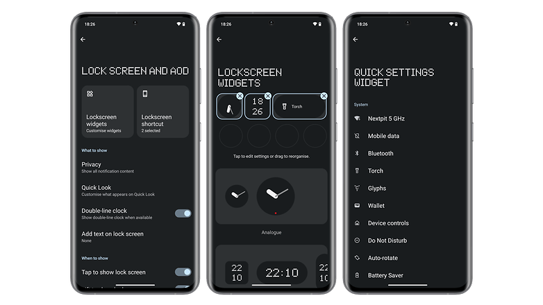
There are also additional widgets that can be added to the lock screen. Visually, I think they look great. Some widgets even feature new animations to display more information.
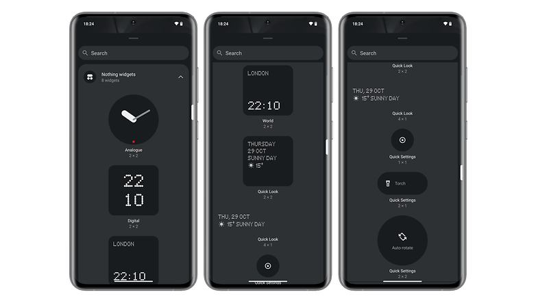
With the weather application, you can swipe the widget to display the current temperature and the max/min forecast for the day, for instance. Of course, you can adjust the widget size, with the giant application icons being there still.
I had no stability issues during my review, and my model has the June security patch installed at the time of writing.
Performance
The Nothing Phone (2) features Qualcomm’s Snapdragon 8+ Gen 1 SoC underneath the hood. This is a far more powerful chip than the Nothing Phone (1)’s Snapdragon 778G+.
Unfortunately, I’m not at liberty to comment anything about the Nothing Phone (2)’s performance in this review, nor am I allowed to share with you the benchmark scores I ran. You’ll have to wait for my full review to find out more.
Just take note that we can obviously expect it to deliver a better performance than the Nothing Phone (1), but that is the bare minimum considering the price hike.
The real challenge, then, lies in how well it controls the temperature control and throttling, if any.
Camera performance
The Nothing Phone (2) continues to offer a dual camera module but lacks a telephoto lens.
There’s a 50 MP main lens and a 50 MP ultra-wide angle lens. The selfie camera is a 32 MP resolution shooter.
Again, I am not allowed to share any photos or videos taken with the Nothing Phone (2) at the moment. We will also have to wait for my full review to find out more about the smartphone’s camera performance.
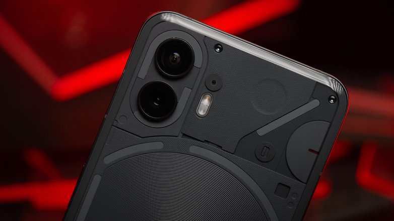
In my opinion, Nothing should have integrated a dedicated telephoto lens into its camera module. The Nothing Phone (2) is supposed to be a flagship device, and considering how it is more expensive than its predecessor, the camera module should reflect a more upmarket sensor.
The primary 50 MP lens is based on a Sony IMX890 sensor with optical stabilization (OIS) and features an f/1.88 aperture. The ultra-wide angle lens incorporates a Samsung JN1 sensor and offers an f/2.2 aperture with a 114° field of view.
Behind the 32 MP selfie lens is a Sony IMX615 sensor with an f/2.45 aperture. Finally, the Nothing Phone (2) can film in 4K at 60 FPS with the two lenses on the back. The selfie camera is locked at 1080p at 60 FPS.
Battery life & charging speed
The Nothing Phone (2) boasts a 4,700 mAh battery, which is 200 mAh more than the Nothing Phone (1).
It still accepts 45W wired charging, 15W wireless charging, and 5W reverse wireless charging.
As you may have guessed, I’m not at liberty to divulge the scores of our battery life benchmark, nor to share my impressions of the Nothing Phone (2)’s battery life for now.
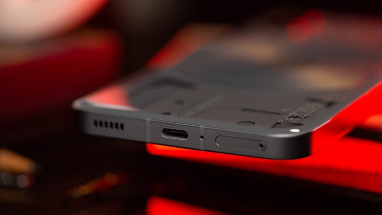
I applaud the fact that Nothing increased its battery charge capacity compared to its previous model. I’ve been using the Nothing Phone (1) as a daily driver for almost a year now, and I’ve never found the battery life to be wanting in any way. I’ll let you know in my full review whether this is also the case with the Nothing Phone (2).
I find that Nothing could have offered a slightly faster recharge though. However, I’m glad to see reverse wireless charging featured here, letting me charge my Nothing Ear (2) (review) via the back of the phone.
Technical specifications
| Nothing Phone (2)—Technical specifications | |
|---|---|
| Photo |  |
| Screen | OLED 6.7 ” | LTPO | 2412 x 1080 p | 120 Hz | 1600 nits |
| Dimensions & weight | 162.1 × 76.4 × 8.6 mm | 201.2 g |
| Colors | White, black |
| SoC | Qualcomm Snapdragon 8+ Gen 1 |
| Memory | 12 GB RAM 128/256 GB storage |
| OS | Nothing OS 2.0 based on Android 13 |
| microSD | ❌ |
| Dual SIM | ✔️ |
| eSIM | ✔️ |
| Photo module | Main lens: 50 MP | f/1.88 | OIS Ultra-wide angle: 50 MP | f/2.2 | FOV 114 |
| Selfie lens | 32 MP | f/2.45 |
| Audio | 2 stereo speakers No 3.5 mm jack |
| Battery | 4700 mAh |
| Charging | Wired: 45 W | Wireless: 15 W | Reverse wireless: 5 W |
| IP certification | IP54 |
| Connectivity | Wi-Fi 6 | Wi-Fi Direct | Bluetooth 5.3 | NFC |
Conclusion
My first impressions of the Nothing Phone (2) are quite positive. I can’t wait to tell you more about the performance gains thanks to the Snapdragon 8+ Gen 1 SoC, its camera performance, and battery life.
The upmarket move can also be felt in many ways. Nothing OS 2.0 is also fast becoming one of my favorite Android skins, but I also felt that the manufacturer did not take the plunge to shake it up more in terms of design and camera hardware.
The Nothing Phone (2) is also a couple of Benjamins more expensive than the Nothing Phone (1), so this premium leaves less wiggle room for error. In my full review, I’ll tell you whether the new model is really worth it or not.
Nothing Phone (2)
To device database


