How quickly time flies! It has already been four years since we made the big step from AndroidPIT to NextPit (and from now on, it will be nextpit; see below). It is not just about the insolvency of Fonpit AG, but also the fact that “smartphones” as a topic has become less and less exciting for more and more people.
It should be about more than just phones: smart homes, personal mobility vehicles, wearables, headphones, and the works! In other words, lifestyle tech. Actually, no stone has been left unturned since then. The design of the nextpit homepage has fundamentally changed, and we have worked a lot on our content and maintaining it. However, the logo has remained the same. This will change as well now—alongside many other things as well.
Minor optical changes and a new logo
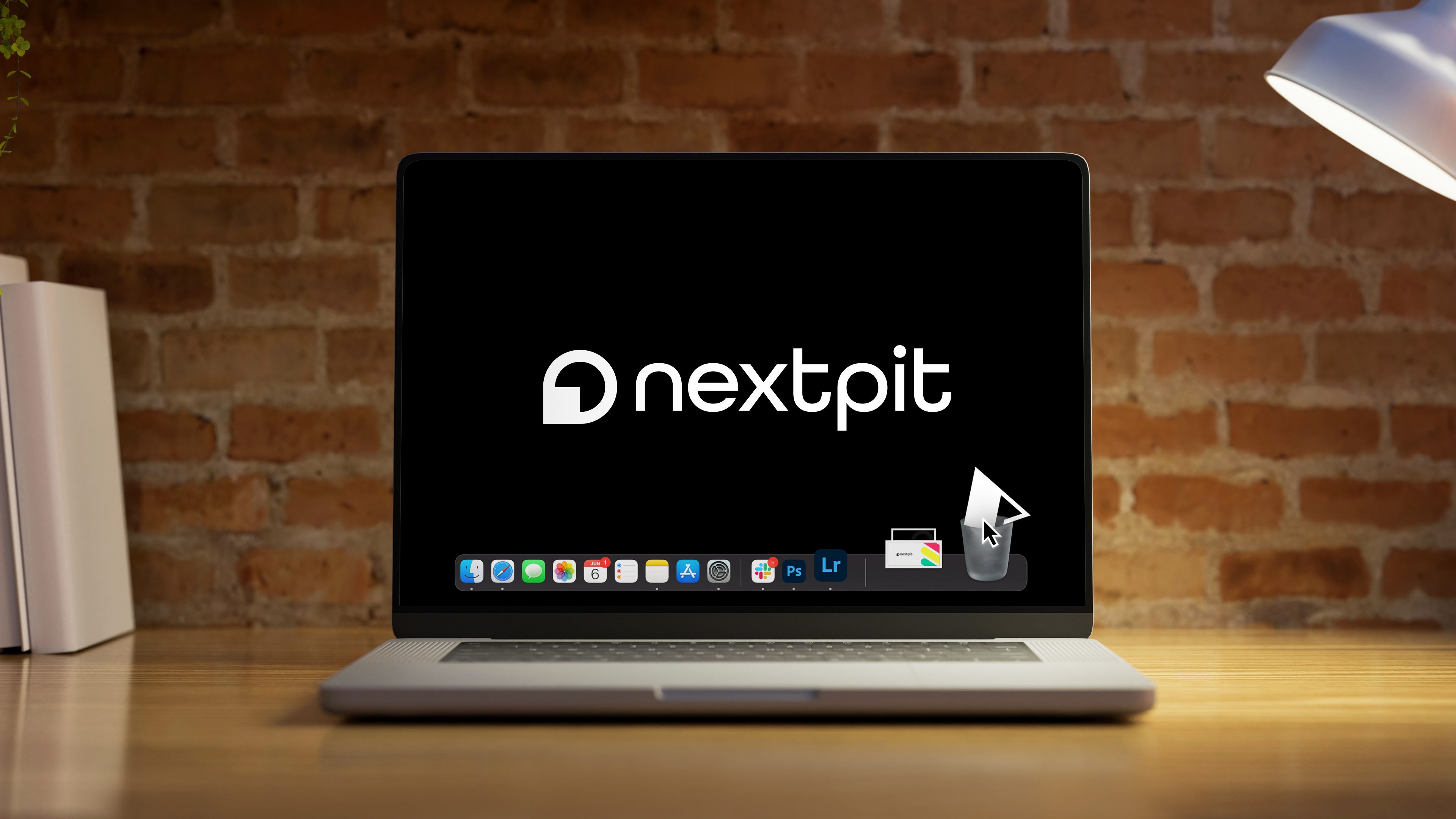
Maybe you have not noticed it yet, but the brand-new look of nextpit was launched today. Apart from a new navigation bar and some color adjustments in our submenus, the biggest visual change is the new logo. After all, a brand-new logo is long overdue for us. The old A with a P in it is still a relic of days gone by, and there hasn’t been time to adapt it for a long time since.
The time has now come. For a long while, we had been discussing internally about our orientation, our goals, and also about what we want to stand for. During the process, an important aspect arose time and again, for which we have had far too little time in the last few years, but which we are still very proud of: Our community!
The logo should also symbolize this. The circle is a symbol of the community, the square forms a kind of play button out of it — and somehow it also doubles up as a speech bubble. It is forward-looking while symbolizing the multimedia approach of our content.
May we introduce the “Engagement Button”?
Of course, a logo doesn’t help in bringing our readers together and forming a community. Here at nextpit, we want users to be able to exchange ideas. A first baby step would be the new button that we have internally christened as the engagement button. The “lightning bolt” is available in both desktop and mobile views. Clicking it opens a bar and reveals additional options for the user. In addition to a “Share” function and the option to find a suitable deal for the product being discussed, there is also the option to leave comments directly.
Before a wave of resistance sweeps us off our feet: this is just a tiny small step towards a more cohesive community. However, there are already a few more points and functions at nextpit (by the way, we’ll be writing in lower case from now on) that are specially meant for you, dear community — and hopefully have a stimulating effect.
Read for free and completely ad-free at nextpit—without any adblocker!
Maybe you were not aware about this yet. nextpit can actually be read “legally” without any pesky advertising banners popping up. Starting from a community level (these are the numbers that you see under the profile pictures) of 30, all advertising banners will automatically disappear.
How do you achieve level 30? OK, admittedly this only works if you are a regular commenter, log in often, and above all, receive many “thanks” from other users. This is easily achievable though, so fret not. Therefore, write along, gain plenty of “thanks” — and receive lots of love from us.
The nextpit forum: Not everything, but still some things are new in June
The heart, soul, and something like liver and kidney (yes, I know that sounds not as nice as the first two terms) of our community is, of course, the nextpit forum. A lot of effort couldn’t be invested over the last few years due to a lack of resources. It has also aged over the years in many areas. This is not only due to technology, which we cannot do miracles with right now. Above all, the structure no longer reflects what nextpit actually stands for and wants to stand for.
Today we have begun to change the structure, close orphaned subforums, and to add new categories. This process will take a few more days. By then, we want to give all threads a new home and the nextpit community will have a clear picture of where the forum journey is headed.
Please join us, comment, ask questions, or help others! That would be great ❤️.
…is that all?
Don’t worry, dear critics—if there should be any now with the new look. We are serious and we have a clear plan. There will be plenty of new features coming, arriving step by step to breathe life to the site. None of it is easy and none of it will happen overnight. However, we will do our best. This is the least we promise!
Please remain in touch with us and thank you, dear nextpit community, for being there.

