It’s been often said that Thunderbird, despite having active support for years, has remained a little… Stagnant. The app still looks a lot like the email client that became popular in the 2000s, which isn’t a great thing. Luckily, things are slowly changing — starting with a new logo.
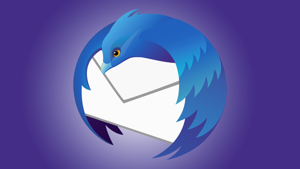
Thunderbird has announced a new visual identity with a new, modernized logo that’s more in line with the modern logo currently used by Mozilla Firefox. It still depicts a bird holding a letter, but it’s stylized very similarly to the Firefox logo. The last logo redesign was in 2018, with the release of Thunderbird 60.
The new logo was designed by Jon Hicks, the designer who made the original logos for both Firefox and Thunderbird, so it’s no surprise that it follows the same overall aesthetic.

The Thunderbird team says that you should begin seeing this logo starting with Thunderbird 115, due for release later this summer, and the new logo should also land on the official website and social media accounts gradually. The Mac and iPhone apps (yes, an iOS version is in the works) will have a white background around the logo to match Apple’s design guidelines, and Android devices will have an optional adaptive version that can change color.
With this logo, Thunderbird wants to signal that big changes are coming to the email client, with a refreshed visual identity being just the start of many of those changes. It’s something the team has been signaling for months and has been slowly fulfilling.
Source: Thunderbird


