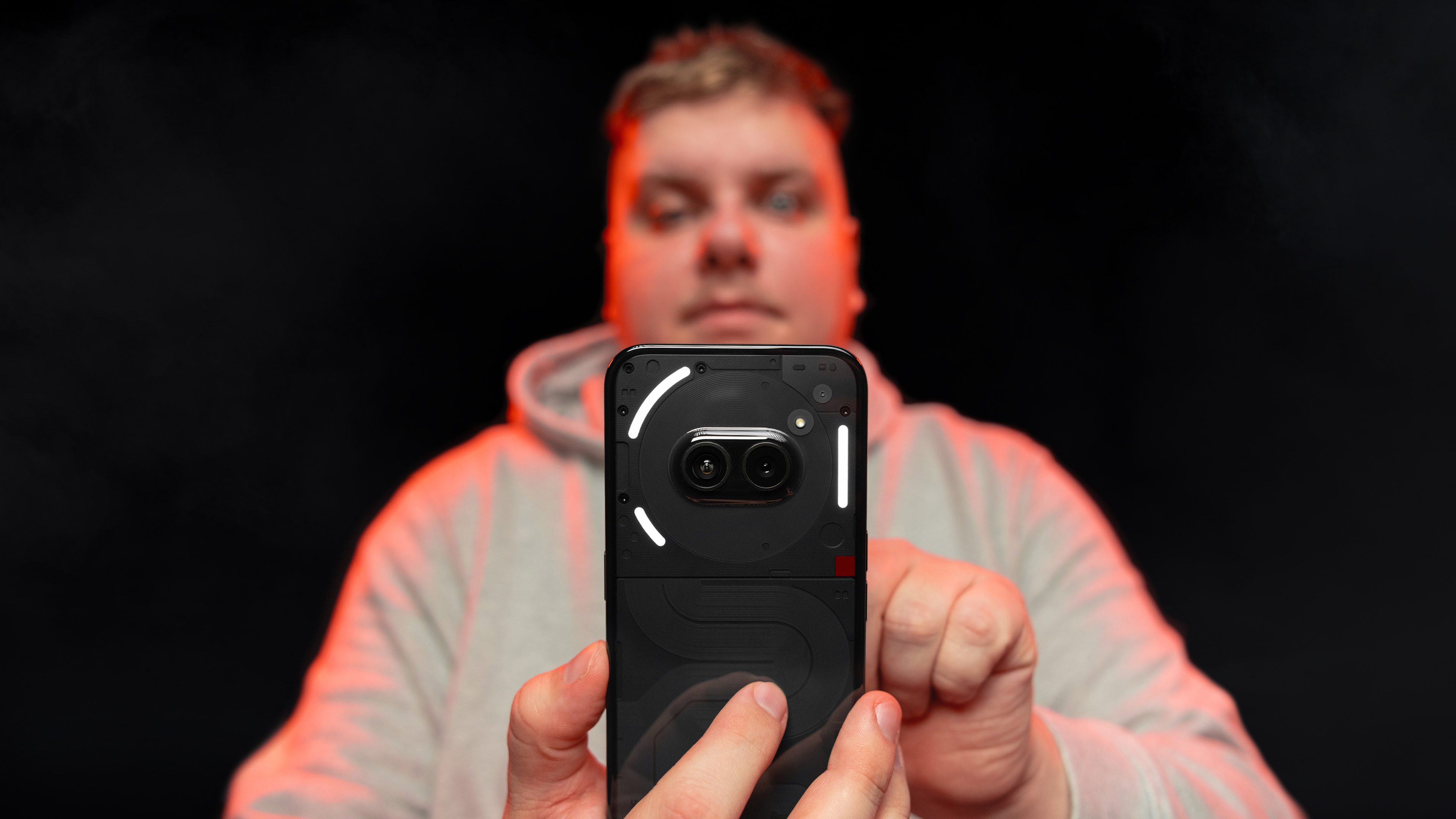
After entering a more premium market with the Nothing Phone (2), Carl Pei’s brand returns with an affordable smartphone: the Nothing Phone (2a). Retailing at $349 a pop, the Nothing Phone (2a) offers a well-balanced handset with above-average specifications. It’s clearly the best-looking mid-range smartphone of 2024, but is it mere cosmetics? I share my honest opinion about the Nothing Phone (2a) in this full review.
Good
- The finest mid-range Android smartphone
- Nothing OS 2.5 is very user-friendly
- 3 Android updates + 4 years of security updates
- Record battery life and a large battery
- Very stable performance
Bad
- Photo quality is not outstanding, especially at night
- Sluggish 45W wired charging speed
- No microSD slot
- Very attractive design albeit using plenty of plastic
Nothing Phone (2a): All deals
The Nothing Phone (2a) in a nutshell
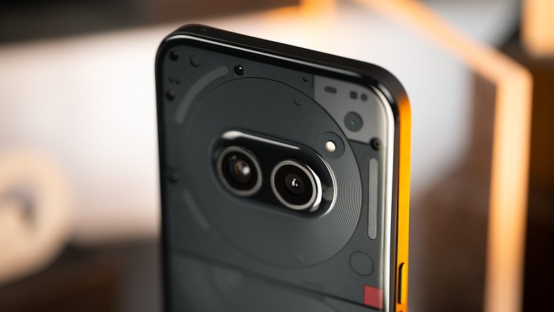
The Nothing Phone (2a) was launched on March 5, 2024, and is sold in only one flavor in the US: $349 for 12GB of RAM and 256 GB of internal memory. Other regions worldwide do get the 8/128 GB model.
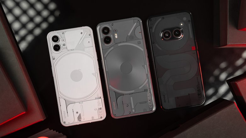
According to Nothing, the Nothing Phone (2a) is neither a successor nor a “lite” version of the Nothing Phone (2) (review), the manufacturer’s current flagship. It should be seen as an extension of the Nothing Phone (1) (review), which was slightly more premium at the time, but did not fit in the flagship mold, either.
Be that as it may, in a market of smartphones that retail for less than $400, models generally focus on one or two elements. Samsung is all about long-term software updates and screen quality. Redmi concentrates on fast charging and performance. Google’s strength would be its cameras. Apple’s… just kidding.
What does Nothing stand for? Design, first and foremost. The Nothing Phone (2a) is the prettiest affordable smartphone on the market. The quality of the Nothing OS 2.5 interface is also a major strength, but is that all?
Design
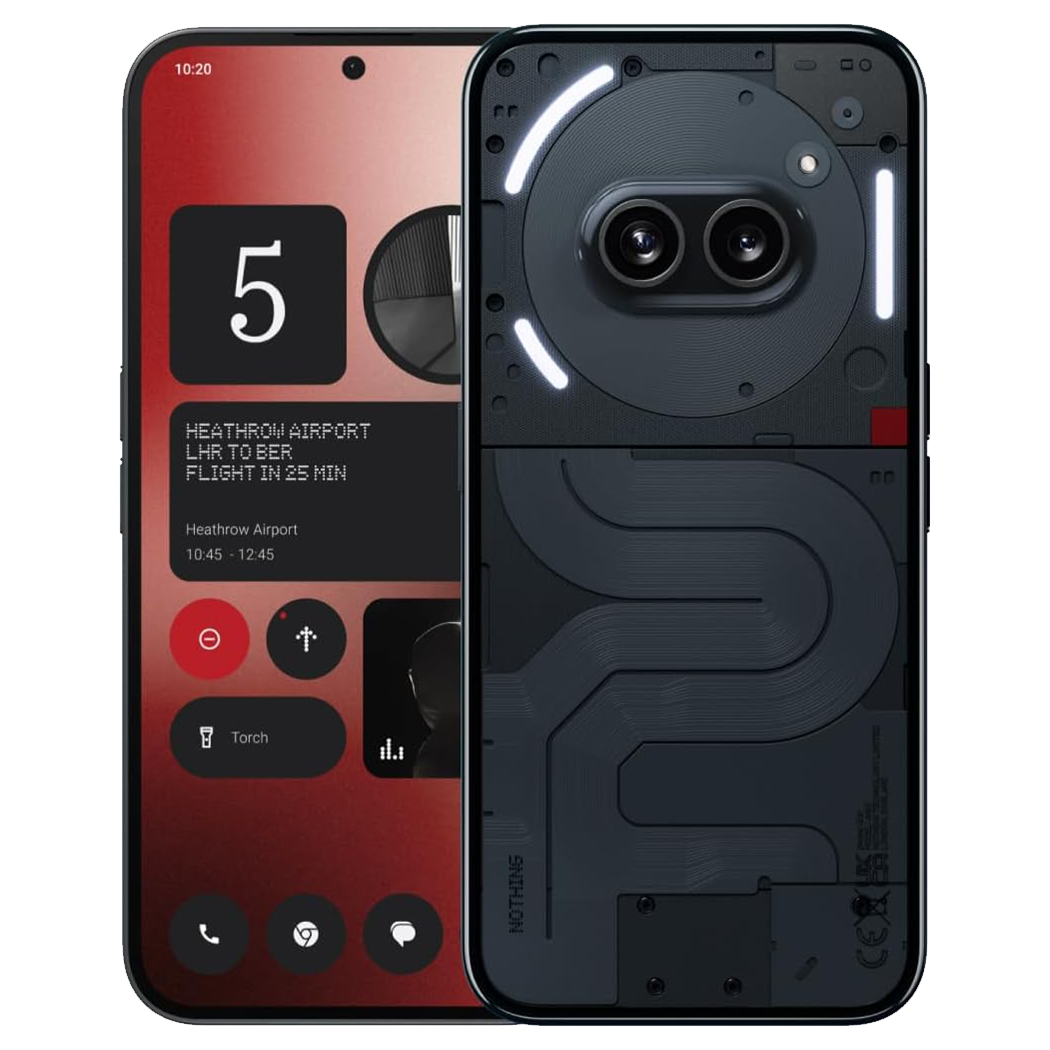
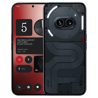
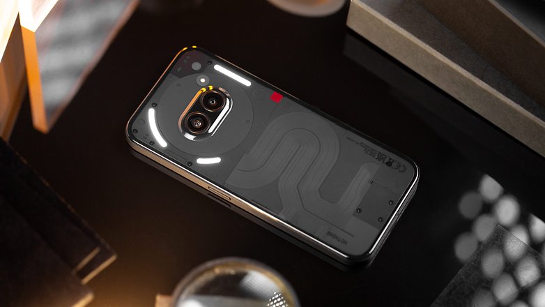
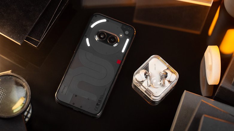
When I claim the Nothing Phone (2a) is an extension of the Nothing Phone (1) and not the Nothing Phone (2), it’s not for…nothing. The design featuring a transparent back is, in fact, inspired by the first concept imagined in the early days of Nothing. We still have the famous Glyph interface intow, even if it has changed a little. However, the smartphone is a worthy heir to the “cool factor” established by previous models even if it’s far less premium.
Pros:
- Attractive transparent design.
- IP54 certification.
- Thin bezels.
- Good grip.
Cons:
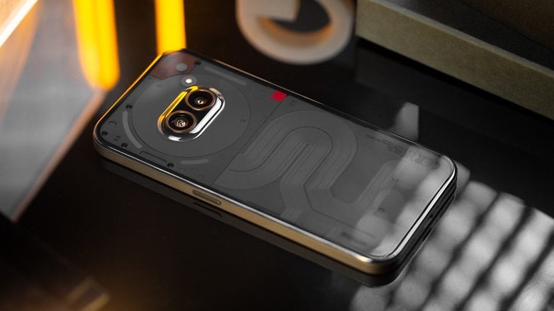
Let’s get straight to the point. The Nothing Phone (2a) retained the typical Nothing look. Transparent back? Check. Visible components via the back? Check. Glyph interface? Check. However, changes run more than skin deep, with other components having undergone a serious downgrade to reduce manufacturing costs.
The smartphone is IP54 certified and the screen is protected by Gorilla Glass 5. The camera module at the back is horizontally positioned at the center. The smartphone doesn’t wobble when you place it flat on a table. It also personifies the Nothing Phone (2a), which looks like a little Wall-E character if you have an overactive imagination (and want to subtly reduce the word count of this review).
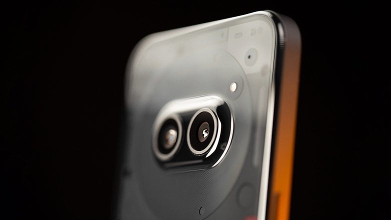
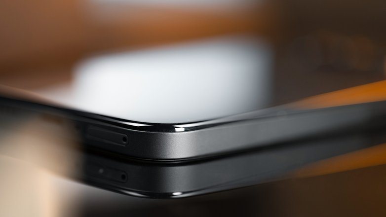
You can feel the smartphone is far less premium. The back and chassis are made of plastic. I’m less bothered by the ridges because it offers a good grip. The plastic back looks a bit cheap and I wonder what it will look like after several years. Will it experience plastic rot? Even the Glyph interface has undergone some budget cuts. The Nothing Phone (1) had five LEDs, the Nothing Phone (2) had eleven, and the Nothing Phone (2a) has just three.
To be honest, I appreciate that Nothing puts so much thought into the design of its products. However, they should be careful not to overdo it, either. I was told the “S” ribbon that looks like an electronic ribbon cable was inspired by Massimo Vignelli’s design of the New York subway map. It might be, but I found that to be rather pompous.
I was also promised that every design choice was the fruit of thousands of trials and tests involving the choice of material, manufacturing process, etc. Knowing that, the Nothing Phone (the only one of its kind in the world) is the result of a lot of hard work. However, the end result was disappointing as the Nothing Phone (2a) is no more premium than a Redmi or Samsung within the same price range in terms of design. It’s visually cooler and prettier, but that’s about it.
Screen
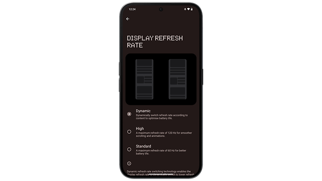
The Nothing Phone’s screen (2a) is surprisingly good. It’s a 6.7-inch AMOLED display with a 2412 x 1084 p resolution. The refresh rate varies between 30-120 Hz, since LTPO technology is not available. Maximum brightness is rated at 1,300 nits.
Pros:
- Well-calibrated colorimetry.
- 120 Hz refresh rate.
- Thin bezels.
Cons:
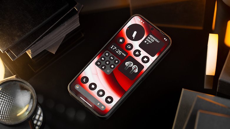
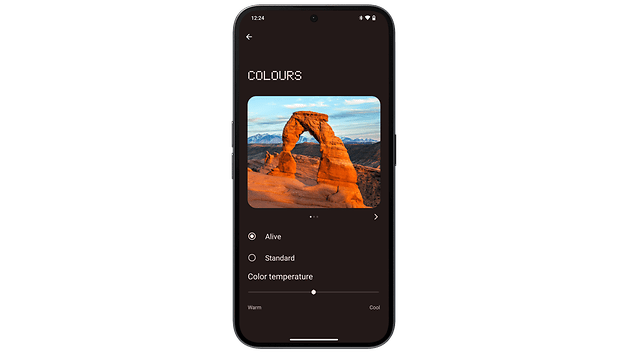
Visually, the Nothing Phone (2a)’s screen is pleasant to look at, featuring thin bezels on all four sides. Colorimetry is quite warm, which I found to be rather pleasant. The colors are not overly saturated and appear quite faithful when reproduced.
The refresh rate varies from 30 to 120 Hz. I’m not surprised, nor frankly disappointed, not to have an LTPO panel that varies the refresh rate from 1 to 120 Hz. This remains par for the course within this price range.
Finally, having a peak brightness of 1,300 nits in a mid-range smartphone is heaven sent. In typical mode, it hovers around 700 nits, and when you are under bright sunlight, it can rise to 1,100 nits. Technical considerations aside, the Nothing Phone 2(a)’s screen left a very good impression on me.
Interface and OS
The Nothing Phone (2a) runs on
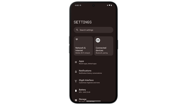
Nothing OS 2.5, a skin based on
Android 14 that’s much cleaner than it looks. The Nothing Phone (2a) also benefits from an adequate update policy.
Pros:
- 3 Android upgrades + 4 years of security updates.
- The Glyph interface is still very cool (but a bit gimmicky).
- The interface is close to stock Android.
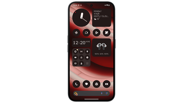
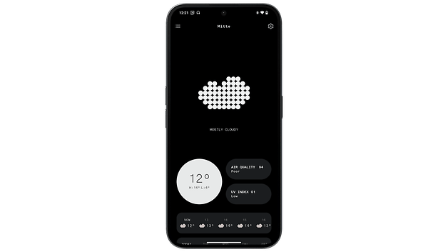
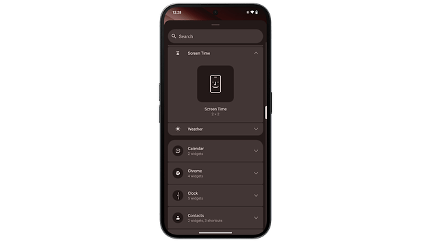
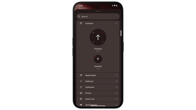
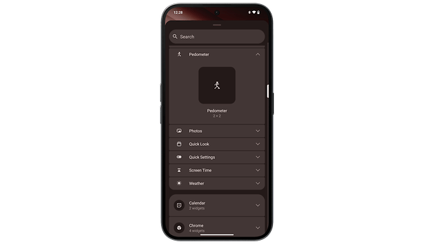
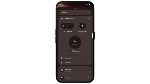
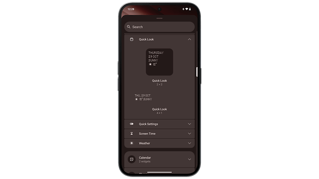
- Nothing widgets are visually striking.
- ZERO bloatware!
Cons:
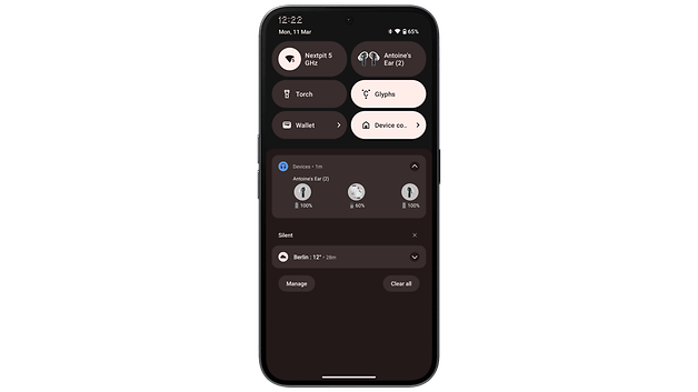
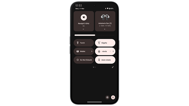
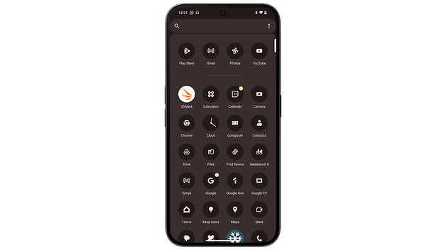
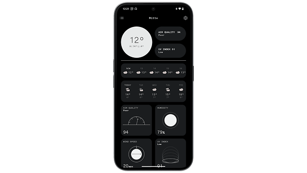
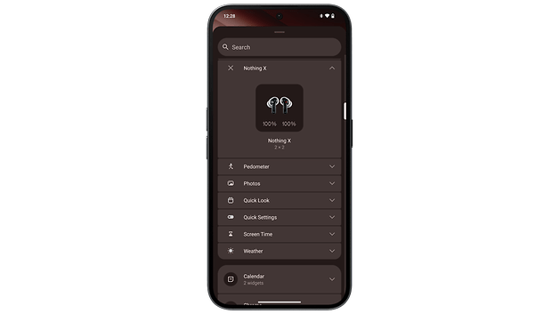
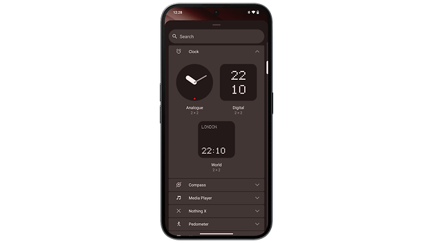
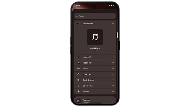
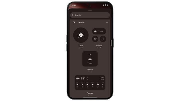
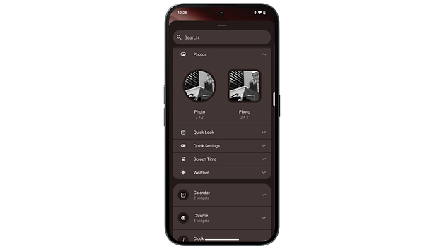
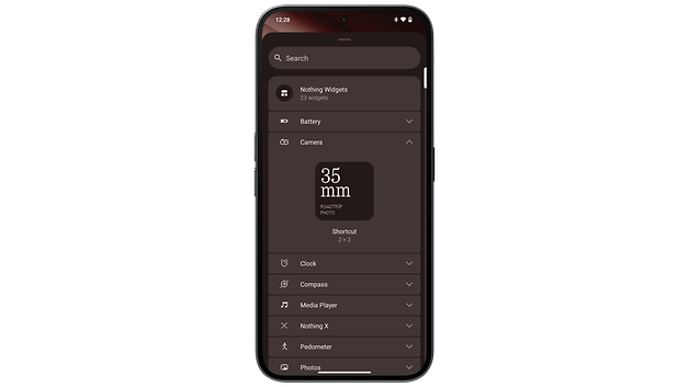
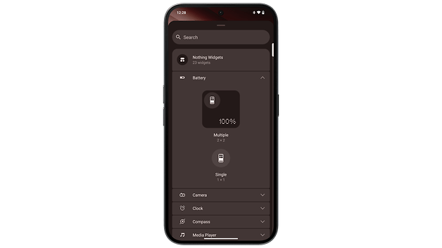
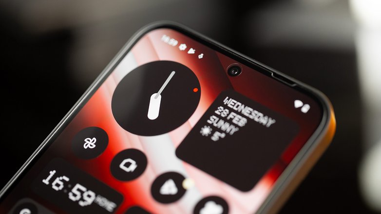
Nothing OS 2.5 is very close to stock Android. Only a few native applications (the weather app is one) and several widgets were customized Nothing-style. I think it’s a good balance, with a clean, sober interface and a few funky touches. I really like the new Nothing widgets, especially the photo gallery widget.
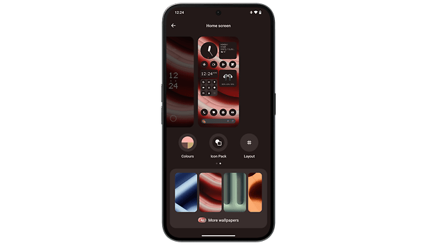
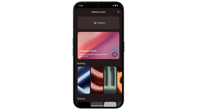
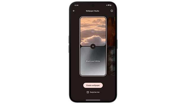
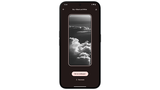
Like Samsung with Galaxy AI (review), Nothing has taken on AI functions. Well, the only AI function present on the Nothing Phone (2) is Google’s AI Wallpaper function. It generates AI wallpapers by mixing two predefined prompts (dark sky + cloud). The combination of possibilities are rather limited and the results are, sad to say, generic.
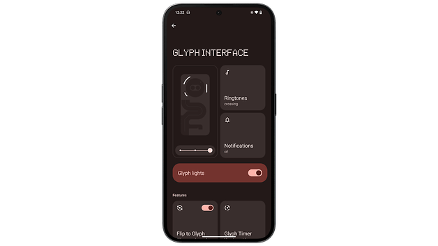
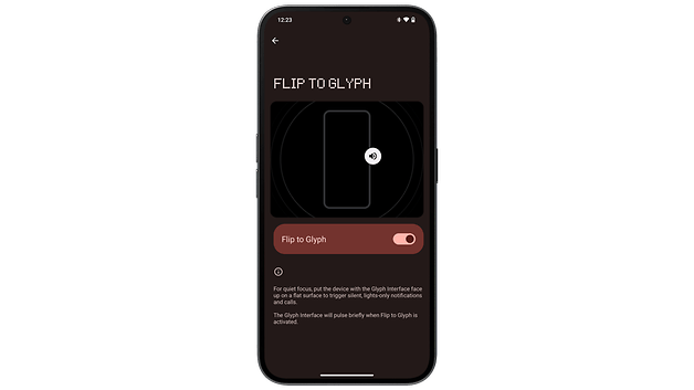
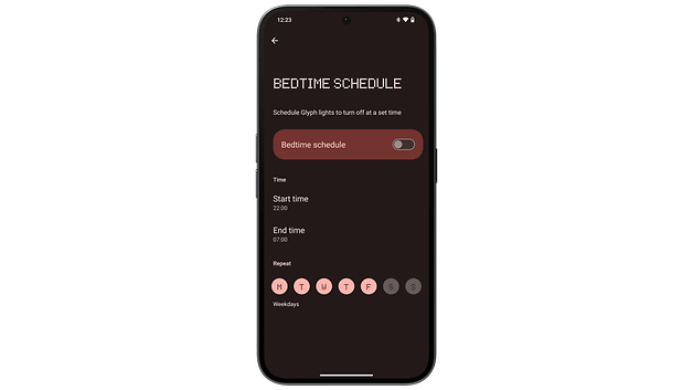
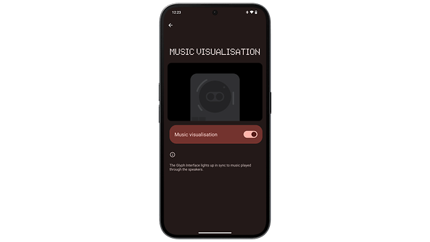
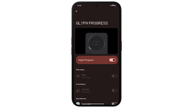
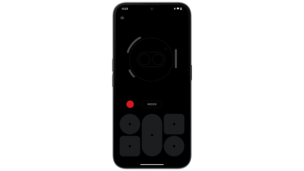
The famous Glyph interface with its luminous LEDs can also be found at the back of the Nothing Phone (2). Despite a lower number of LEDs (3 vs. 11 on the Nothing Phone (2)), the manufacturer offers quite a few features. The most interesting is the Flip to Glyph function, which acts as an Always On Display and is better than the Nothing Phone’s (2a) true AOD, in my opinion.
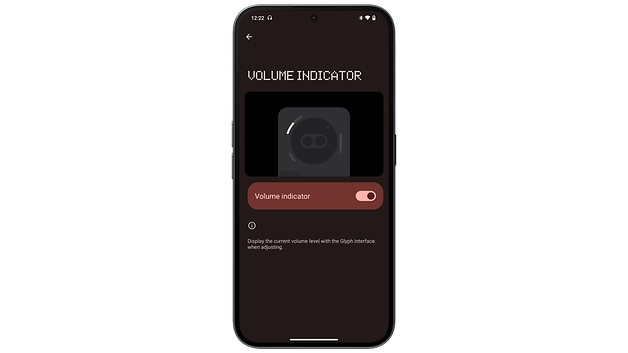
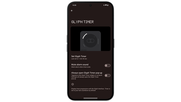
The Glyph Composer is still a very cool and original gimmick that lets you create your own light signals in a playful manner. Having the Glyph interface function as a progress bar for the timer and the volume gauge are also great features to limit screen time.
Finally, the Nothing Phone (2a) benefits from a very good update policy for a mid-range smartphone, offering up to three Android upgrades and four years of security updates.
Performance and SoC
The Nothing Phone (2a) is the manufacturer’s first smartphone that does not feature a Qualcomm chipset. There will be not Snapdragon
SoC underneath the hood this year, but a MediaTek Dimensity 7200 Pro fills the shoes instead. This not-so-new chip is paired with 12 GB of LPDDR5 RAM and 256 GB of UFS 3.1 storage, without any microSD card slot. I was surprised it was more powerful than expected.
Pros:
- Stable performance.
- Zero overheating issues.
Cons:
In terms of raw performance, the Nothing Phone (2) doesn’t break the ceiling. It performs slightly poorer than the Redmi Note 13 Pro+ 5G (review), which was equipped with the MediaTek Dimensity 7200 Ultra.
This mid-range Dimensity 7200 chip was launched in 2023. Nothing’s Pro version, like Xiaomi’s Ultra version, is an upgrade of the same SoC. But the Dimensity 7200 Pro runs at 2.8 GHz, just like the basic version of the chipset.
| Nothing Phone (2a) (Dimensity 7200 Pro) |
|
|---|---|
| 3D Mark Wild Life | 4,129 |
| 3D Mark Wild Life Stress Test |
Best loop: 4,131 Worst loop: 4,085 |
| 3D Mark Wild Life Extreme Stress Test |
Best loop: 1,153 Worst loop: 1,148 |
| Geekbench 6 | Single: 1,148 Multi: 2,589 |
When gaming, you cannot expect to play at a constant 60 FPS on resource-hungry games. When playing Genshin Impact, I was hovering at around 40 FPS with the graphics settings set to medium. I didn’t notice any major loss of framerates, though.
Neither did I notice the slightest bit of overheating. Benchmarks showed it ran stably for over 99% of the time, which is very good. Performance is consistent within this price range. The Nothing Phone (2a) made a good case for itself here, no more, no less.
Photo quality
The Nothing Phone (2a) features a dual camera module at the back. It comprises a main lens and an ultra-wide angle lens, each clocking in at 50 MP. The selfie camera has a 32 MP resolution. Photo quality on the Nothing Phone (2a) may be good, but I think Nothing’s software processing isn’t mature enough. Results remain too inconsistent.
Pros:
- Main lens is excellent during the day
- No unnecessary sensors.
- Great-looking selfies.
Cons:
- Digital zoom is too limited.
- Unnatural-looking night photos.
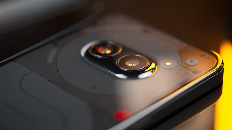
The camera module at the back of the Nothing Phone (2a) comprises a 50 MP Samsung GN9 main sensor (f/1.88) and a 50 MP Samsung JN1 ultra-wide angle sensor (f/2.2).
Main lens and ultra-wide angle
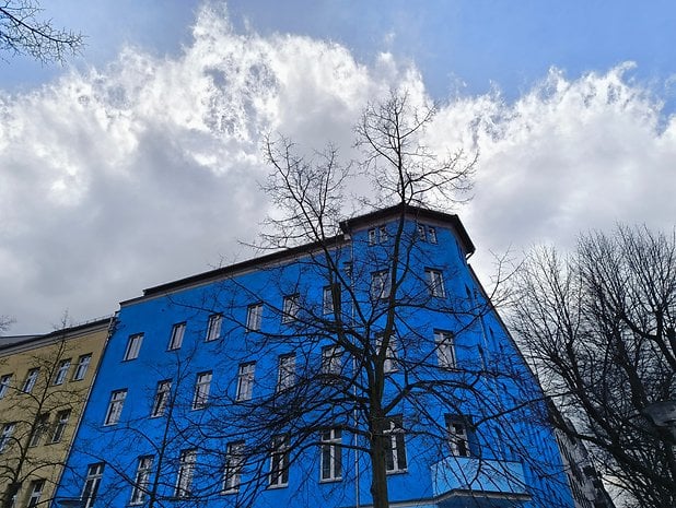
During the day, the Nothing Phone’s main lens performed very well. The level of detail and sharpness are there, and the dynamic range is very well managed, even in less-than-optimal conditions (bad weather, etc.). I’ve only reviewed flagships this year, and I was really expecting a cold shower with the Nothing Phone (2a), but that wasn’t the case.
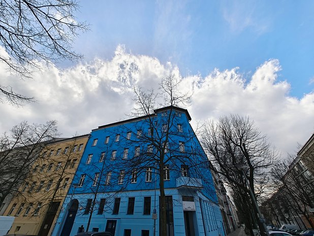
The ultra-wide angle lens was far less interesting. Logically, the level of detail should be lower than the photos taken using the main lens. However, the distortion at the edges of the photos was the primary issue that bothered me. There were also other elements, always at the margins of each photo, that ended up looking like pixel mush.
I’ve also had some surprising results with Nothing’s Ultra HDR mode. This function is supposed to improve dynamic range by shooting 7 RAW photos at different exposure levels to obtain the best balance. This mode is activated by default when you launch the photo application. I was surprised at times to see big artifacts on photos without Ultra HDR compared to photos with Ultra HDR enabled. The difference shouldn’t be that obvious, and my review unit was clearly updated in terms of its software version.
2x digital zoom
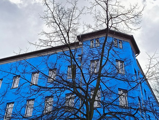
The Nothing Phone (2a) has no telephoto lens, which is expected in this price range. The main lens can operate via digital zoom ranging from 2x to 10x. You do not even get 2x optical zoom here.
Needless to say, I was really disappointed with the zoom quality due to the drastic reduction in detail, even in photos zoomed in at 2x. For buildings or people captured from a distance, it’s okay. As soon as you take a closer look, the lack of detail really jumps out at you.
Needless to say, the maximum magnification of 10x was of little interest to me.
Selfie lens and portrait mode
Daytime selfies are fine. There is no hyper-aggressive smoothing of facial skin, as often is the case. At night, we obviously lose sharpness and the smartphone smoothes out digital noise accordingly. Before you think I am too harsh, I would say that for this price range, the results are perfectly acceptable.
Portrait mode proved to be less impressive with less-than-clean clipping around the edges. One of the earpieces on my headset was completely out of focus in one photo in one instance, while in another instance saw an element in the background being totally in focus. In short, Nothing’s algorithm lacks finesse.
Night-time photo quality
At night, Nothing Phone (2a) photos aren’t bad, but they’re not natural at all. The night sky is outrageously blue. You get the impression that it’s early evening, whereas I took my photos at night. You know, at night, when the sky is completely dark.
Above all, I had the impression that Nothing was pushing the sharpness to the limit to compensate for the lack of detail due to the low light conditions, and doing so only accentuated the photo’s flaws.
On the other hand, I was surprised that a mid-range smartphone managed to brighten up a scene so much. Even if it was poorly done, it’s interesting. Nothing just needs to refine its software processing. A little less sharpness and a lot less aggressiveness on blue sky, that’s all I’m asking for—for now.
In terms of video, the Nothing Phone (2a) is capable of filming in 4K at 30 FPS and 1080p at 60 FPS. There’s also a 120 FPS slow-motion mode in 1080p.
Battery and recharging
The Nothing Phone (2a) is equipped with a 5,000 mAh battery that accepts 45 W wired charging. The battery life of Nothing’s smartphone is excellent. I was expecting it to perform far worse because of the Glyph interface, but I was pleasantly surprised.
Pros:
- Excellent battery life.
- Decent charging speed.
Cons:
The Nothing Phone (2a)’s battery is big, boasting a 5,000 mAh charging capacity. This is not uncommon in the mid-range smartphone market. I had my doubts about the battery life because of the Glyph interface, which I feared would consume too much power.
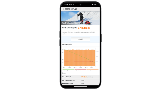
In the PC Mark benchmark, with brightness set to 50%, the Nothing Phone (2a) lasted 17:02! That’s an impressive score. It’s the best score I’ve measured this year. Some models struggle to exceed 10 hours in this test with brightness set at 200 nits (a level well below 50%).
In practical daily use, this superior battery life was also evident. It’s child’s play to go for two days without having to plug the smartphone into the mains. Charging is done via cable only, which is logical, at 45 W. This is far slower than what Xiaomi offers in its Redmi handsets. Using my Ugreen Nexode 140 W charger, it took me 1h30 for the battery to go from 0 to 100%.
Technical data
| Technical specifications | |
|---|---|
| Device | |
| Image |  |
| Screen |
|
| SoC |
|
| RAM | |
| Storage | |
| OS |
|
| Photo module |
|
| Selfie camera | |
| Battery |
|
| Connectivity |
|
| IP rating | |
| Dimensions & weight |
|
Conclusion
Would I recommend the Nothing Phone (2a) at $349? Yes. At first, I thought the Nothing Phone (2a) was a handsome smartphone from afar, but far from beautiful.
Basically, I thought that Nothing had overemphasized the cool design of its smartphone to hide its rather plain technical and performance specifications.
It is true in a manner of speaking. However, the design of the Nothing Phone (2a), and the enormous amount of thought and design behind it, goes more than just skin-deep cosmetics. Nothing has little or nothing to be ashamed of. The Nothing Phone (2a) is a decent mid-range smartphone and for under $350, there are no nasty surprises in store.
On the contrary, the 120 Hz AMOLED screen with its very thin bezels is excellent. The MediaTek Dimensity 7200 Pro SoC is good enough for everyday use, and there is no need to ask for more. While photo quality remains unremarkable, as is the case for all smartphones within this price range compared to the Pixel 7a (review), there is still the pleasant Nothing OS 2.5 with an adequate update policy. Last but not least, the battery life is nothing short of phenomenal.
After all this, I have to admit that the Nothing Phone (2a) left me with a bitter aftertaste. I’d like to elaborate on this point in a separate article. I found that Nothing’s initial philosophy—to make intuitive tech that improves your everyday life—is being left behind slowly but surely. Apart from its sublime (and very subjective) cool design, nothing distinguishes the Nothing Phone (2a) from any other smartphone at this price point. So, what is the main selling point of Nothing compared to other smartphone manufacturers?

