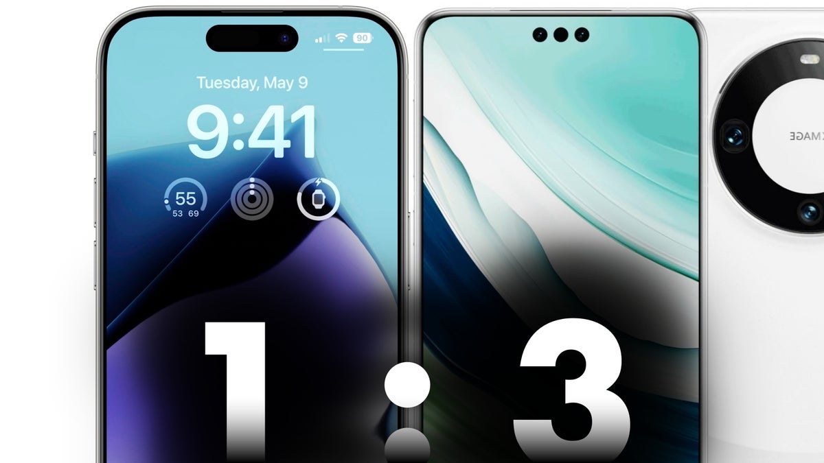
What’s equally as interesting as the beautiful design of the Mate 60 Pro is Huawei’s decision to release its new flagships (in China) just a couple of weeks before the biggest smartphone launch of the year, which takes place on September 12 when the iPhone 15 series is expected to finally become official.
And while the “2.5D curved front glass on all sides, with thinner, symmetrical display borders and a Dynamic Island cutout” is what we expect to see from the iPhone 15 Pro and iPhone 15 Pro Max/Ultra, here is Huawei delivering on Apple’s own “promise” weeks before the iPhone 15 Pro, and with an even more intriguing twist… Three Dynamic Islands instead of one! Bet you didn’t see that coming…
Huawei Mate 60 Pro and Mate 60 Pro+ bring three Dynamic Islands two weeks before the launch of the iPhone 15 Pro to remind Apple who did it first
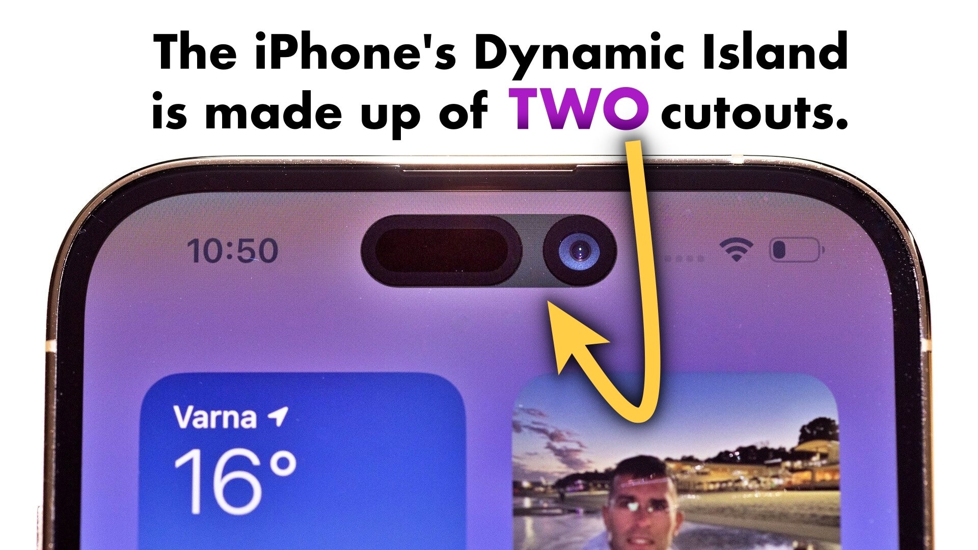
Apple’s iPhone 14 Pro also has multiple display cutouts joined together with the help of software.
Anyway, even Tim Cook will tell you that Huawei used an identical pill-shaped cutout all the way back in 2020 for the Huawei P40 and Huawei P40 Pro flagships, and one that wasn’t a gimmick either – it housed a set of similar 3D face-unlocking sensors like the ones in iPhone 14 Pro, which followed two years later. In a way, the Huawei Mate 60 Pro reclaims the “Dynamic Island” cutout with Face ID that the company pioneered years ago and simply moves it from the left side of the display to the middle.
Of course, the elephant in the room here is that Huawei’s latest take on the “Dynamic Island” cutout is actually… three cutouts. And whether you like this look or not, it hardly matters, since Huawei allows you to choose a unified display cutout that makes the Huawei Mate 60 Pro’s “island” look like the one in the Huawei P40 Pro, which might’ve been Apple’s initial inspiration for the iPhone’s latest look.
Huawei gives you something Apple never did, which is the choice to decide how you see your “Dynamic Island”. You might not know this, but the iPhone’s “unified” cutout is actually made up of two separate cutouts, which Apple stitched together with the help of software – just like in the case of the Huawei Mate 60 Pro’s three holes. Unlike Huawei, Apple doesn’t allow you to choose to see both holes.
Stunning Huawei Mate 60 Pro design is all about the symmetry – front and back
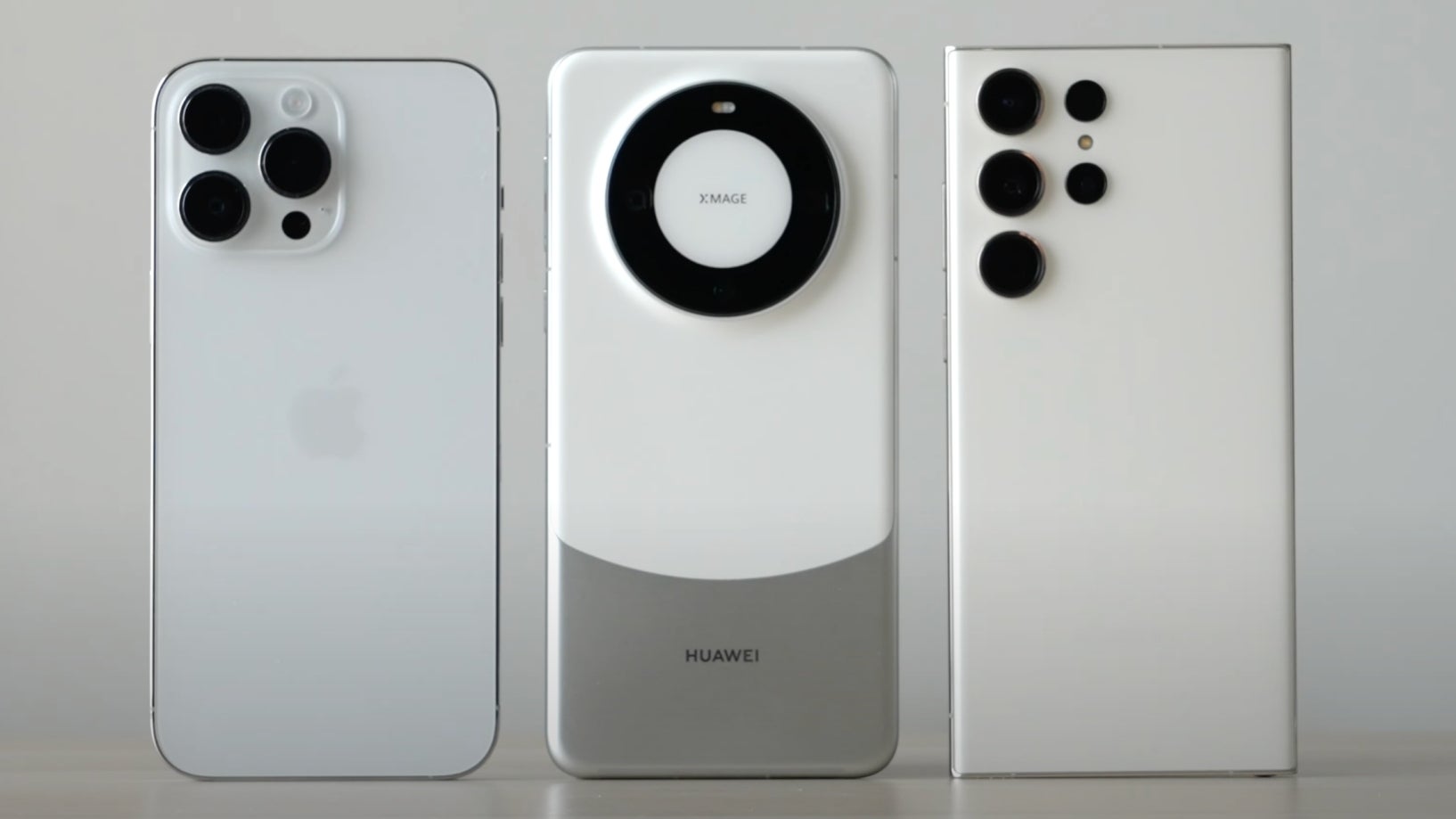
- Uses a dual-tone rear design on the back; the surprising part here is that the bottom portion of the back is actually made out of aluminium, which is a first for Huawei since the ancient Huawei P10 (2017); the aluminium almost seamlessly blends into the the top portion of the phone’s back which is made out faux leather
- The Mate 60 Pro also has super thin symmetrical display borders, similar to the ones expected in Apple’s iPhone 15 Pro; this is a first for a Huawei phone, and you can clearly see how it makes the Huawei Mate 60 Pro look cleaner; for the record, the only phone-makers that managed a fully symmetrical display look all around (so far) are Apple, Google, Samsung, Nothing, and Huawei (in that chronological order)
- After a year-long hiatus, we can see the typical Huawei camera ring make a comeback, giving the Mate 60 Pro a uniquely elegant look especially next to the iPhone 14 Pro and Galaxy S23 Ultra; this is awesome news considering the somewhat lacklustre design of last year’s Mate 50 Pro
The Huawei Mate 60 Pro brings one of the most symmetrical smartphone designs in a long time – front and back. I can’t help but think how amazing this phone would’ve been if it was allowed to run Google apps, and if it still came with the iconic Leica logo in the middle of the camera ring. Thanks again, US trade ban.
Apple rules the premium smartphone segment but should Android phones copy the iPhone design, or try to make something different to stand out?
So, no… Not all Android flagships coming out in 2023 and 2024 should have a “Dynamic Island” cutout – most of them don’t need one. In fact, Huawei’s own Mate 60 (vanilla model) comes with the exact same design as its more premium siblings but with a single punch-hole camera as it features a fingerprint reader instead of 3D face-unlocking.
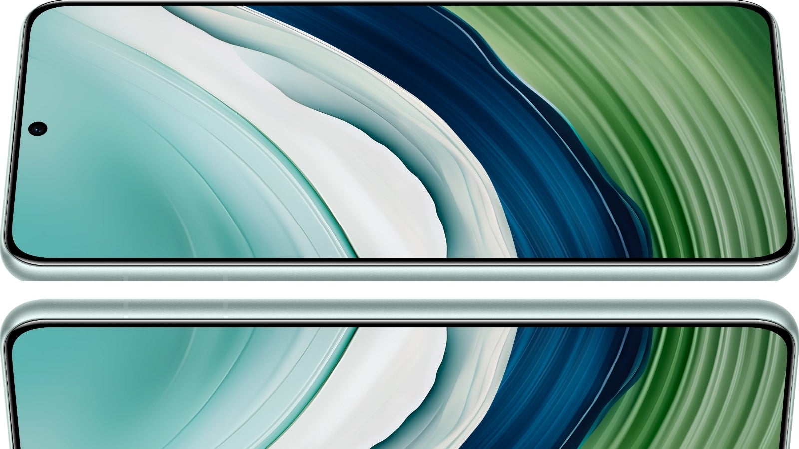
The vanilla Huawei Mate 60 has a single selfie camera cutout and the same thin display borders as the Mate 60 Pro.
But when it comes to the back of the phone and the materials, textures, and even colors used, Android can and probably should go back to being a little bit… bolder. I already discussed Apple’s affinity for muted colors and repetitive design elements in a recent story criticizing the iPhone 15’s design, but the truth is that some Android phone makers have also been playing it safe – like Samsung with their Galaxy S22, S23, and alleged S24 series of phones, which are expected to share a single design.
The Huawei Mate 60 Pro gets my smartphone design “award” for this year (so far), as it manages to seamlessly blend Apple’s clean, symmetrical design aesthetic on the front with bolder, more extravagant, Android-like detail on the back. On a personal note, Huawei managed to make a black smartphone that I’d consider picking over any other color, which doesn’t happen. Like ever.
How much do people care about their smartphone’s design? Galaxy S24 Ultra vs iPhone 15 Ultra vs Pixel 8 Pro, Huawei Mate 60 Pro, etc.
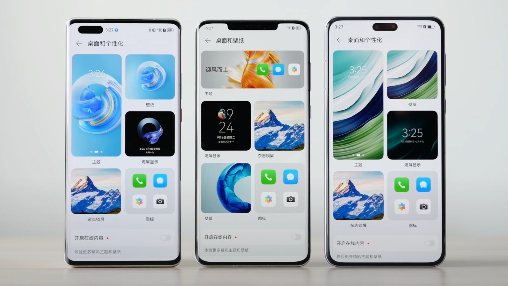
Huawei Mate 40 Pro, Mate 50 Pro, Mate 60 Pro – as you can see Huawei’s Mate 40 Pro from 2020 had a Dynamic Island-like cutout with Face ID way before the iPhone 14 Pro.
- For example, how important is the size of the display borders, which have been getting more and more attention around Apple’s upcoming iPhone 15 Pro, which should have the thinnest bezels on any phone?
- How important is the rear design considering most people would put a case on their phone? And should this design change every year (like with the Google Pixel 6, Pixel 7, and Pixel 8), or should it stay consistent (although boring) like on the iPhone and Galaxy?
- How important is the size of the hole in the display of your phone? Are you team Dynamic Island, team Dynamic Island(s), or team… small hole?
Finally, if you’re curious to have my personal take, I’d argue the materials used to build a phone are far more important than anything else. Give me a metal phone with a titanium frame, and I won’t ask for much more!
I guess the Huawei Mate 60 Pro is half the way there thanks to its half-metal back, and so will be the iPhone 15 Pro, which should have a durable titanium frame (but a glass back).
I don’t care about the holes. Do you?

