Key Takeaways
- The Linux top command is a valuable utility that provides critical information about system performance and running processes.
- Despite its initial complexity, top can be customized to display only the information that is relevant to the user.
- Top supports various keyboard shortcuts and optional features such as color, highlighting, and graphs to enhance the readability of the displayed information.
The Linux top command is one of the stalwarts of Unix-like operating systems. Its utilitarian display is packed with useful information about your system’s running processes and resource usage. But, did you know it also supports color, highlighting, and even elementary graphs?
An Information-Packed Dashboard
The top command has been around since 1984, and there are many variants of it. For this article, we’re running Ubuntu 18.04 with all patches applied, and version 3.3.12 of top. As of Ubuntu 23.04, very little has changed. We also cross-referenced everything on two other test computers, one running Fedora and the other Manjaro.
The default top display crams as much information as possible in the terminal window. Information is a prerequisite to administration, so this is a good thing. One of the traits of a good system administrator is the ability to identify emerging problems and deal with them before they affect service. top gives you a dashboard of many different system metrics that help you do just that.
The display is best described as functional, rather than intuitive, and abbreviations abound. When you first encounter top, it feels cramped, cryptic, and off-putting. With a few keypresses, though, you can tune the contents and format of the display according to what’s important to you.
Check Your Version of top
To check which version of top you have, type the following a terminal window:
top -v
If your version is way behind 3.3.12, it might not support all the features we’re going to cover.
The Default Display
You can start top by typing the following and hitting “Enter”:
top
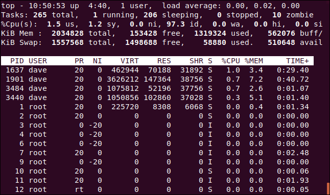
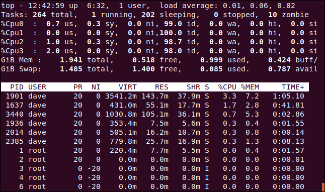
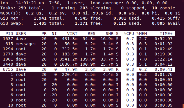
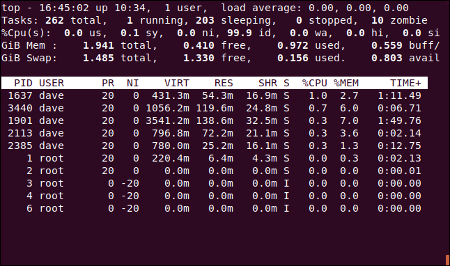
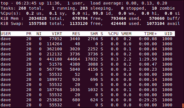
The default display contains two areas of information: the summary area (or dashboard), and the task area (or process list). By default, top updates its display every three seconds—you’ll notice a slight flicker when it does.
The first line of numbers on the dashboard includes the time, how long your computer has been running, the number of people logged in, and what the load average has been for the past one, five, and 15 minutes. The second line shows the number of tasks and their states: running, stopped, sleeping, or zombie.
The third line displays the following central processing unit (CPU) values:
- us: Amount of time the CPU spends executing processes for people in “user space.”
- sy: Amount of time spent running system “kernel space” processes.
- ni: Amount of time spent executing processes with a manually set nice value.
- id: Amount of CPU idle time.
- wa: Amount of time the CPU spends waiting for I/O to complete.
- hi: Amount of time spent servicing hardware interrupts.
- si: Amount of time spent servicing software interrupts.
- st: Amount of time lost due to running virtual machines (“steal time”).
The fourth line shows the total amount (in kibibytes) of physical memory, and how much is free, used, and buffered or cached.
The fifth line shows the total amount (also in kibibytes) of swap memory, and how much is free, used, and available. The latter includes memory that’s expected to be recoverable from caches.
The column headings in the process list are as follows:
- PID: Process ID.
- USER: The owner of the process.
- PR: Process priority.
- NI: The nice value of the process.
- VIRT: Amount of virtual memory used by the process.
- RES: Amount of resident memory used by the process.
- SHR: Amount of shared memory used by the process.
- S: Status of the process. (See the list below for the values this field can take).
- %CPU: The share of CPU time used by the process since the last update.
- %MEM: The share of physical memory used.
- TIME+: Total CPU time used by the task in hundredths of a second.
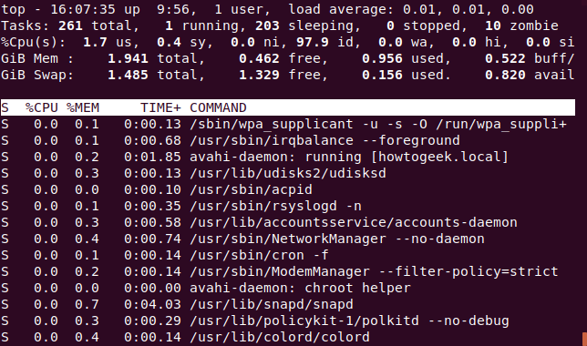
- COMMAND: The command name or command line (name + options).
Memory values are shown in kibibytes. The COMMAND column is off-screen, to the right—it didn’t fit in the image above, but we’ll see it shortly.
The status of the process can be one of the following:
- D: Uninterruptible sleep
- R: Running
- S: Sleeping
- T: Traced (stopped)
- Z: Zombie
Press Q to exit top.
You can press the Up or Down Arrows, Home, End, and Page Up or Down keys to move up and down and access all the processes.
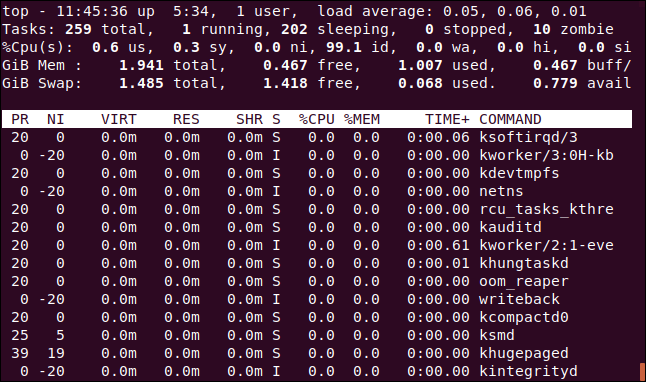
Press the Left or Right Arrow to move the process list sideways. This is useful to see any columns that don’t fit within the confines of the terminal window.
In the image below, we’ve pressed the Right Arrow a few times to see the COMMAND column.
Changing the Numeric Units
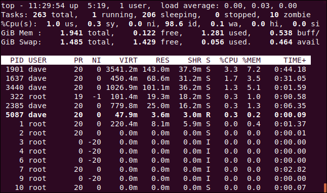
Let’s change the display units to sensible values. Press capital E to cycle through the units used to display memory values in these options: kibibytes, mebibytes, gibibytes, tebibytes, pebibytes, and exbibytes. The unit in use is the first item on lines four and five.
Press lowercase “e” to do the same thing for the values in the process list: kibibytes, mebibytes, gibibytes, tebibytes, and pebibytes.
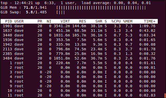
We pressed E to set the dashboard memory units to gibibytes and “e” to set the process list memory units to mebibytes.
Changing the Summary Contents
You can change the display settings for the lines in the dashboard or remove them completely.
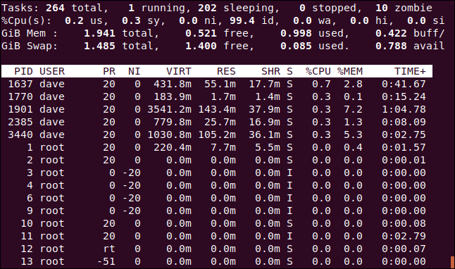
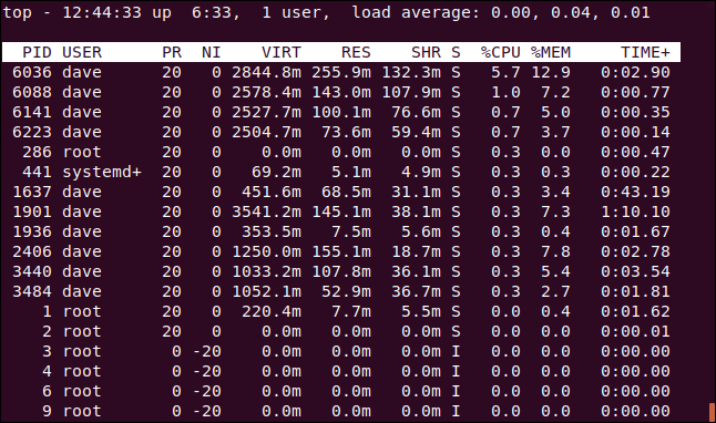
Press l to toggle the load summary line (the first line) on or off. We removed the load summary line in the image below.
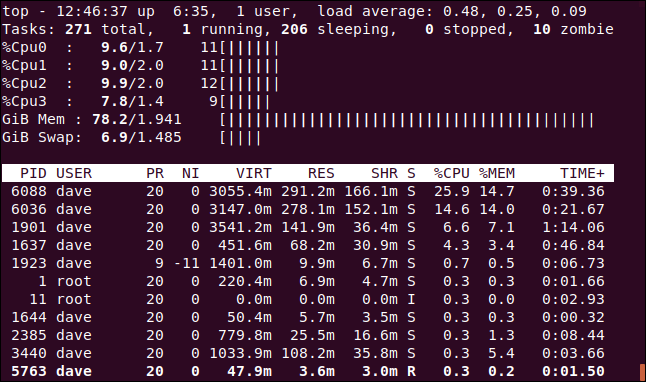
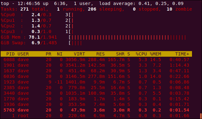
If you have a multi-core CPU, press 1 to change the display and see individual statistics for each CPU. There are four CPUs on our computer. We press 1 to see how hard each of them is working.
Of course, this takes up more screen real estate within the terminal window.
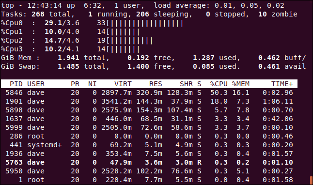
You can press “t” to swap the CPU displays to simple ASCII graphs that show the percentage of usage for each CPU.
For each CPU, top displays three numbers and the graph. From left to right, the numbers are as follows:
- The combined
usandnipercentage (user space+tasks with nonstandard nice settings). - The
sypercentage (kernel space). - The total (rounded to an integer value).
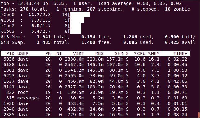
Press “t” again to change the graph display to solid block characters.
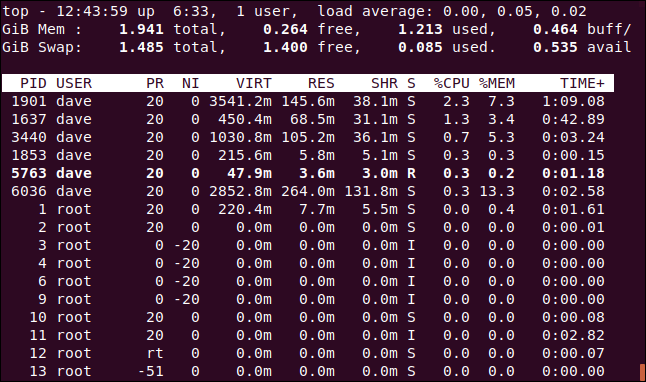
Press “t” once more to remove the CPU display and task summary line completely.
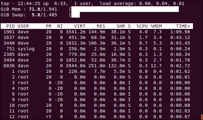
Press “m” to cycle the memory and swap memory lines through different display options. The first press replaces the statistics with an ASCII graph.
Another press changes the graph to block characters.
Press “m” once more to remove the CPU lines altogether.
If you want, you can see CPU and memory graphs at the same time. Just press “t” and “m” until you get the combination you want.
Color and Highlighting
You can press “z” to add color to the display.
When you think of top, you probably don’t think of colored displays and ASCII graphs, but they’re built right in.
Press “y” to highlight running tasks in the process list. Pressing “x” highlights the column used to sort the process list. You can toggle between bold and reversed text highlighting by pressing “b.”
Sorting by Columns
By default, the process list is sorted by the %CPU column. You can change the sort column by pressing the following:
- P: The
%CPUcolumn. - M: The
%MEMcolumn. - N: The
PIDcolumn. - T: The
TIME+column.
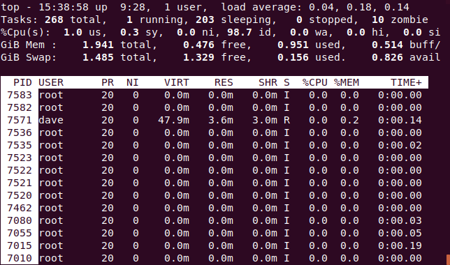
In the image below, the process list is sorted by the PID column.
See the Full Command Line
Pressing “c” toggles the COMMAND column between displaying the process name and the full command line.
To see a “tree” of processes that were launched or spawned by other processes, press V.
See Processes for a Single User
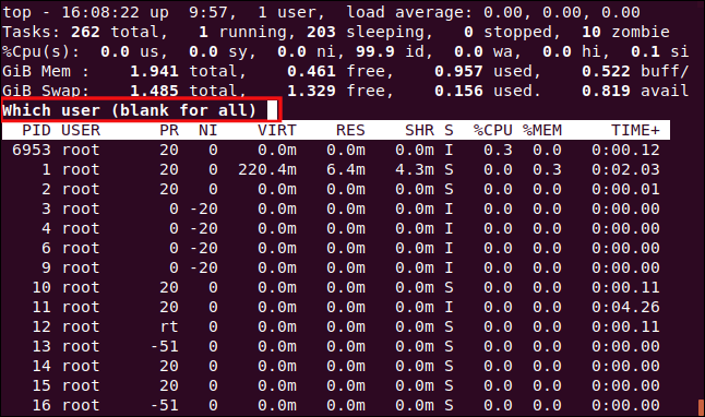
Press “u” to see the processes for a single user. You’ll be prompted for the name or UID.
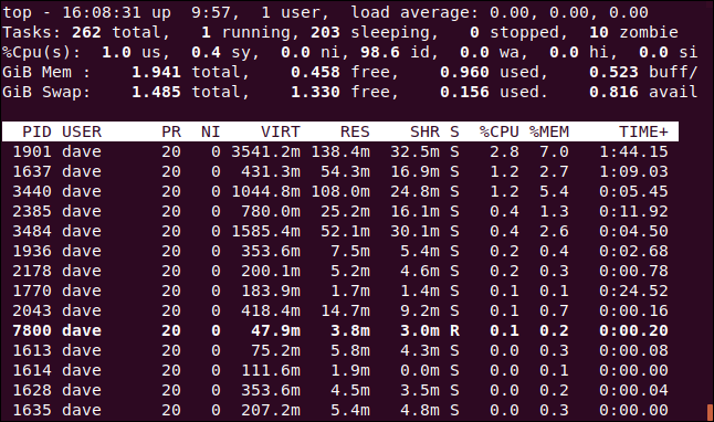
Type the name of the UID of the person you want to monitor. We’ll type “dave” and hit “Enter.” Now, the only processes in the task area belong to the user dave.
Only See Active Tasks
Press I to see only active tasks.
Tasks that haven’t consumed any CPU since the last update won’t be shown.
Set How Many Processes to Display
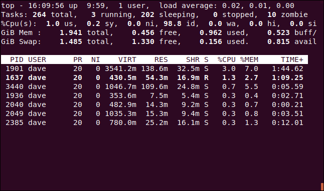
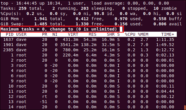
Press “n” to limit the display to a certain number of lines, regardless of whether the tasks are active. You’ll be prompted for the number of processes to display.
We typed 10 and pressed Enter, so 10 processes appear in the task area.
Renice a Process
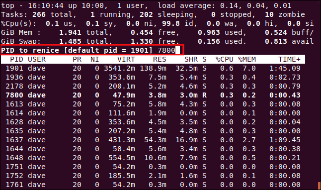
You can press “r” to change the nice value (priority) for a process. You’ll be prompted for the process ID. Just press Enter to use the process ID of the task at the top of the process window. We type 7800, which happens to be the process ID of an instance of Firefox.
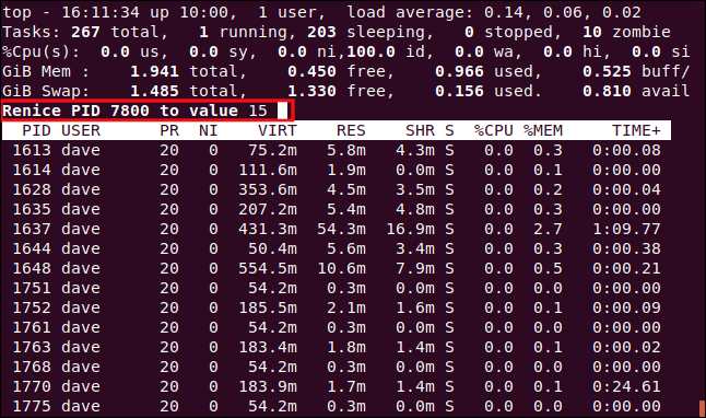
After you hit Enter, you’re prompted for the new nice value to apply to the process. We type 15, and then press Enter.
The new nice value is applied to the process immediately.
Kill a Process with top
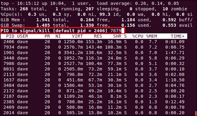
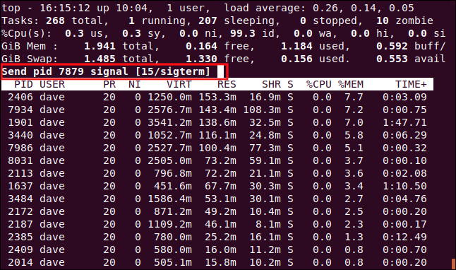
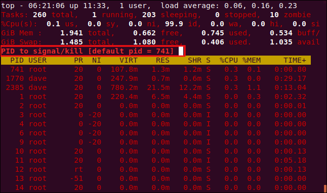
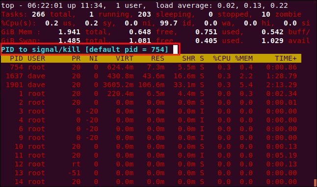
Press “k” to kill a process. You’ll then be prompted for the process ID you want to kill. In fact, you can send any signal to the process. We’re going to kill process 7879, which has stopped responding.
You’ll be offered the chance to type the signal you want to send. You can specify it by name or number. If you simply hit Enter, top sends the SIGTERM (kill) signal.
As soon as you hit Enter, the signal is sent to the process.
Customizing the Display
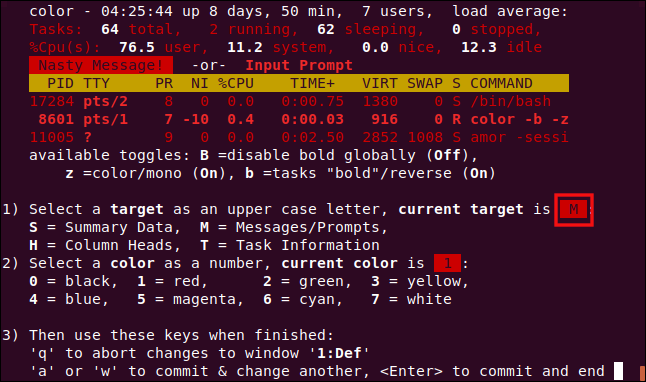
You can also customize the colors and columns that are displayed. We’re going to change the color used for prompts, the default for which is red.
Press capital Z to go to the color settings page. The top part of the screen shows the colors in use by the different display elements. To indicate which display element you want to change, press one of the following, which are case sensitive:
- S: Summary Data area.
- M: Messages and prompts.
- H: Column headings.
- T: Task information in the process list.
We press M to change the prompts.
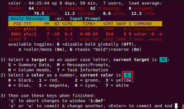
To pick a color, press one of the following numbers:
- 0: Black.
- 1: Red.
- 2: Green.
- 3: Yellow.
- 4: Blue.
- 5: Magenta.
- 6: Cyan.
- 7: White.
We press 6 to use cyan.
Press Enter to save your settings. Prompts for input will now be in the color you selected.
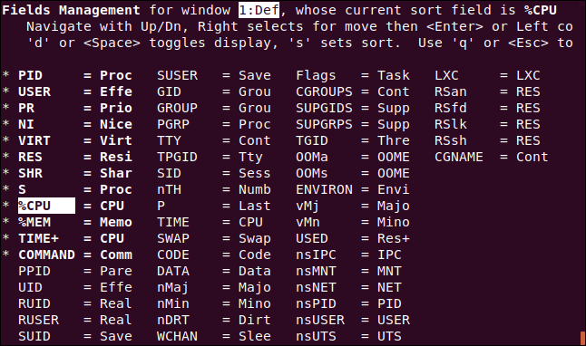
We can also change the columns displayed in the Fields Management screen. Press F to enter the Fields Management screen.
Fields that are displayed have an asterisk (* ) beside them and are highlighted in bold. Press the Up and Down arrows to move the highlight through the list of fields.
If you move the highlight off the bottom of a column, it will appear at the top of the next (unless you’re at the bottom of the last column). If you move it off the top of a column, it will appear at the bottom of the previous (unless you’re at the top of the first column).
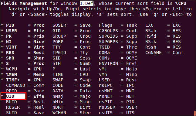
We moved the highlight to the COMMAND entry, and then pressed “d” to remove the asterisk (*). We then moved to the UID entry and pressed “d” to place an asterisk next to that entry. This means the COMMAND column won’t be displayed, but the UID column will.
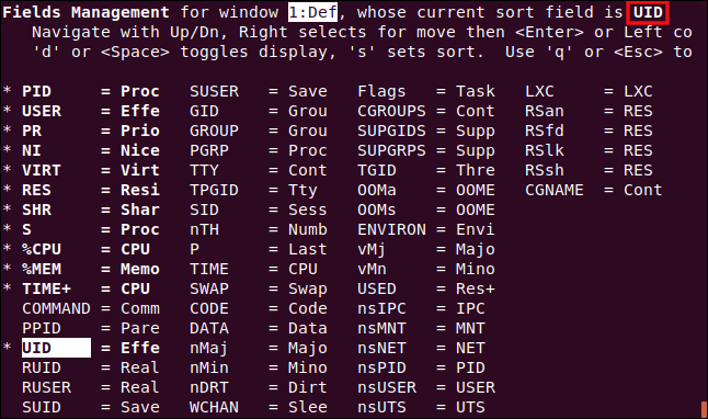
While the highlight is on the UID column, we press “s” to sort the process list on the UID column.
Press Enter to save your settings, and then press “q” to leave the Fields Management screen.
The UID column has replaced the COMMAND column, and the process list is sorted by it.
Alternative Display Mode
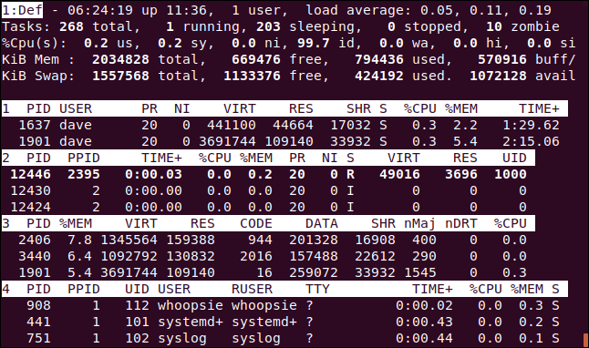
This works best in full-screen mode. Press A to display four areas in the process list, and then press “a” to move from area to area.
Each area has a different collection of columns, but each is also customizable through the Fields Management screen. This gives you scope to have a full-screen, customized display showing different information in each area, and the ability to sort each area by a different column.
Other Keystrokes
The following are some other keys you might find useful in top:
- W: Save your settings and customizations so they’ll still be in effect when you next start
top. - d: Set a new display refresh rate.
- Space: Force
topto refresh its display right now.
Are There Alternatives to Top?
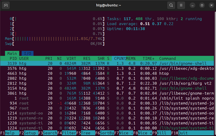
As we’ve seen, top has quite a repertoire. However, there are alternatives out there if you want something different. The utility htop is probably the most common and popular top alternative, since it is lightweight. It will be immediately familiar to anyone that has ever used top, but has colors applied right out of the gate that make it easier to read. It also nicely spells out the controls along the bottom.
The major advantage top has is its ubiquity — top is installed everywhere. When you go to businesses to look at networks or servers, you’ll often be told that absolutely nothing can be changed on the live servers. The client makes the rules, so you have to use what’s already installed.
Even if you prefer a different monitoring tool, you should get to know top. Sooner or later, you’ll likely find yourself in a situation where it’s all you’ll have access to.


