
Ever since Elon Musk bought Twitter, it seems that the once-favorite social media site has just been going down in flames. It’s a sad sight to see — fake news and misinformation running rampant from paid “verified” accounts, restoration of formerly banned accounts (they were banned for good reason), and so much other stuff that I just can’t keep up anymore. With all of these changes, there’s been a rise in alternatives to Twitter, like the incredibly popular Mastodon.
I prefer something simpler, like the new Hive Social that has recently made waves. Think of Twitter and Instagram, and what you would end up with if you combined the two. There’s also a little dash of Myspace in there, as you can even add some music to your profile page. I’ve been poking around on Hive Social since I joined a week ago, and while I’ve been enjoying my time there, I also noticed a few things along the way.
Hive reminds me of the early days of Twitter
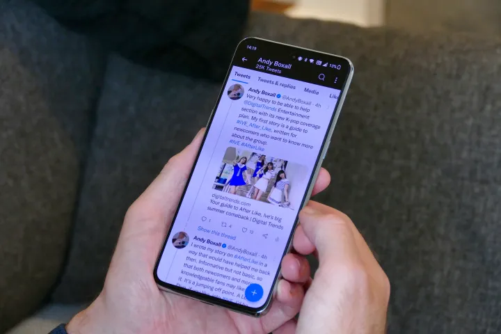
Hive Social is different than Mastodon and reminds me of the early days of Twitter (I’ve been on Twitter since 2007, crazy right?). Once you get your Hive account set up and follow some people, the home feed is a simple combination of text and images. So far, from the people I’m following, my home feed has given me a window into the random musings of my friends, some industry-related posts, questions and answers, and photos of food, pets, and other fun stuff.
Though my feed has been a little slow lately, I keep coming back to Hive, even if there isn’t much happening sometimes. It’s been reminiscent of the early days of Twitter for me, where people posted random thoughts, what they were up to at the moment, and pictures of what they were having for lunch. So far, there’s no drama, no politics, etc. — it’s just been “good vibes only” for me so far, and that’s just what I need.
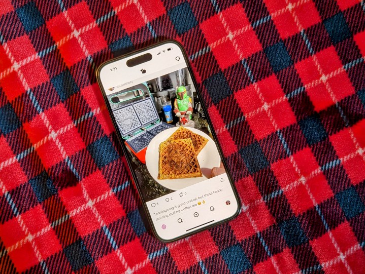
Creating a new post is easy enough too. Posts on Hive can have an unlimited amount of text, and you can even attach numerous photos and video clips. GIFs are welcome, and you can also poll your followers. Already from the get-go, you can select who can comment on your post, which is something that took years for Twitter to implement.
Again, the early days of Twitter were pretty rough — remember the Fail Whale? Right now, Hive is very reminiscent of that old experience, and I’m hoping to see it get improved with time, just like Twitter did. Only without horribly crumbling to the ground.
Simplicity is Hive’s biggest draw

When Mastodon came out a few years ago, I created an account because it was the “hot new thing.” But with all of the Twitter nonsense, it seems that everyone has been flocking over to Mastodon. I gave it another shot, but I just can’t get over how confusing it is as a whole. The servers/instances bit makes it hard for me to find my old Twitter friends if I don’t know which server they signed up on, and I honestly hate how usernames look when you @ someone who isn’t on the same instance as you. It’s messy, and the fact that every individual server or instance can have its own set of emojis and other little “perks” just makes it feel like Reddit or Discord. That’s not what I want in my Twitter alternative.
That’s why I’m enjoying Hive so much more than Mastodon — it’s easy.
Unlike Mastodon, Hive is simple — it’s one place for everyone to gather, just like Twitter. You create your account and have a username, and then people can find you, as long as they have your username. Since most people these days use the same username online, it’s not super hard to find your friends or favorite influencers. There’s no extra nonsense like servers — just search for someone’s username, and if they’re on Hive, they’ll show up. Easy peasy.
I know that there are people who are drawn to Mastodon because it’s decentralized, and for some people, that’s exactly what they want. But not me. I just want one place where all my friends are hanging out, and I can follow them. Having separate servers and whatnot makes it feel very disjointed. That’s why I’m enjoying Hive so much more than Mastodon — it’s easy.
There’s still a lot of room for improvement
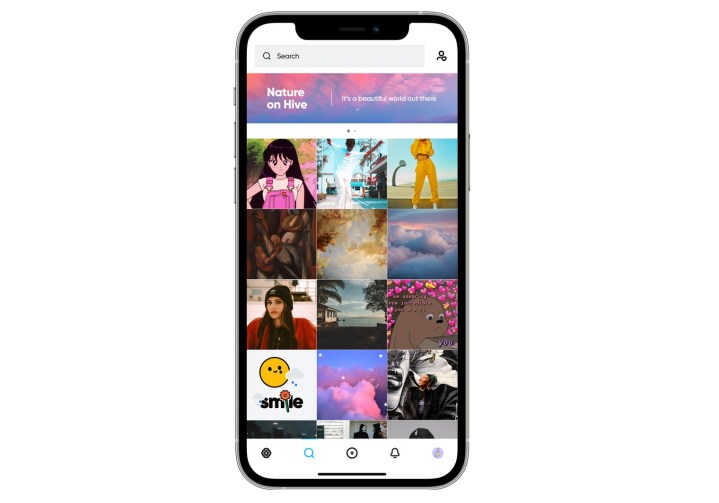
It seems that Hive is still just getting started, and that’s okay. Hive has been around since 2019 and is managed by only two people. But with all of the Twitter drama, it has had an explosive number of new user signups — about a million in a week.
I have noticed every time I open up the Hive app on my iPhone 14 Pro, it takes at least 10 seconds for my home feed to load up. This is assuming it doesn’t just pick up from where I left off from the last use. I’d imagine that this is because Hive’s servers weren’t anticipating this many new users so quickly, so things are a little slow because of it — and that’s totally understandable. But I still hope that the developers behind Hive add more servers to handle capacity sooner rather than later.
I also noticed that search is pretty much useless right now, and somehow, usernames aren’t unique (there are multiple people with the same handle). NSFW posts also have to be manually tagged every time, so if a user doesn’t do this, then NSFW content can show up in the Discover section, regardless of whether or not you chose to allow it on your account. Content moderation needs to be something that is seriously considered on the Hive platform because, right now, it’s obvious that it’s nonexistent.

The app itself could also use improvement. There are inconsistent touch zones when browsing profiles, and you can’t just tap anywhere on the screen to simply close out of a contextual menu. On an iPhone, you can’t tap the device status bar to go back to the top (pro tip: tap the home feed tab to do this). The Android version of the Hive app is somehow worse, and you need workarounds to do little things like adding a profile picture with an existing image on your device. Yeah, it’s definitely rough, to say the least.
And the biggest issue that a lot of people are having with Hive is the fact that it is currently a mobile app only. There’s no website and no desktop app. Everything involving Hive Social is on your iPhone or Android phone. For Hive to succeed, it needs to be available on devices other than phones and tablets. I sincerely hope that the developers are working on this because I know a few people who simply won’t consider it because of this fact.
I just want pre-Elon Twitter back
I know a lot of people have always disliked Twitter, but for me, Twitter was more than just a hot mess all these years. I got started in my career because of Twitter, and I’ve met so many amazing people that I consider friends through Twitter — even meeting some of them in person. It’s also how I share my work with people who may even be remotely interested, and it’s how I find out about breaking news.
It’s hard to start over and keep in touch with the people you care about when everyone is splitting up and going to smaller places.
I’m trying all of these “alternatives” to Twitter because so many of those cool people I’ve met have left for something else. I’ll go where the people go, but I’ve been on Twitter for 15 years, building up a small following. It’s hard to start over and keep in touch with the people you care about when everyone is splitting up and going to smaller places, rather than one big “public town square.”
So far, Hive is the only alternative that I’ve actually enjoyed using, but it definitely has a long road ahead of it. I’ll keep at it for now, and hopefully, more people hop on board once it makes some much-needed additions.
At least, you know, until the next big social network option pops up.
Editors’ Recommendations


