Apple sometimes makes the strangest decisions for its products. However, Apple never does anything by accident, for better or for worse. In this opinion piece, I’m going to challenge my prejudices. Without playing devil’s advocate. I’m going to explain why some of Apple’s dumb design choices in the past aren’t totally meaningless.
“But, WHY?!!!!” This is often what I sigh, howl inwardly, secretly lament, or exclaim at the top of my lungs whenever Apple makes a totally arbitrary design choice that defies all logic. The most striking example is the Magic Mouse. You know, the one with the Lightning port located right below. The one you cannot use when charging it. I know, it’s low-hanging fruit but that’s just to illustrate my basic point.
However, since the release of the iPhone 15, Apple has been able to convert me in part. I’ve been using the iPhone 15 Pro Max as a daily driver for months now. So far, I haven’t felt the urge to switch back to Android. For all that, I remain convinced that Apple adopts very predatory and sometimes anti-consumer product strategies.
I’d like to believe that I’ve matured over time. I don’t want to fall back into my old ways. The days when I wrote lengthy diatribes about the exorbitant prices of iPhones are over. I don’t ever want to indulge in totally primitive anti-Apple posturing again.
Apple doesn’t do anything by accident
I thought about the latest Apple products I’ve reviewed. The AirPods Max (review), the iPhone 15 Pro Max (review), the Beats Solo Buds (review), (yes, Beats is part of Apple). I tried to think harder about some of the things I had against these products.
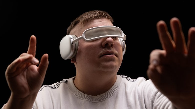
Take the AirPods Max for instance. What puzzled me the most during my review was how it proved impossible to turn off the Bluetooth headset. The AirPods Max can never be completely switched off. You can put it into deep sleep by storing it in its case, or by not touching it for 72 hours. But you simply can’t turn it off.
For a manufacturer that just published its white paper on the durability and longevity of its products, this is ironic. What better way to wear out my AirPods Max battery and force me to replace it sooner? Well, yes, to prevent me from preserving said battery by turning off my headphones when I’m done using them.

One of the arguments for this choice is Apple wants to offer you a certain type of audio experience. An experience whose quality must not be altered, even by you. This quality is guaranteed by the headset’s H1 chip, which processes the sound. This H1 chip must always be active. The headset must therefore always be switched on to power this chip. This argument is silly in my opinion, and I’ll tell you why in the second part of this article.
On second thoughts, I’ve come up with another far more acceptable reason. Intuitiveness. One of the great strengths of the AirPods Max or AirPods Pro 2 (test) is their ease of use. Pairing with an iPhone is a breeze. Active Noise Cancellation, equalization — almost everything is seamless. You don’t even need an app.
That’s why Apple doesn’t want you to turn off your AirPods Max. It’s that experience that Apple doesn’t want to alter. When you take AirPods Max out of its case, it’s already paired to all your devices and ready to use. There is nothing to power on, no buttons to press, no adjustments to make. Just slip on the headset and you’re ready to go. This fluidity would be drastically interrupted if AirPods Max wasn’t on all the time.
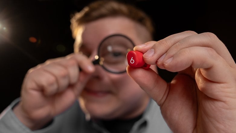
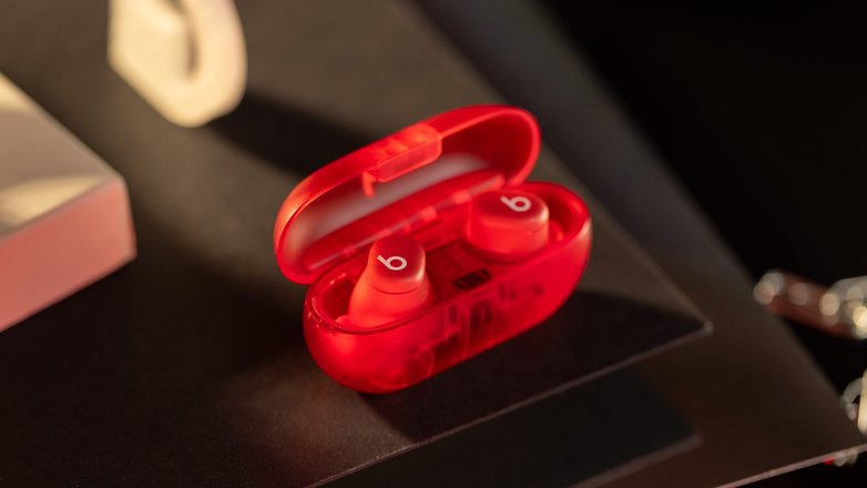
Another example is the Beats Solo Buds. There’s nothing special about these earbuds, apart from the fact that their charging case has no battery. Yes, to recharge the earbuds, you have to place them in their case. So far, so good. However, this case must be plugged in via a USB-C cable; otherwise it won’t charge the earbuds.
Silly, isn’t it? Well, yes, in a way, but the idea isn’t totally uninteresting. The Beats Solo Buds case has no battery, but the earbuds themselves have a battery life of 18 hours. 18 hours on a single charge are three to four times longer than “normal” headphones.
Let’s not forget that recharging these earbuds is a very slow process, taking between 1h3 0m and 3 hours on average for a full charge, so the idea of having earbuds that can last 18 hours straight isn’t so absurd after all. You can use them uninterrupted all day long. Who cares if you can’t recharge them whenever you want?
An arbitrary vision of the user experience
Personally, the main reason for my reticence towards Apple products is the manufacturer’s dirigisme. Apple has a precise vision of the experience it wants to provide for its users. It dictates the terms so that what we do with its products corresponds to this vision.
If we were to take the AirPods Max as an example, Apple would like to offer the best possible musical experience. To achieve this level of quality, a component in the headset must always be active. For this to happen, the headset must always be switched on. That’s why AirPods Max can’t be turned off.
This first point is primarily a matter of opinion. It’s a debate. Apple is entitled to defend its vision for its products. It has its brand image to project, after all. It’s also not the only manufacturer to do so. You and I am entitled to agree or disagree and make our purchasing decisions accordingly.
My second point is Apple’s very strange relationship to durability and repairability. For Apple, these two concepts seem to be polar opposites. The more repairable a product is, the less durable it is, and vice versa. The video below, which is highly critical of Apple, shows several concrete examples where Apple has made design choices that are totally anti-consumer. These choices don’t serve to defend a vision of user experience, but simply to get people through the checkout line.
Anyway, I found this exercise quite interesting. It’s always good to take a step back and become aware of one’s own cognitive biases. Apple-bashing is silly, but I also quickly found the limits of this experience.
First, I had a hard time finding other examples of bad Apple choices that were actually good or at least justified. Mind you, I’m not saying that Apple makes only bad decisions. I’m just saying that among the bad Apple decisions I’ve looked at, I haven’t been able to justify many of them.
More importantly, I was no longer simply trying to understand Apple’s intentions. I felt like I was doing mental gymnastics, and making excuses for the manufacturer by forcing myself to adopt its fallacious logic is not my aim here.
Apple doesn’t do anything accidentally, but it’s not always for the right reasons.


