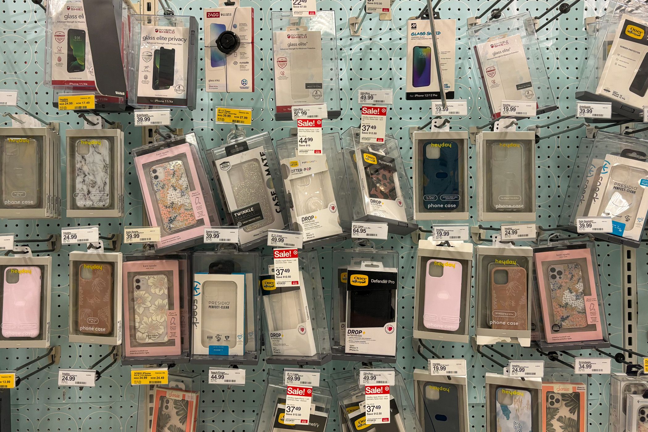
Most smartphone models are updated yearly, and even though they usually don’t undergo significant design changes each time, cases designed for one model usually won’t work on the next iteration. So you’re stuck coughing up more money for a new case (or gambling with a naked phone). It doesn’t have to be this way, though.
We’re long past the era of smartphones receiving groundbreaking changes every year, outside of foldables and other experimental form factors. Most of the improvements we see each year’s iPhone or Galaxy S device are faster internal components and faster software, not new screen dimensions or a completely new shape. The most significant design change in each generation is usually the position and size of the rear cameras, which don’t need to move around on the back each year, but that’s what happens anyway.
Take the Galaxy S20 Plus and its successors as an example, which are all nearly the same size and shape. The Galaxy S20 Plus was 161.9 x 73.7 x 7.8 mm, the Galaxy S21 Plus was 161.5 x 75.6 x 7.8 mm, and the Galaxy 22 Plus was 157.4 x 75.8 x 7.6 mm.
The only change over those three generations that was more than a fraction of a millimeter was the depth, which grew to accommodate a larger battery 4,800mAh battery in the S21+, before shrinking back down to 4,500mAh on the S23+. Progress!
You might not even notice the change in physical dimensions from one iPhone to the next, but they are enough to render every existing case and most screen protectors unusable. After people start upgrading to the next model, demand for previous-generation accessories slows down. Eventually, they end up in clearance sections, donation stores, and landfills. Take a peek in a phone store dumpster after new phones arrive, and you’ll surely find bag upon bag of discarded old-generation cases still brand new in the boxes. How many more pieces of plastic end up polluting the environment because Samsung, Motorola, or Google moved the rear cameras slightly or changed the width of their new phones by a fraction of a millimeter?
Consistent Phone Size and Design Can Work (And These Examples Prove It)
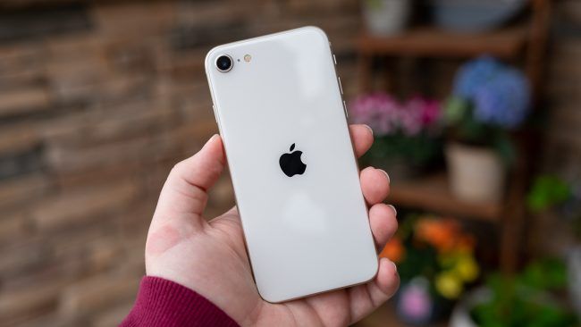
There have been a few examples of smartphones maintaining the same design over multiple generations. The most high-profile example is the iPhone SE series, where Apple reuses the shells of older mainline iPhones and updates the internal hardware.
The original iPhone SE from 2016 had the same design as the iPhone 5S from 2013, allowing people to switch from the 5S to the SE and keep using all the same accessories.
The second-generation iPhone SE used the shell from the iPhone 8, and that same shell was used again for the third-generation iPhone SE. That’s three phones over the course of six years that can all use the same accessories, which not only cuts down on waste, but also means people with older phones still have readily available options for cases and screen protectors.
It also seems like a win for the accessory companies making cases and other products — they might lose out on some money from people buying fewer new cases, but they can also keep selling the same design for a longer time.
Flagship phones don’t often use the same shell across multiple generations, but Motorola came close with the Moto Z series, starting in 2016. Motorola created several modular accessories that magnetically attached to the phones, called Moto Mods, such as portable batteries and projectors. They were designed to be flush with the phone’s frame, which meant all the Moto Z phones had to use identical width and height dimensions. However, the mod ecosystem ended up a flop, so the 2019 Moto Z4 was the final phone to use that design.
Also, the screen size and phone depth changed slightly between each model, so you couldn’t re-use cases or screen protectors across the Z series anyway. That probably wouldn’t have saved the Z series, but it certainly would have helped.
Consistent Design Is Good for Everyone (And the Environment)
It’s fine for smartphones (as well as tablets and other electronics) to update the design if there’s a valid reason, like changing the screen size, packing in a larger battery, or adding more buttons. However, many times design updates are just change for the sake of change.
For five years in a row, from the iPhone 11 through the iPhone 15, the screen has remained the same 6.1 inches. The screen bezels shrunk on the iPhone 12, but since then, the physical dimensions have changed just enough to render accessories incompatible between each generation.
Many smartphone manufacturers, especially Apple, are making significant changes to reduce the environmental impact of their products. Many of those changes are more difficult, such as switching to more efficient energy sources and improving the hardware repair process. This should be one aspect that is much easier to adopt — if you’re already selling almost the same phone design every year, why not literally do that and reduce the environmental waste from accessories? What good is obsessing about making every element of your supply chain carbon-neutral if a single tiny design choice forces entire factories to dump their stock, retool, and adjust to compensate for the change you made?
Constant smartphone redesigns are bad for the phone buyer, and bad for the environment. It’s time for them to end.


