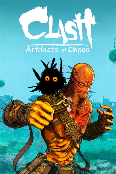
Video games can use many different styles to create a unique look and feel. For Clash: Artifacts of Chaos, we knew from the beginning that we wanted to use a very colorful and non-realistic one for many reasons: to set it apart from other games in the genre, to allow us to stylize and exaggerate the animation and color palette, and to approximate the illustrations and punk-fantasy art that inspired the creation of the world in the first place.
Stylized rendering is a powerful tool that highlights that “What to draw?” and “How to draw it?” are two different questions. This is the third time we have visited the surreal world of Zenozoik and its primitive humanoid animal inhabitants, but it is the first time we are approaching the “how to draw it” with a really different technique!

There are many ways we could have gone, and we tested several different styles before landing on the one we used. By choosing what to simplify and what to exaggerate, you get very different effects. One of the more interesting styles we tested was a painterly thick brushstroke look (above). It allowed very expressive shapes, a messy almost impressionistic look, and was certainly very different.
We eventually decided against this style because of the excessive simplification it produced: our artists always wanted to add more small details to characters and environments, details which would not really shine in this impressionistic style.

The rendering style we ended up going for is called hatching, or crosshatching. It is a drawing style that creates shading and conveys lighting by drawing closely spaced lines. The closer the lines are together, the darker the area will appear. This style is often used in traditional drawings, illustrations, and comic books, and gives the artwork a hand-drawn look. This technique allowed us to achieve an illustrated style while still preserving detail.
By separating the lighting information and conveying light intensity and detail mostly with the ink pencil linework, we can treat color as a separate layer. This allows us to use more artificial color schemes which would look strange in a realistic rendering style but feel consistent with the look of an illustration. Violet and orange skies, characters with blue or yellow skin, orange dirt, cyan and green mineral deposits in the mountain walls… we intentionally use saturated colors, or color combinations hard to find in nature to convey this is a different world.

One of the main challenges to make the hatching style work was to make sure that it worked at different distances and different levels of detail. It is not just drawing lines on the surfaces, because what works for small details up close might not work for a mountain at a distance. Also some features must be preserved more carefully, like character eyes which are a focus point and must always remain well defined and sharp. The linework needs to be consistent to seem like it was all done with the same tool.
Finally, while we have designed a very specific look for the game, we still chose to enable configuration options for players to personalize the look. Players can choose a cleaner look or add and remove effects. We even left in a comic book inspired black and white mode, which is not ideal for readability, but is still very cool to play with!

Clash: Artifacts of Chaos will be released on March 9 and is available now for pre-order on Xbox Series X|S and Xbox One. If you are interested in keeping track of all future news, devs blogs and trailers, don’t hesitate to follow us on Twitter or join our official Discord server.

Clash: Artifacts of Chaos
Nacon

