Welcome to another edition of Box Art Brawl!
In last week’s brawl, we checked out Mario Golf for the Game Boy Color, pitting the Western Design against the rather quirky effort from Japan. In the end, Japan won the vote at 72% – well done!
This week, we’re moving onto the Nintendo DS with Super Scribblenauts from WB Games and Konami (Japan). Released in 2010, it carried on the original game’s premise of allowing you to create a vast array of objects to solve puzzles by simply writing them out.
We’ve got three distinct cover designs here, so without further ado, let’s get cracking.
Be sure to cast your votes in the poll below; but first, let’s check out the box art designs themselves.
North America
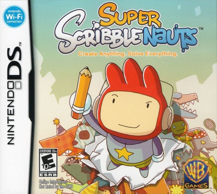
There’s a lovely almost-sunset kind of vibe going on with North America’s background, while the game’s protagonist, Maxwell, is showcased front and centre, wielding the mighty pencil up in the air. It’s also made to look as though he’s bursting through the paper display itself, which is a nice little touch.
Europe
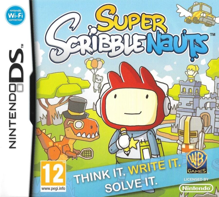
Europe’s design is quite similar, though the colours are simultaneously brighter and yet more muted, somehow. Maxwell is also situated directly within the game’s world, with various characters making up the image’s background. Also, there’s a flying car. Nice.
Japan
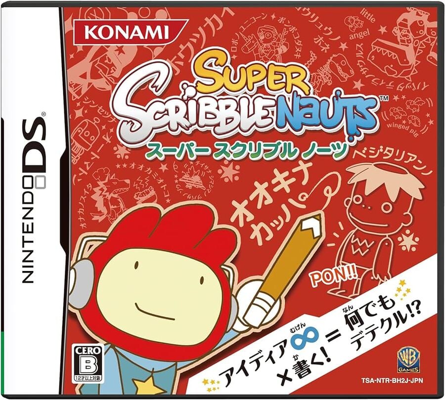
Japan’s design takes on a more abstract approach, showcasing Maxwell in the bottom left corner against a red background filled with doodles. It makes sense given the overall premise of the title, and it’s certainly a bold, eye-catching design.
Thanks for voting! We’ll see you next time for another round of the Box Art Brawl.

Welcome to another edition of Box Art Brawl!
In last week’s brawl, we checked out Mario Golf for the Game Boy Color, pitting the Western Design against the rather quirky effort from Japan. In the end, Japan won the vote at 72% – well done!
This week, we’re moving onto the Nintendo DS with Super Scribblenauts from WB Games and Konami (Japan). Released in 2010, it carried on the original game’s premise of allowing you to create a vast array of objects to solve puzzles by simply writing them out.
We’ve got three distinct cover designs here, so without further ado, let’s get cracking.
Be sure to cast your votes in the poll below; but first, let’s check out the box art designs themselves.
North America

There’s a lovely almost-sunset kind of vibe going on with North America’s background, while the game’s protagonist, Maxwell, is showcased front and centre, wielding the mighty pencil up in the air. It’s also made to look as though he’s bursting through the paper display itself, which is a nice little touch.
Europe

Europe’s design is quite similar, though the colours are simultaneously brighter and yet more muted, somehow. Maxwell is also situated directly within the game’s world, with various characters making up the image’s background. Also, there’s a flying car. Nice.
Japan

Japan’s design takes on a more abstract approach, showcasing Maxwell in the bottom left corner against a red background filled with doodles. It makes sense given the overall premise of the title, and it’s certainly a bold, eye-catching design.
Thanks for voting! We’ll see you next time for another round of the Box Art Brawl.


