WHAT’S UP EVERYBODY, WELCOME TO ANO…. *cough cough, splutter*
Sorry… We had to try the whole YouTube thing. Yeah, it’s not for us. Welcome to another edition of Box Art Brawl, folks!
Before we get cracking with this week’s undoubtedly heated battle, let’s touch base with what went on last time when we looked at Donkey Kong Country for the SNES. Rather surprisingly, at least in this writer’s opinion, the Western design for North America and Europe won comfortably with 72% of the vote. Y’all didn’t like that gorgeous Japanese version, huh?
So, this time, we’re going to be checking out the delightful Puyo Pop Fever for the GameCube. Created by Sonic Team and published by Sega, Puyo Pop Fever is perhaps one of the more beloved entries in the Puyo Puyo franchise (and it still isn’t on Switch?! Come on…), launching all the way back in 2003. The franchise itself is still going strong today with the latest entry, Puyo Puyo Tetris 2, launching on Switch in 2020.
It’s a good old fashion three-way battle this week, so let’s get cracking!
Be sure to cast your votes in the poll below; but first, let’s check out the box art designs themselves.
North America
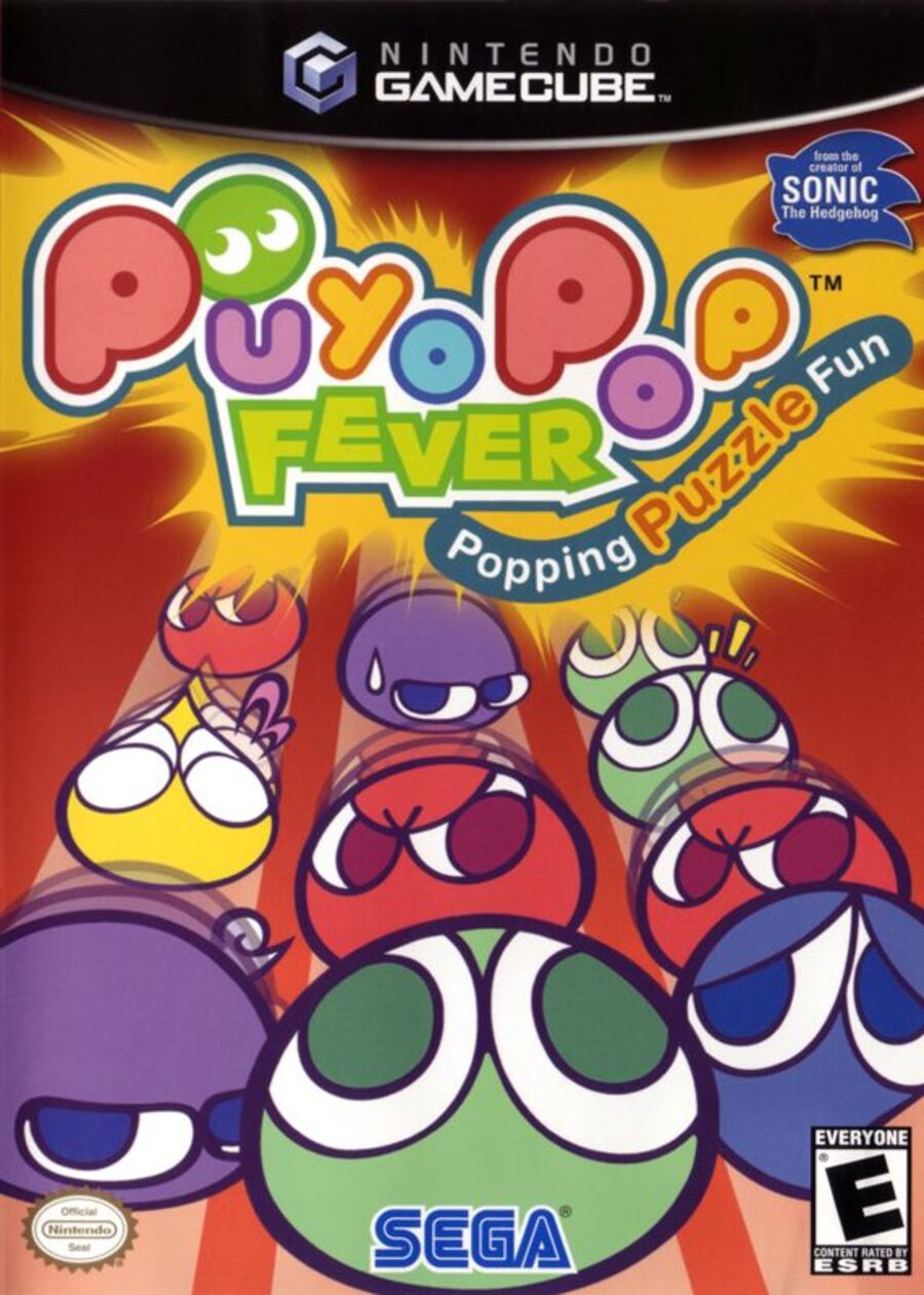
Curiously, the North American release of Puyo Pop Fever is the only one not to feature the protagonist Amitie on the cover. Instead, we’ve just got a bunch of the signature, slimy Puyos lining up from front to back. It’s perhaps a good indication of what the gameplay is like in the title, but we’d be lying if we said it was an exciting and bold design. It’s fine, we guess.
Europe
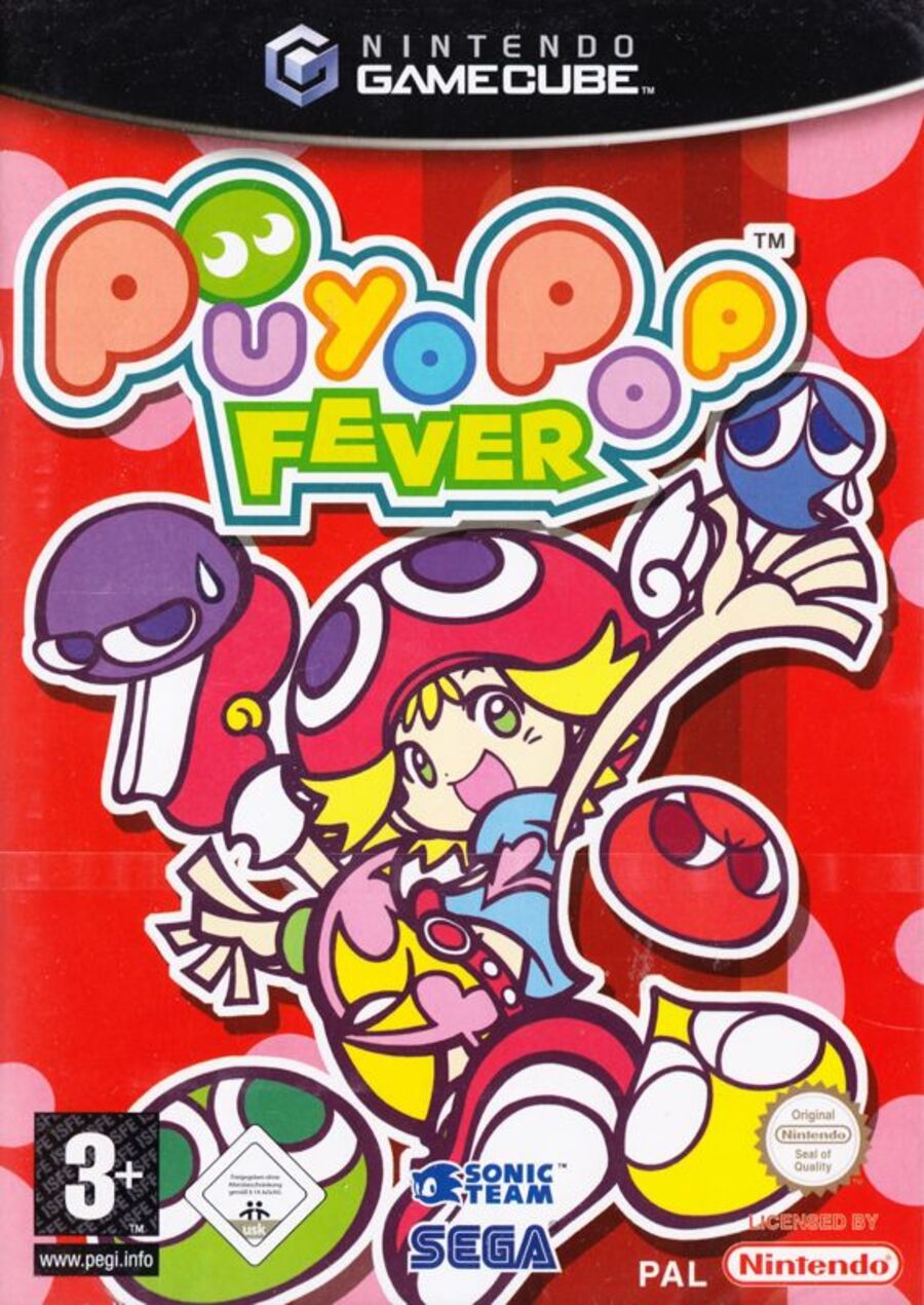
Ah, here we go, this is more like it. Here, we can see Amitie front and center, surrounded by those adorable Puyos. The red background is retained from the North American design, but it’s a lot brighter this time with some pink spots dotted around to provide some nice variety. We like this one!
Japan
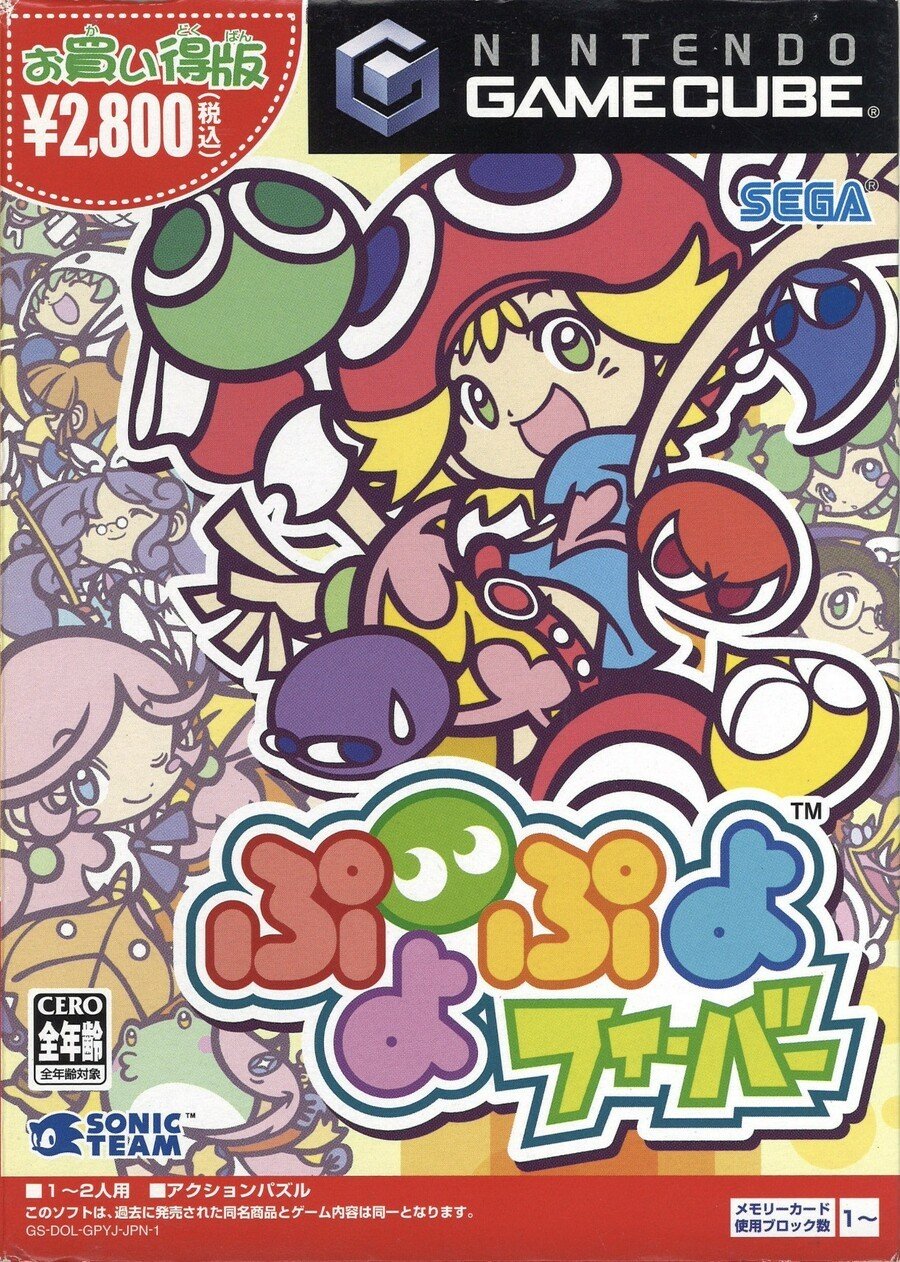
Japan’s design is very similar to Europe, featuring the same image of Amitie along with the surrounding Puyos (albeit in slightly different positions and poses). The main difference here is that the background is made up of more of the game’s core characters, and it definitely makes the overall image pop. Of course, the logo itself is also written in Japanese, which frankly looks awesome. We reckon this will be a close battle between Europe and Japan this time.
Thanks for voting! We’ll see you next time for another round of the Box Art Brawl.

WHAT’S UP EVERYBODY, WELCOME TO ANO…. *cough cough, splutter*
Sorry… We had to try the whole YouTube thing. Yeah, it’s not for us. Welcome to another edition of Box Art Brawl, folks!
Before we get cracking with this week’s undoubtedly heated battle, let’s touch base with what went on last time when we looked at Donkey Kong Country for the SNES. Rather surprisingly, at least in this writer’s opinion, the Western design for North America and Europe won comfortably with 72% of the vote. Y’all didn’t like that gorgeous Japanese version, huh?
So, this time, we’re going to be checking out the delightful Puyo Pop Fever for the GameCube. Created by Sonic Team and published by Sega, Puyo Pop Fever is perhaps one of the more beloved entries in the Puyo Puyo franchise (and it still isn’t on Switch?! Come on…), launching all the way back in 2003. The franchise itself is still going strong today with the latest entry, Puyo Puyo Tetris 2, launching on Switch in 2020.
It’s a good old fashion three-way battle this week, so let’s get cracking!
Be sure to cast your votes in the poll below; but first, let’s check out the box art designs themselves.
North America

Curiously, the North American release of Puyo Pop Fever is the only one not to feature the protagonist Amitie on the cover. Instead, we’ve just got a bunch of the signature, slimy Puyos lining up from front to back. It’s perhaps a good indication of what the gameplay is like in the title, but we’d be lying if we said it was an exciting and bold design. It’s fine, we guess.
Europe

Ah, here we go, this is more like it. Here, we can see Amitie front and center, surrounded by those adorable Puyos. The red background is retained from the North American design, but it’s a lot brighter this time with some pink spots dotted around to provide some nice variety. We like this one!
Japan

Japan’s design is very similar to Europe, featuring the same image of Amitie along with the surrounding Puyos (albeit in slightly different positions and poses). The main difference here is that the background is made up of more of the game’s core characters, and it definitely makes the overall image pop. Of course, the logo itself is also written in Japanese, which frankly looks awesome. We reckon this will be a close battle between Europe and Japan this time.
Thanks for voting! We’ll see you next time for another round of the Box Art Brawl.


