Be sure to cast your votes in the poll below; but first, let’s check out the box art designs themselves.
North America
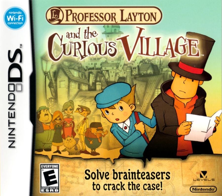
What we will see across the three different box arts is a choice being made between selling the game on its puzzles, or on its mystery. In the case of the North American variant, it’s all about the latter. This cover showcases the game’s protagonists, looking around with a slightly concerned look while some of the residents of St. Mystere gather behind them. It’s a cover that provokes questions. What’s that letter in Layton’s hand? What’s in the spooky tower that looms behind them? How on earth did that cat get to be so big?
Europe
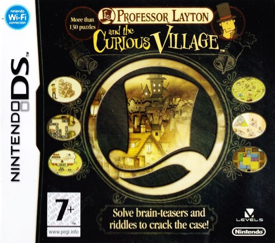
The European cover takes a noticeably different approach to NA, instead marketing the game by its puzzles first and foremost. The sense of mystery is here replaced by the giant Layton logo, surrounded by snapshots of the puzzles that are in store. This isn’t all about the characters (Hershel is subjugated to a little ‘hmm’ pose in the top corner), but instead all about the gameplay.
Japan
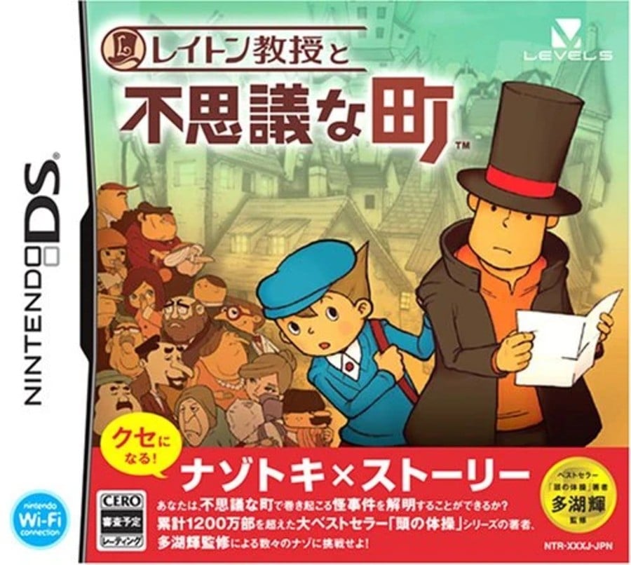
The Japanese box art is back in line with that which we saw for NA. In fact, on an initial glance, you might even assume that it is the same cover, but looking closer reveals a whole bunch more of St. Mystere’s locals lingering nearby. It might not be the biggest change, it is true, but finishing the game and discovering how all of the residents are connected does give this cover a slightly more threatening air. Layton and Luke aren’t up against a small-scale mystery, this suggests that they have a whole town to reckon with.
Thanks for voting! We’ll see you next time for another round of the Box Art Brawl.
Be sure to cast your votes in the poll below; but first, let’s check out the box art designs themselves.
North America

What we will see across the three different box arts is a choice being made between selling the game on its puzzles, or on its mystery. In the case of the North American variant, it’s all about the latter. This cover showcases the game’s protagonists, looking around with a slightly concerned look while some of the residents of St. Mystere gather behind them. It’s a cover that provokes questions. What’s that letter in Layton’s hand? What’s in the spooky tower that looms behind them? How on earth did that cat get to be so big?
Europe

The European cover takes a noticeably different approach to NA, instead marketing the game by its puzzles first and foremost. The sense of mystery is here replaced by the giant Layton logo, surrounded by snapshots of the puzzles that are in store. This isn’t all about the characters (Hershel is subjugated to a little ‘hmm’ pose in the top corner), but instead all about the gameplay.
Japan

The Japanese box art is back in line with that which we saw for NA. In fact, on an initial glance, you might even assume that it is the same cover, but looking closer reveals a whole bunch more of St. Mystere’s locals lingering nearby. It might not be the biggest change, it is true, but finishing the game and discovering how all of the residents are connected does give this cover a slightly more threatening air. Layton and Luke aren’t up against a small-scale mystery, this suggests that they have a whole town to reckon with.
Thanks for voting! We’ll see you next time for another round of the Box Art Brawl.


