
It’s time to witness another clash of the covers as we dive into this week’s edition of Box Art Brawl!
Last time, things got medieval as we matched up two different covers from the DS’ Castlevania: Order of Ecclesia with North America facing off against the combined forces of Europe and Japan. Holy smokes was this a close one! NA just managed to seal the victory with 55% of the vote, while EU/JP took home 45% — that’s some classic Box Art Brawl action right there.
This week we are sticking with the Nintendo DS and pitting three covers against each other from 2009’s Might & Magic: Clash of Heroes. This fantasy puzzler RPG has just had a swanky Switch remaster courtesy of Dotemu, which we gave a ‘great’ 8/10 in our review. Now entering the world of Ashan once again, it seemed only right to look back to the source with a good old-fashioned cover match-up.
There are three different covers to choose between this week but only from two different regions. Why? Because NA has brought a duo of fighters to this brawl — why didn’t Europe think of that?
And so, without further ado, let the challenge… begin.
Be sure to cast your votes in the poll below; but first, let’s check out the box art designs themselves.
North America #1

The North American cover hits just about every fantasy beat that you could hope for. We see our main heroes along the bottom, each wielding their respective fantasy skill, small silhouettes of dragons and castles pepper the background and even the ‘Clash of Heroes’ font has a certain Lord of the Rings flare. There’s no doubting what kind of world this game takes place in.
North America #2
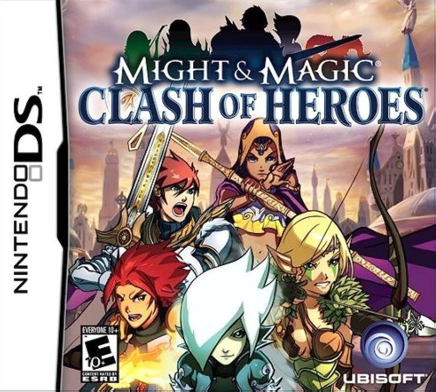
North America’s other box art is similar to the first, though there are some notable changes. The characters are now the main focal point, but the cream background returns, here adorned with towering buildings instead of dragons and mountains. The title font has also changed and now features a silhouette of the characters on top of it too.
Europe
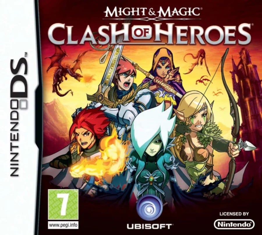
The European cover takes things up a notch. Gone is the cream background, here replaced by a firey red; The characters are again front and centre, stacked up like a modern-day superhero movie poster; even the dragons are clearer to see, being given more detail than in the first NA version. In fact, the only thing that seems toned down is the font, which appears far more standard than that seen previously.
Thanks for voting! We’ll see you next time for another round of the Box Art Brawl.

It’s time to witness another clash of the covers as we dive into this week’s edition of Box Art Brawl!
Last time, things got medieval as we matched up two different covers from the DS’ Castlevania: Order of Ecclesia with North America facing off against the combined forces of Europe and Japan. Holy smokes was this a close one! NA just managed to seal the victory with 55% of the vote, while EU/JP took home 45% — that’s some classic Box Art Brawl action right there.
This week we are sticking with the Nintendo DS and pitting three covers against each other from 2009’s Might & Magic: Clash of Heroes. This fantasy puzzler RPG has just had a swanky Switch remaster courtesy of Dotemu, which we gave a ‘great’ 8/10 in our review. Now entering the world of Ashan once again, it seemed only right to look back to the source with a good old-fashioned cover match-up.
There are three different covers to choose between this week but only from two different regions. Why? Because NA has brought a duo of fighters to this brawl — why didn’t Europe think of that?
And so, without further ado, let the challenge… begin.
Be sure to cast your votes in the poll below; but first, let’s check out the box art designs themselves.
North America #1

The North American cover hits just about every fantasy beat that you could hope for. We see our main heroes along the bottom, each wielding their respective fantasy skill, small silhouettes of dragons and castles pepper the background and even the ‘Clash of Heroes’ font has a certain Lord of the Rings flare. There’s no doubting what kind of world this game takes place in.
North America #2

North America’s other box art is similar to the first, though there are some notable changes. The characters are now the main focal point, but the cream background returns, here adorned with towering buildings instead of dragons and mountains. The title font has also changed and now features a silhouette of the characters on top of it too.
Europe

The European cover takes things up a notch. Gone is the cream background, here replaced by a firey red; The characters are again front and centre, stacked up like a modern-day superhero movie poster; even the dragons are clearer to see, being given more detail than in the first NA version. In fact, the only thing that seems toned down is the font, which appears far more standard than that seen previously.
Thanks for voting! We’ll see you next time for another round of the Box Art Brawl.


