Be sure to cast your votes in the poll below; but first, let’s check out the box art designs themselves.
North America
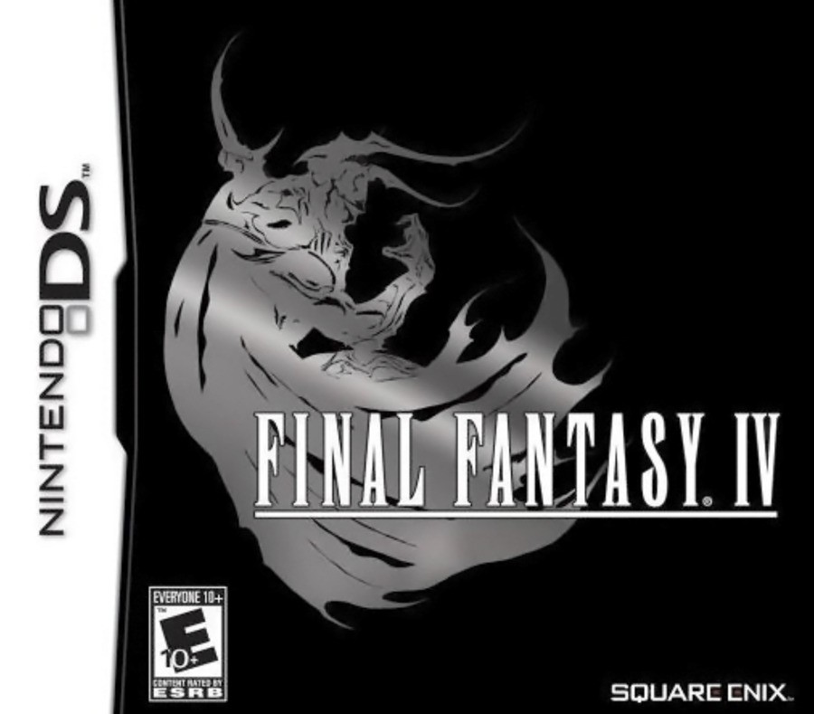
So this is very much your “quintessential” Final Fantasy cover, with the beautiful title font set against a lovely image of antagonist Golbez. What’s interesting about the North American version, however, is that the standardised colour palette for Final Fantasy has effectively been inverted, with the title in white and the background in black. The image of Golbez, meanwhile, is all shiny and pretty. Ooh…
Europe
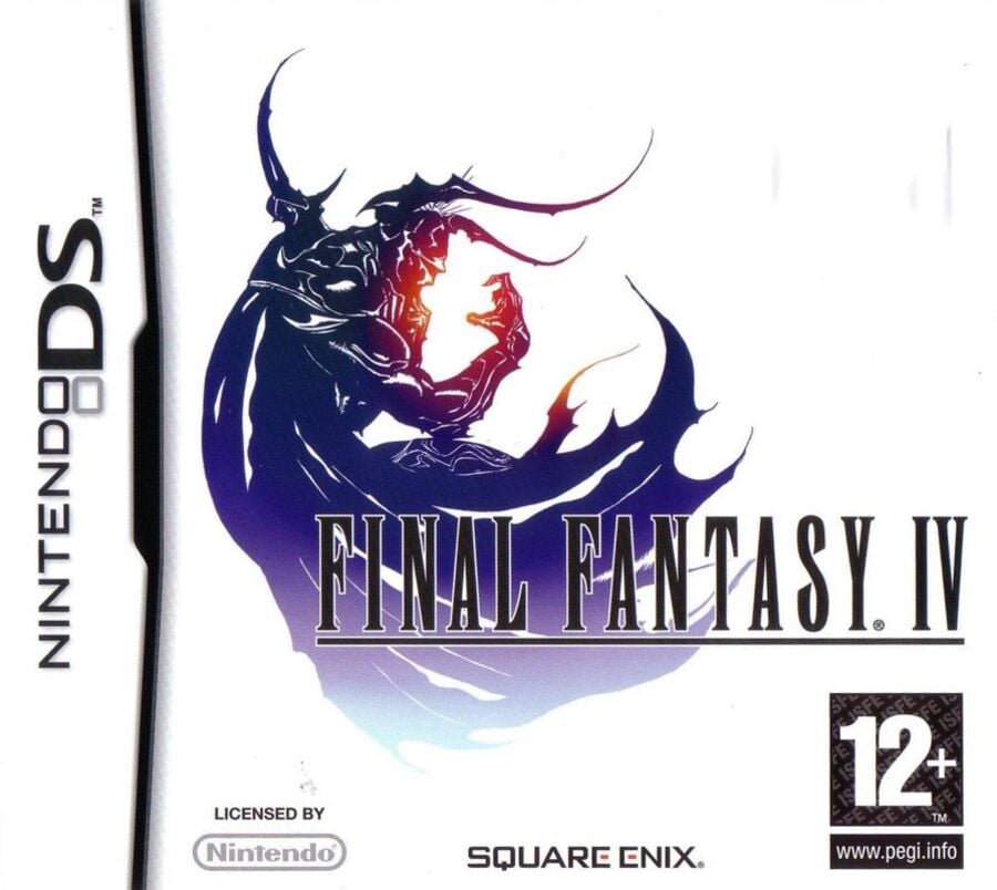
So for Europe, the composition is exactly the same as its North American counterpart, but the colours are much more in keeping with Final Fantasy’s “traditional” image. The title font is now in black, the background is in white, and the image of Golbez is now mostly blue with hints of orange and red.
Japan
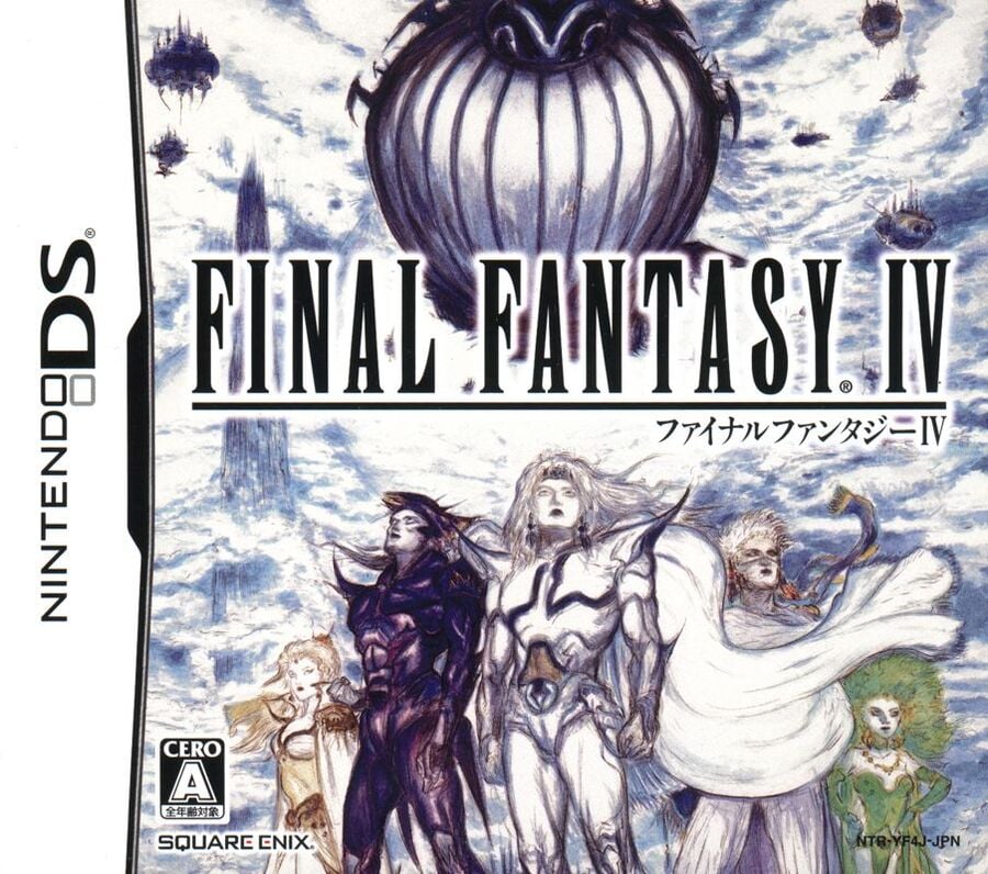
Okay, so Japan really bucks the trend with this one, utilising the skillset of Final Fantasy illustrator Yoshitaka Amano for the cover art. We see the game’s core protagonists in the foreground with a whole bunch of airships and clouds in the background. It’s a striking piece, to be sure, but is it as iconic as the European/North American approach..?
Thanks for voting! We’ll see you next time for another round of the Box Art Brawl.
Be sure to cast your votes in the poll below; but first, let’s check out the box art designs themselves.
North America

So this is very much your “quintessential” Final Fantasy cover, with the beautiful title font set against a lovely image of antagonist Golbez. What’s interesting about the North American version, however, is that the standardised colour palette for Final Fantasy has effectively been inverted, with the title in white and the background in black. The image of Golbez, meanwhile, is all shiny and pretty. Ooh…
Europe

So for Europe, the composition is exactly the same as its North American counterpart, but the colours are much more in keeping with Final Fantasy’s “traditional” image. The title font is now in black, the background is in white, and the image of Golbez is now mostly blue with hints of orange and red.
Japan

Okay, so Japan really bucks the trend with this one, utilising the skillset of Final Fantasy illustrator Yoshitaka Amano for the cover art. We see the game’s core protagonists in the foreground with a whole bunch of airships and clouds in the background. It’s a striking piece, to be sure, but is it as iconic as the European/North American approach..?
Thanks for voting! We’ll see you next time for another round of the Box Art Brawl.


