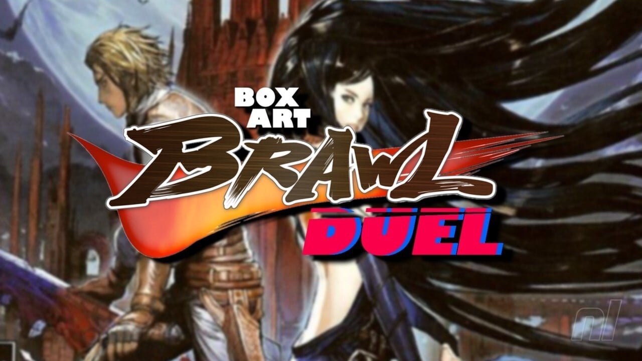
Be sure to cast your votes in the poll below; but first, let’s check out the box art designs themselves.
North America
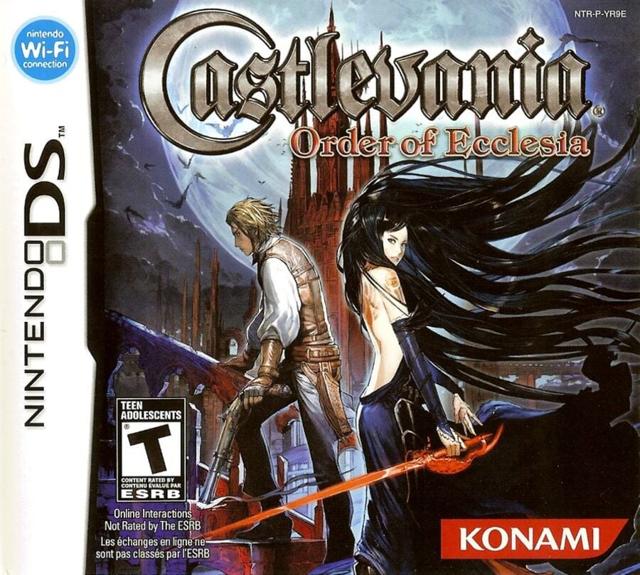
North America’s design features our heroine Shanoa and unlockable character Albus standing side-by-side (sort of) against a rather striking backdrop of… you guessed it, a castle. It’s very reminiscent of older Castlevania titles with a distinct painterly quality that just looks wonderful.
Europe / Japan
Okay, so we’ve lumped Europe and Japan together here, but there are some very minor differences between the two: mainly the logo itself – obviously – and the fact that Japan’s image is slightly larger than Europe’s. That’s really it. Be sure to click on each image to view it in full.
Otherwise, both images feature Shanoa in all her glory against a full moon in the background, much like North America’s design. We’d argue that it’s a more impactful image, but it’s a bit of a departure from the more “traditional” Castlevania box art approach.
Thanks for voting! We’ll see you next time for another round of the Box Art Brawl.
Be sure to cast your votes in the poll below; but first, let’s check out the box art designs themselves.
North America

North America’s design features our heroine Shanoa and unlockable character Albus standing side-by-side (sort of) against a rather striking backdrop of… you guessed it, a castle. It’s very reminiscent of older Castlevania titles with a distinct painterly quality that just looks wonderful.
Europe / Japan
Okay, so we’ve lumped Europe and Japan together here, but there are some very minor differences between the two: mainly the logo itself – obviously – and the fact that Japan’s image is slightly larger than Europe’s. That’s really it. Be sure to click on each image to view it in full.
Otherwise, both images feature Shanoa in all her glory against a full moon in the background, much like North America’s design. We’d argue that it’s a more impactful image, but it’s a bit of a departure from the more “traditional” Castlevania box art approach.
Thanks for voting! We’ll see you next time for another round of the Box Art Brawl.


