Hi everyone, and welcome to another edition of Box Art Brawl.
Last time, we took a look at Yoshi’s Island for the N64. In the end, the vote heavily favoured towards the Japanese box art, which went for a lovely embroidered aesthetic over the more traditional approach taken by North America and Europe. With 64% of the vote, Japan won by a near landslide. Well done!
This time, we’re jumping forward in time a bit to 2003 and the launch of Ubisoft’s Beyond Good and Evil for the GameCube. Although the action-adventure was deemed a commercial failure, it nevertheless gained a significant cult following, leading to Ubisoft announcing a sequel in 2008 which… still isn’t out. Oh well.
Beyond Good and Evil sadly didn’t launch in Japan back in 2003, so we’re just going to be looking at the North American and European box art this week. With that in mind, let’s get cracking, shall we?
Be sure to cast your votes in the poll below; but first, let’s check out the box art designs themselves.
North America
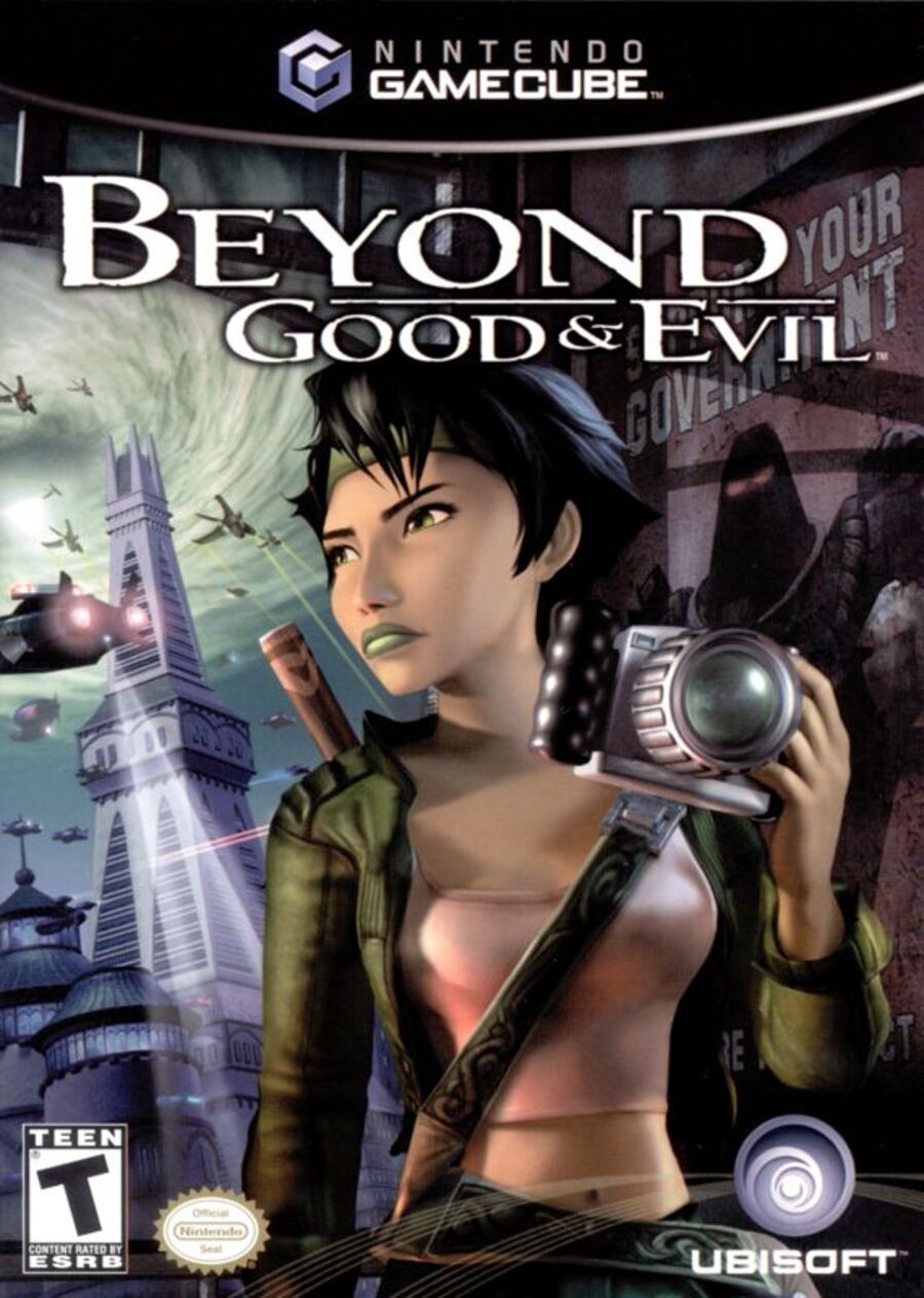
Both variants here are relatively similar to one another. Both showcase the game’s journalist protagonist, Jade, looking exceptionally badass, we must say. The North American version features a more close-up image of the character with the logo itself sitting just above her.
We can also catch a decent glimpse of the game’s world in the background, lending the overall image a nice sense of place. Overall, a decent effort!
Europe
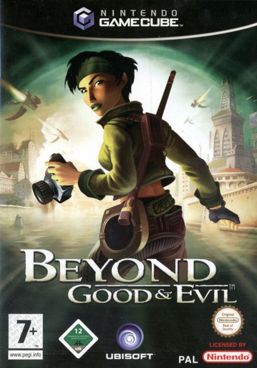
Here, we can see a bit more of Jade herself as she takes centre stage in the composition. The overall brightness of the image has been boosted slightly in comparison to the North American version, and we’d argue that Jade’s pose is a lot more impactful.
This is going to be a tough one! Over to you, folks.
Thanks for voting! We’ll see you next time for another round of Box Art Brawl.

Hi everyone, and welcome to another edition of Box Art Brawl.
Last time, we took a look at Yoshi’s Island for the N64. In the end, the vote heavily favoured towards the Japanese box art, which went for a lovely embroidered aesthetic over the more traditional approach taken by North America and Europe. With 64% of the vote, Japan won by a near landslide. Well done!
This time, we’re jumping forward in time a bit to 2003 and the launch of Ubisoft’s Beyond Good and Evil for the GameCube. Although the action-adventure was deemed a commercial failure, it nevertheless gained a significant cult following, leading to Ubisoft announcing a sequel in 2008 which… still isn’t out. Oh well.
Beyond Good and Evil sadly didn’t launch in Japan back in 2003, so we’re just going to be looking at the North American and European box art this week. With that in mind, let’s get cracking, shall we?
Be sure to cast your votes in the poll below; but first, let’s check out the box art designs themselves.
North America

Both variants here are relatively similar to one another. Both showcase the game’s journalist protagonist, Jade, looking exceptionally badass, we must say. The North American version features a more close-up image of the character with the logo itself sitting just above her.
We can also catch a decent glimpse of the game’s world in the background, lending the overall image a nice sense of place. Overall, a decent effort!
Europe

Here, we can see a bit more of Jade herself as she takes centre stage in the composition. The overall brightness of the image has been boosted slightly in comparison to the North American version, and we’d argue that Jade’s pose is a lot more impactful.
This is going to be a tough one! Over to you, folks.
Thanks for voting! We’ll see you next time for another round of Box Art Brawl.


