 At a glance
Expert’s Rating
Pros
- Beautiful timeless design
- Superb battery life
Cons
- Design has barely changed in years
- Disruptive interface changes in watchOS 10
Our Verdict
The Apple Watch Series 9 is just like the Series 8 but improves on it in a few small ways: the processor is faster, battery life is considerably better, the screen is brighter, and you get the new double tap feature. Almost by default, the Series 9 wins the title of the best general-purpose smartwatch Apple has ever made.
Price When Reviewed
From $399
Best Prices Today: Apple Watch Series 9

$389.99

$399

$399

$399

$399.99
It’s probably fair to say that the Apple Watch is not prone to radical change. In the eight years and nine standard generations since the first model launched in 2015, the fundamental design has barely altered, and it’s often difficult to differentiate one generation from another. One day, perhaps, this will change. But not today.
The Apple Watch Series 9, launched in fall 2023, doesn’t mess with the formula that has seen Apple effortlessly dominate the smartwatch market for the best part of a decade, and differs from last year’s Series 8 in only a few respects. But does that mean it’s a bad watch? Of course not! Aside from the Apple Watch Ultra line, which is aimed at a different audience, this is the best smartwatch Apple has ever made, as this in-depth review will explain.
Design & build
- Physical identical to Series 8
- But remains a classic minimalist design
- Attractive and comfortable on the wrist
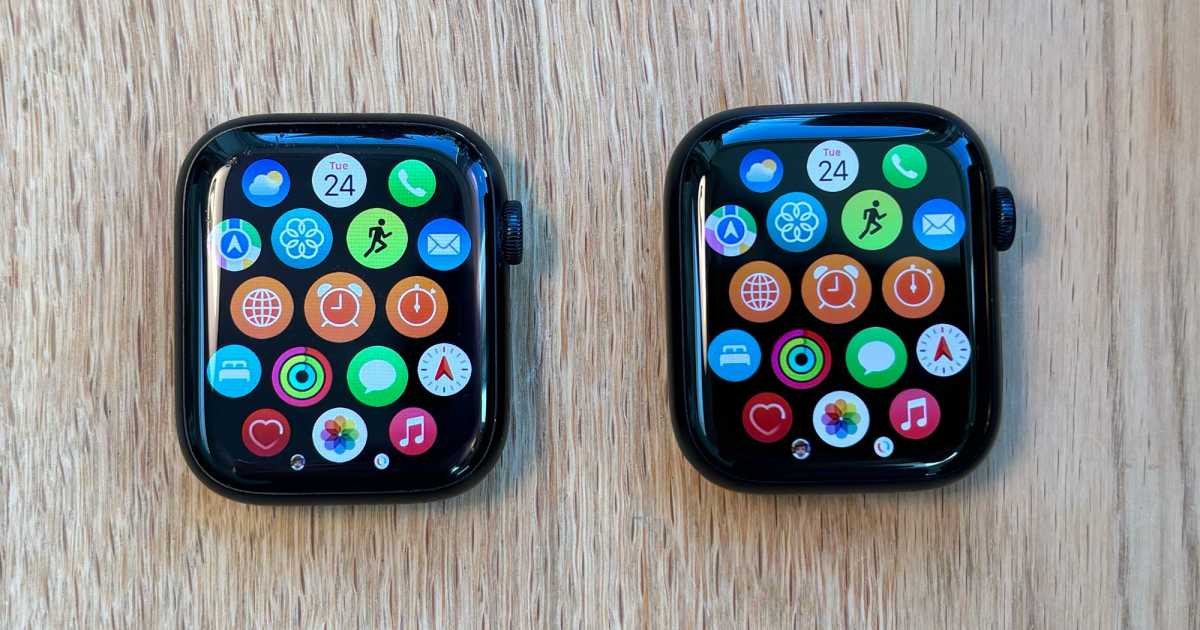
Series 8 owners should look away now because very little has changed in this department. That isn’t the greatest of tragedies, of course, since the Series 8 was already a beautifully designed little object.
David Price / Foundry
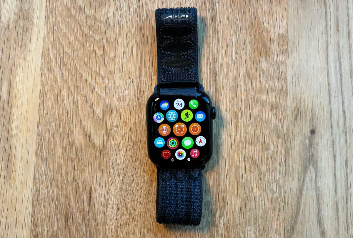
Like its predecessors, the Series 9 is a neat, organic-feeling squircle with pleasing curved edges and corners that sits unobtrusively on your wrist; unlike the Apple Watch Ultra, it very rarely gets caught on a sleeve and has never struck me as bulky. There’s a convex bulge on the underside of the watch, which is where the optical sensor presses into your wrist. This looks like it might be uncomfortable but really isn’t. (Although I occasionally worry that long-term use is creating a little divot in my skin, which is probably a sign I should wear it more loosely than I do at present.)
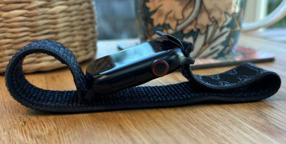
There’s a minimalist charm to the design, with just two hardware controls, a dial on the right and a button below this, and the button is so seamlessly integrated that it’s almost invisible. This isn’t a problem, of course, since you locate it by touch. The entire design, indeed, feels like an attempt to turn the watch into an invisible envelope for the screen, which is large and bright; outside of this frame, the matte-finish casing draws almost no attention to itself, which is how it should be.
David Price / Foundry
The Digital Crown dial, which is the showiest element of the case thanks to its (still pretty subtle) red circle marking, has a beautifully smooth action whether you’re rotating or pressing it. Apple is so good at these kinds of small but important details.
Screen quality
- Clear and colorful screen
- Twice as bright as the previous model
In most respects, the Series 9’s screen is the same as the one in the Series 9. Again, that doesn’t need to matter very much if you’re thinking of upgrading from an older model (or if this would be your first Apple Watch) but it feels worth mentioning just for the principle of the thing.
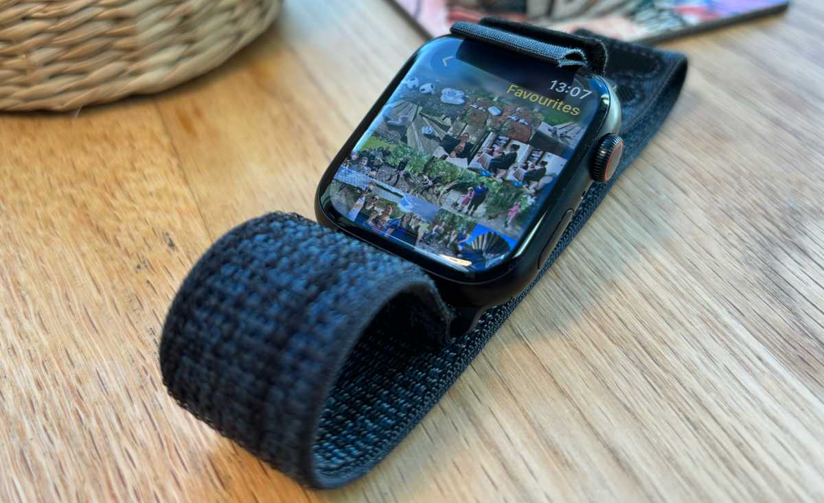
The size of the screen you get will depend on which version of the Series 9 you go for. The larger (45mm) model has a 1.9-inch screen with a resolution of 484 x 396; the 41mm edition has a 1.69-inch (430 x 352) screen. Either way, it’s a sharp, colorful display; even when zooming in hard on a photo, and peering very closely at the screen, I was unable to detect any pixelation or fuzziness. It just feels like a window into a digital world. It never feels like you’re looking at a screen, just interacting with your apps.
David Price / Foundry
Like the iPhone 15 and 15 Plus, however, the Apple Watch gets a bump in screen brightness this year. Last year’s Series 8 was capped at 1,000 nits, but the Series 9 goes up to 2,000. (Note that the Ultra line is one step ahead, having already hit 2,000 nits last year and jumping to 3,000 this time around.) In theory, this should mean better legibility outdoors, particularly when the conditions are bright–a common use case for the Apple Watch in its guise as a fitness companion. But I can’t say I really noticed the difference. In a good way, I guess, in the sense that I didn’t find the brightness of the Series 8 an issue.
At the other end of the scale, Apple says the Series 9 can get dimmer than previous models: it goes all the way down to 1 nit when you don’t want to disturb anyone or just want to preserve battery life. Mind you, Apple didn’t announce the minimum brightness of the Series 8, so it’s hard to judge how much things have changed… but some analysts have suggested it might have been capable of dropping to 2 nits and no lower. This doesn’t sound like much of a difference but it has an impact on battery performance as you’ll see below.
Performance: Paper gains
- Features S9, fastest ever Apple Watch processor
- Performance gains not yet apparent in real-world testing
Apple spent a fair bit of its launch presentation talking about the processor in the Apple Watch Series 9, which is called the S9. For the first time in years, we get a noticeable bump in processing power; the S8 and S7 in previous generations were essentially rebranded editions of the S6 in the Apple Watch Series 6 from 2020. But the S9 should deliver far better performance according to Apple.
The emphasis, there, on the word should.
Here’s the thing: processing power is not a limiting factor on the Apple Watch. The Series 8, we’re told, has what is in essence a three-year-old processor, but I’ve never found it slow, not even once. It can run every available app without an issue, switches between apps smoothly and rapidly, and generally behaves like the one-year-old product it is. The Series 9 is super-slick and super-fast, of course, but that’s no change from its predecessor.
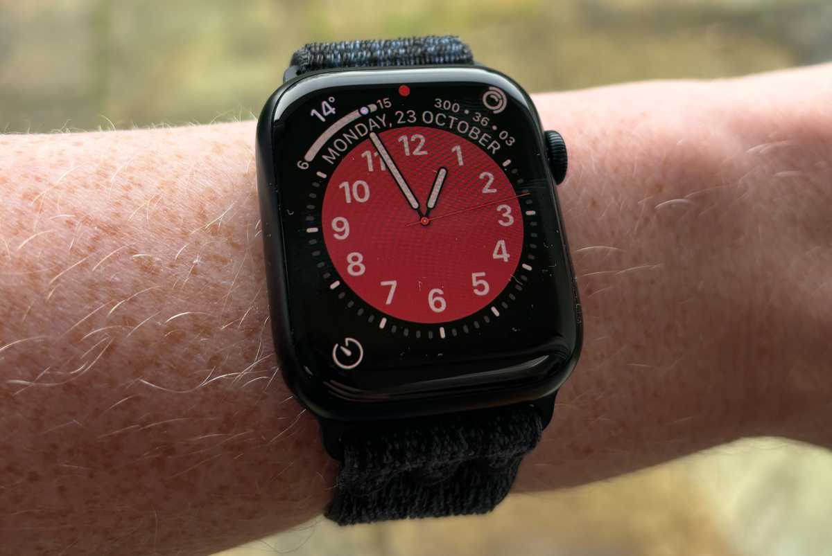
So if the S9 chip doesn’t give us a noticeable change in performance, what’s the point of it? Well, there are two benefits. It should mean the Series 9 is far more future-proofed than the previous few models, which may become more of an issue now that app developers have faster hardware to write software for; in a year or two the Series 8 might seem like a slow option. Second, the S9 is specifically cited as the basis for other improvements: It’s more power-efficient and it’s also enabled Apple to implement new gesture support. And to talk about the latter, we need to get into software.
David Price / Foundry
Software: watchOS suffers from change
- watchOS 10 features disruptive changes to the interface
- But watchOS in general remains the benchmark for smartwatches
One of the enduring advantages the Apple Watch has held over its rivals is the fact that it runs the watchOS software platform. Apple’s smartwatch operating system is efficient, user-friendly, and attractive. Its intuitiveness comes partly from smart design, and partly from consistency… but unfortunately, this year consistency has been thrown out. After several years with virtually the same interface, Apple’s UX experts chose the watchOS 10 update to switch things up a little, and the result, for this long-term Apple Watch user at least, is confusion and irritation in about equal measure.
The biggest problem is that the Dock has been removed. Previously, you could press the side button at any time and see a short curated list of your favorite apps; speaking personally, this was how I accessed virtually all apps. Now the side button brings up the Control Center, which used to be activated by swiping up from the bottom of the screen. Swiping up now brings up the Smart Stack. And the Dock cannot be accessed at all. (You can double-press the dial, which brings up a list of recently used apps, which is the next best thing. But this list cannot be curated, you just see what you’ve been using recently.)
There are smaller changes too, however. It used to be that you could switch easily from grid view to list view and vice versa by simply long-pressing on the app screen and selecting an option. Now you have to go into the Settings app. And it’s no longer possible to swipe easily between your watch faces; you have to long press first to open the face edit pane.
Change is not necessarily a bad thing. When the very first Apple Watch hit the market all those years ago, it had a dial and a button but clearly didn’t know what to use the button for… with the result that this was used as a single-use control for bringing up a list of contacts. It was only when the watchOS 3 update appeared that this was replaced by the Dock and the side button became useful.
But there’s a difference between the inevitable and necessary tinkering that occurs early in a product’s life, when use habits haven’t yet settled down and the manufacturer may not yet understand how the product will be used, and unnecessary tinkering later on when muscle memory has built up and habits have become ingrained. This is the latter. Perhaps in a few months’ time, I will be used to it, but for now, it’s annoying.
Double tap: The change you might like
- Useful gesture support (in beta for now)
- Hands-free responses to notifications
This isn’t supposed to be a review of watchOS 10, which we examine in depth elsewhere, so I won’t dwell on it much longer. But one of the system’s new features is particularly pertinent here because it’s a Series 9 (and Ultra 2) exclusive that relies on their S9 chip and sensors. It’s called Double Tap.
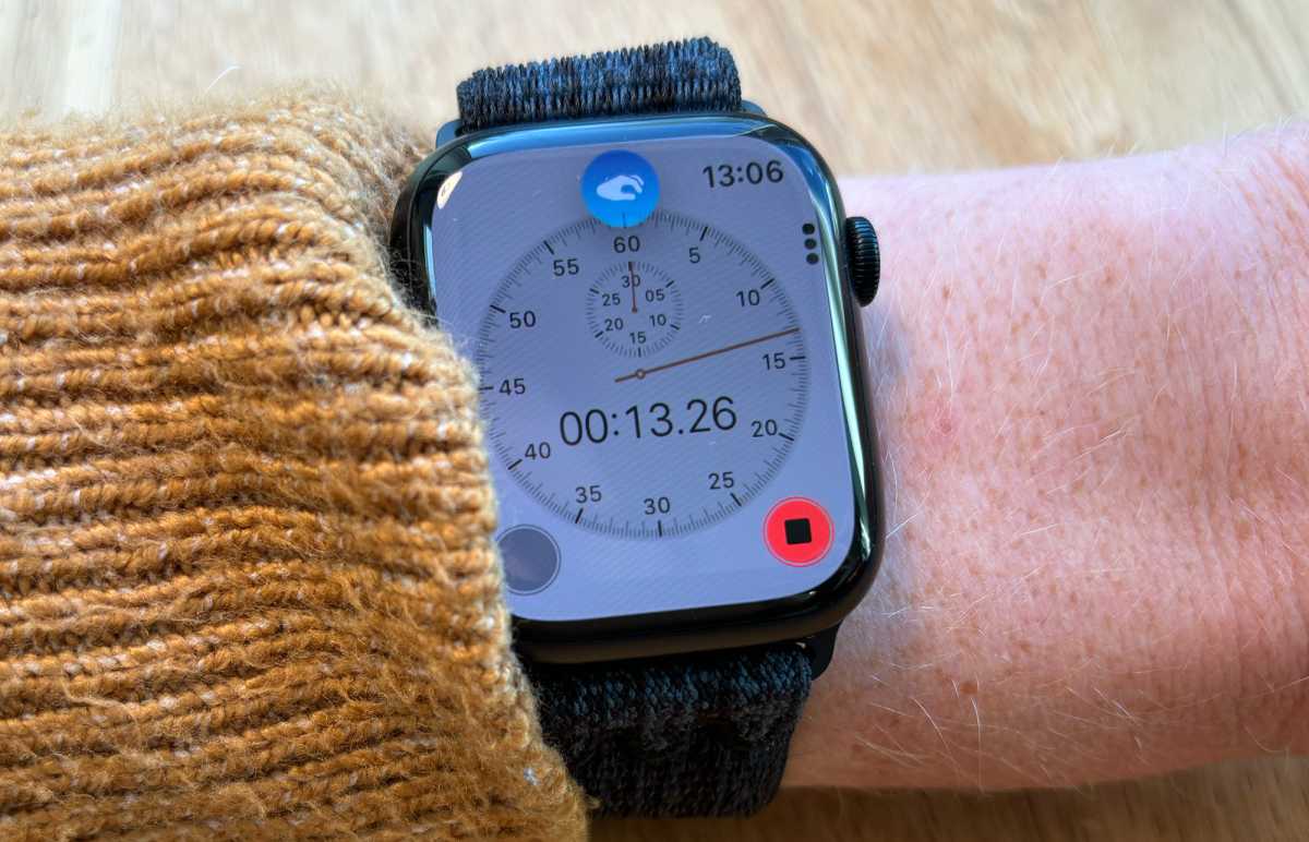
Double Tap is activated, as you’d expect, by making a double-tap gesture. What’s more surprising is that you don’t actually don’t tap on the screen or any of the buttons; instead, you tap together the thumb and index finger of the hand wearing the Apple Watch.
This gesture is mainly intended to be reactive, as a way of responding to incoming notifications when you’ve only got one hand free because you’re holding a coffee, hanging on to a strap on a subway train, or have just applied hand cream or whatever. It can be used to answer a phone call, record a voice message in response to a text, hit snooze on an alarm, stop a timer, take a photo when using Camera Remote, and various other quick actions.
David Price / Foundry
I like Double Tap, unlike so many of the other changes in watchOS 10, for two reasons: it’s in addition to other control methods rather than instead of them, and it can be turned off entirely if you don’t like it. I often forgot to use the feature in the excitement of an incoming call or alarm, and sometimes found the Apple Watch didn’t successfully detect it anyway. But I think it could become a useful option once we’re all used to it.
On-device Siri: An overdue change
- Non-informative Siri requests can be accessed on-device
- Noticeable improvements not in speed but in reliability
We’ve long asked Apple to give Siri a Siri-ous overhaul since it’s fast approaching the status of “not fit for purpose.” And while a larger, system-wise revamp still hasn’t arrived, it’s good to see Apple take the smaller but similarly much-needed step of enabling the new Apple Watch to use Siri without having to contact the internet.
The Series 9, for the first time in the Apple Watch’s history, can process many common Siri requests on-device. In theory that should mean they’re faster, which I can’t say I noticed: even with the power of the S9, there was still a noticeable pause while the watch thought about the request. But far more important in my opinion is the improvement in reliability when your internet connection is spotty. This removes a point of failure from the procedure (for some of us a point of very frequent failure) and it is glorious to see.
Please implement this on HomePod next, Apple.
Precision Finding
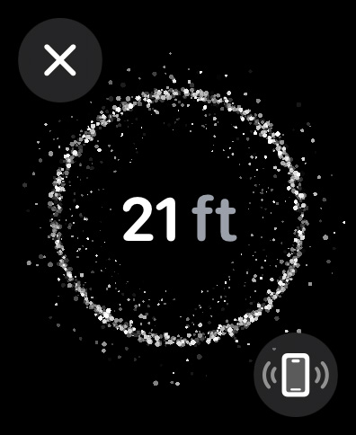
The S9 provides one more new feature we should talk about, Precision Finding, the location-sensing function many readers will be familiar with from interactions between the iPhone and the AirTag.
Now, when you tap that useful button in the Apple Watch’s Control Center that pings your iPhone, you don’t just get a helpful ringing sound; you also get details on the screen guiding you to it.
David Price / Foundry
Battery life and charging
- Exceptional battery life
- Lasted two full days between charges
In the tech specs, Apple says the Series 9 is good for 18 hours of “normal” use. Despite the improved power efficiency of the S9 chip, that’s the same estimate the company gives for the Series 6, 7, and 8. But how does the watch shape up in the real world?
I would say it’s a very conservative estimate. There’s no standardized test you can use to measure an Apple Watch’s battery life, and the time will vary widely depending on what you’re doing with it. (I find that long workouts are particularly draining.) But in none of my tests did the Series 9 give me less than 38 hours, and in my most scientific test it lasted very nearly 48 hours. That’s a stunning performance, well ahead of the Series 8, which lasted 32.5 hours and puts us comfortably into the zone where you can miss a night of charging and power through to the next night.
We’re still some way behind the Ultra line, which in my review of the first-gen model lasted 72.5 hours and is genuinely a multi-day device. But the Series 9 is a big step forward in battery performance.
The Series 9 comes with a USB-C charging puck, but no power adapter, so you’ll have to supply your own. It charges pretty fast: 20 minutes was enough to bump it from empty to 43 percent power.
Price
The Apple Watch Series 9 starts at $399/£399. That’s the same U.S. price as the Series 8, and U.K. customers even see a small price cut. Note that these are the prices direct from Apple with the cheapest straps, but you can bump up the cost if you go for a stainless steel band or similar, or potentially pay a little less if you shop around for the best deal.
Aluminum:
- Apple Watch Series 9, 41mm, GPS: From $399 / £399 / A$649
- Apple Watch Series 9, 45mm, GPS: From $429 / £429 / A$699
- Apple Watch Series 9, 41mm, cellular: From $499 / £499 / A$809
- Apple Watch Series 9, 45mm, cellular: From $529 / £529 / A$859
Stainless steel:
- Apple Watch Series 9, 41mm, cellular: From $699 / £699 / A$1,199
- Apple Watch Series 9, 45mm, cellular: From $749 / £749 / A$1,279
David Price / Foundry
Verdict: Should you buy the Apple Watch Series 9?
Almost inevitably, this is the best general-purpose smartwatch Apple has ever made. (The Ultra models are better in several respects, but their greater bulk and higher price mean that for many customers they simply aren’t suitable.) It’s just like the Series 8, which held that title until this fall, but improves on it in a few small ways: the processor is faster, which makes very little difference to performance now but should ensure a longer useful life; battery life is considerably better; the screen is brighter, though again I didn’t notice the difference; and you get the new Double Tap feature. Of these, I would say that only battery life is likely to palpably change your experience with the product, and maybe not even that if you’re a regular nighttime charger. But these are changes that are only better, and so, almost by default, the Series 9 wins the title of best Apple Watch.
The only change for the worse, in fact, is the uncomfortable and (to me) unnecessary tweaking of the interface in watchOS 10. This, I don’t like at all. But it applies to all Apple Watches that install the new OS, so that’s not really a slam on the Series 9.
Should you buy the new watch? That depends on what you currently own. If you’re on a Series 7 or 8, I would say no, since the changes won’t really be noticeable. If you’ve got anything older, or if this is going to be your first Apple Watch, then dive on in! The water’s lovely.
Tech specs
- S9 SiP with 64-bit dual-core processor, 4-core Apple Neural Engine
- 64GB storage capacity
- 1.9-inch (484 x 396) or 1.69-inch (430 x 352) OLED display with up to 2000 nits brightness
- Blood oxygen sensor
- Electrical heart sensor
- Optical heart sensor
- Compass
- Always-on altimeter
- High-g accelerometer
- High dynamic range gyroscope
- Ambient light sensor
- L1 GPS, GNSS, Galileo, and BeiDou
- LTE and UMTS
- Wi-Fi 4 (802.11n)
- Bluetooth 5.3
- Second-generation Ultra Wideband chip
- Apple Pay
- GymKit
- Water resistance 50m (swimproof); IP6X10 dust resistance
- Battery life up to 18 hours normal use (estimated), up to 36 hours (low-power mode)
- 41 x 35 x 10.7mm (41mm model) or 45 x 38 x 10.7mm (45mm model)


