Apple, as a company, has always extolled the value of putting the “personal” in “personal computer.” From its earliest days pushing back at the monolith of IBM and beige boxes that all looked like one another, to its more recent extremely personal devices like the iPhone, Apple Watch, and AirPods.
But that ethos of “personal” technology has always been in fundamental tension with the company’s other overriding principle: Apple knows best. Whether it’s the design of its apps or how to use its features, the company has a strong streak of imposing on its users what it believes is the best approach.
In the company’s latest platform updates, this tension is more apparent than ever. Apple announced several new features that allow users to bring their own touches to their devices—but it did so in a typically Apple fashion that still kept everything within bounds.
Custom-ish-ation
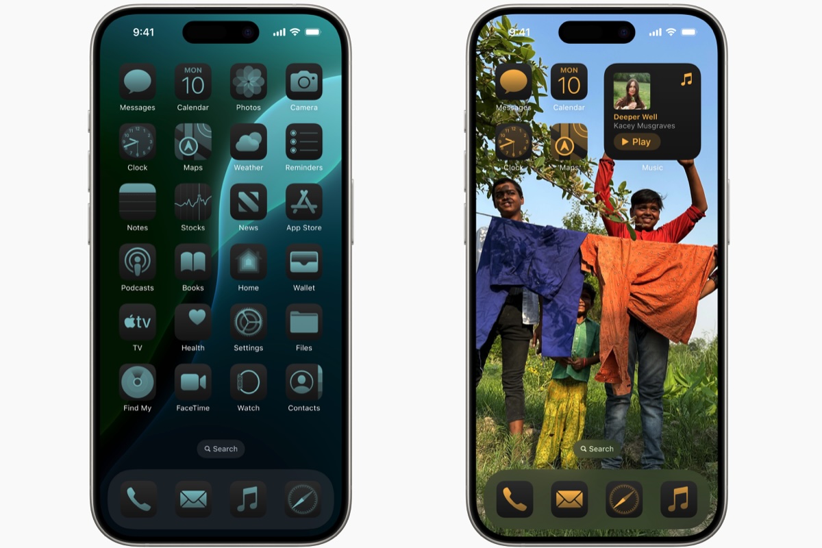
One of the most anticipated announcements ahead of this year’s Worldwide Developers Conference was that Apple would finally relax the strictures around your iOS device’s home screen. The grid of icons has remained largely unchanged since its appearance in the very first iPhone back in 2007. There have been a few additions of course: folders, the App Library, and at long last the addition of widgets in iOS 14. But even all of those enhancements fit within the structure provided by the grid.

iOS 18 gives you more freedom than ever to customize your iPhone home screen, but it’s not a free-for-all.
Apple
The rumor that this year would let you put icons anywhere on your screen no doubt conjured the freedom of macOS in some minds’ eyes. Unsurprisingly, perhaps, it wasn’t to be: when the company did announce the feature, it became clear that while you could move your icons around and leave open spaces so your wallpaper showed through, the icons would still ultimately reside within the grid.
Likewise, the news that you would at long last be able to reassign the iPhone’s lock screen shortcut buttons for the flashlight and the camera was greeted enthusiastically…but there remain just the two icons. Apple specifically acknowledged this push and pull to me, saying that they wanted to give users the freedom to customize their experiences while still trying to maintain the iconic look and feel of the iPhone.
There is, however, one place on the home screen where Apple has put people’s customizations front and center: the new app icon features, which let you not only choose a light or dark option but also tint all your apps the same color. When you select a tint, it changes all of your app icons—regardless of whether or not the developer has designed their icon appropriately.
Picture window
There’s a big Photos redesign happening this year, and it’s largely about customization as well. Users can choose what they want to show up in the carousel at the top, whether it’s the traditional grid of photos or a specific set of curated pictures, or even photos the system has chosen to feature. Below that main section is a set of collections, which you can select and order as you like.
The push-and-pull of the customization is almost more internalized to the app here. It’s a question of Apple trying to make your Photos app look as good as possible by suggesting the content that might take center stage, even if you do have the option to override it. Given that this is a feature centered around your own pictures, it does seem smart for Apple to try and go a little more hands-off here, making sure that it’s your content that remains the star.

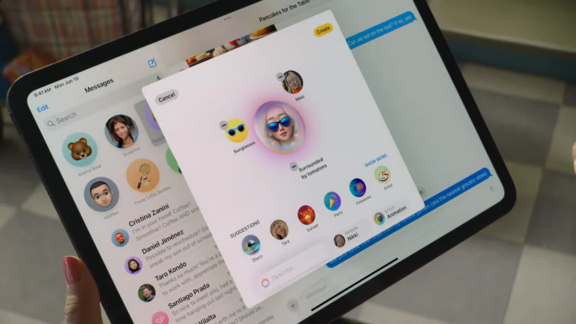
Apple Intelligence tools such as Image Playground can make images for you, but how much of it will look like artwork that truly reflects you?
Apple
Intelligence agency
By far the most personal-oriented development from this year’s WWDC is, of course, the company’s rollout of its AI-powered features, under the aegis of “Apple Intelligence.” This suite of improvements to features across the company’s platforms may unlock some very powerful behaviors that help you do the things you need to do, but it remains to be seen just how personal it will be.
The problem is, to a degree, inherent in the very technology that underpins it. Much as AI is intended to help people accomplish things in a faster and more efficient manner, the way it achieves this is via a technology that is often trained on a huge corpus of material. One risk of technology like that is that it can feel depersonalized–almost generic. For example, if you use Apple’s new Writing Tools feature to make an email sound more professional, might it do so in a way that sounds less…like you? Will everybody’s use of the “Friendly” rewrite tone end up sounding like the same person? Again, it’s not a concern that’s unique to Apple–much of the text generated by other systems like ChatGPT has a way of sounding samey–but it’s something that the company may have to contend with when convincing people to take advantage of its feature.
Likewise, Apple’s new image generation technologies might unlock the ability to create pictures even for those who, like me, are artistically challenged, but their reliance on a handful of specific styles can end up feeling generic. Or, as developer Sebastiaan de With pointed out a feature that “can turn whimsical sketches into AI slop.”
All of this is something that Apple needs to contend with as it attempts to make its own foray into artificial intelligence. A personalized intelligent agent needs to feel personal, and the company’s demonstration of a system that knows about your data and information is a good step in that direction…even if the generative features sometimes feel like a step back.


