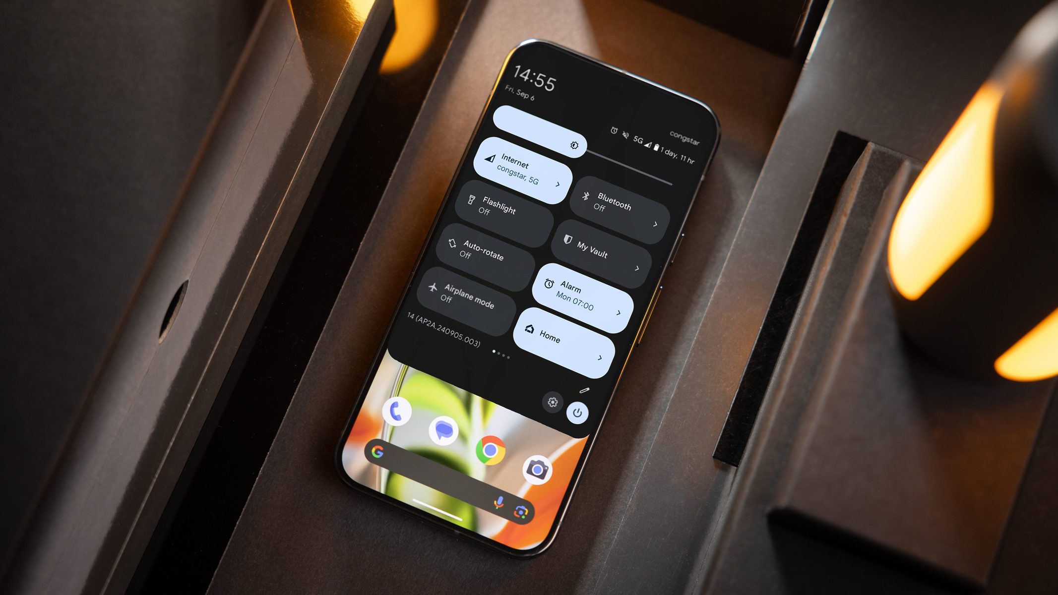
With the release of Android 15, most of the new features and changes focus more on functionality and security rather than customization. This is also true for the quick settings panel, which has only seen minor tweaks compared to recent Android versions, at least in the stock version. However, it may get a more significant update in Android 16 next year.
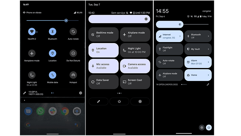
In the current stock Android 14 quick settings layout, such as on the Pixel 9 (review), the top section features a large brightness slider and up to eight shortcut icons. You can access additional shortcuts by swiping left. This menu takes up only half of the screen, with the lower half used for notifications, media controls, or left empty if there’s nothing to display.
Compared to skinned versions of Android like Samsung’s One UI 6 or Xiaomi’s HyperOS, the stock Android quick settings menu is simpler and offers fewer customization options.
Android 16 might change the quick settings
Developer Mishaal Rahman (via Android Authority) discovered in the Android 15 QPR1 Beta that Google is working on a redesigned quick settings section, which could be introduced in Android 16.
The updated panel appears to be slightly larger but can still be accessed by swiping down from the top with two fingers. The brightness slider remains at the top, occupying the entire row. Below that, there are four smaller widgets for Bluetooth, Wi-Fi, Cast, and Do Not Disturb, all in the same elliptical shape but in a 2 x 2 size. The bottom section contains eight even smaller widgets.
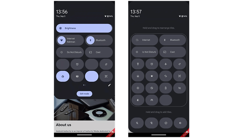
The new quick settings in Android 16 will include a total of 13 shortcuts and toggles. More shortcuts can be added, but they will appear in the smallest size on a second page, which you can access by swiping.
Additionally, the entire menu now appears to float, with transparent areas showing part of the current screen beneath. This space will likely still hold controls and notifications. There is also an edit button and an icon at the end of the panel.
Currently, it seems resizing (making widgets bigger or smaller) isn’t supported, or at least wasn’t available in this version. However, future updates may bring changes or new features.
While this is still an early version and it’s not guaranteed that this design will make it to the final release, it shows that Google is working on improving and updating the stock Android quick settings.
From different skinned Android OS, which do you think has the best quick settings layout and the most intuitive? And how would you like to improve the design on Android 16? Please let us know your answers in the comments.


