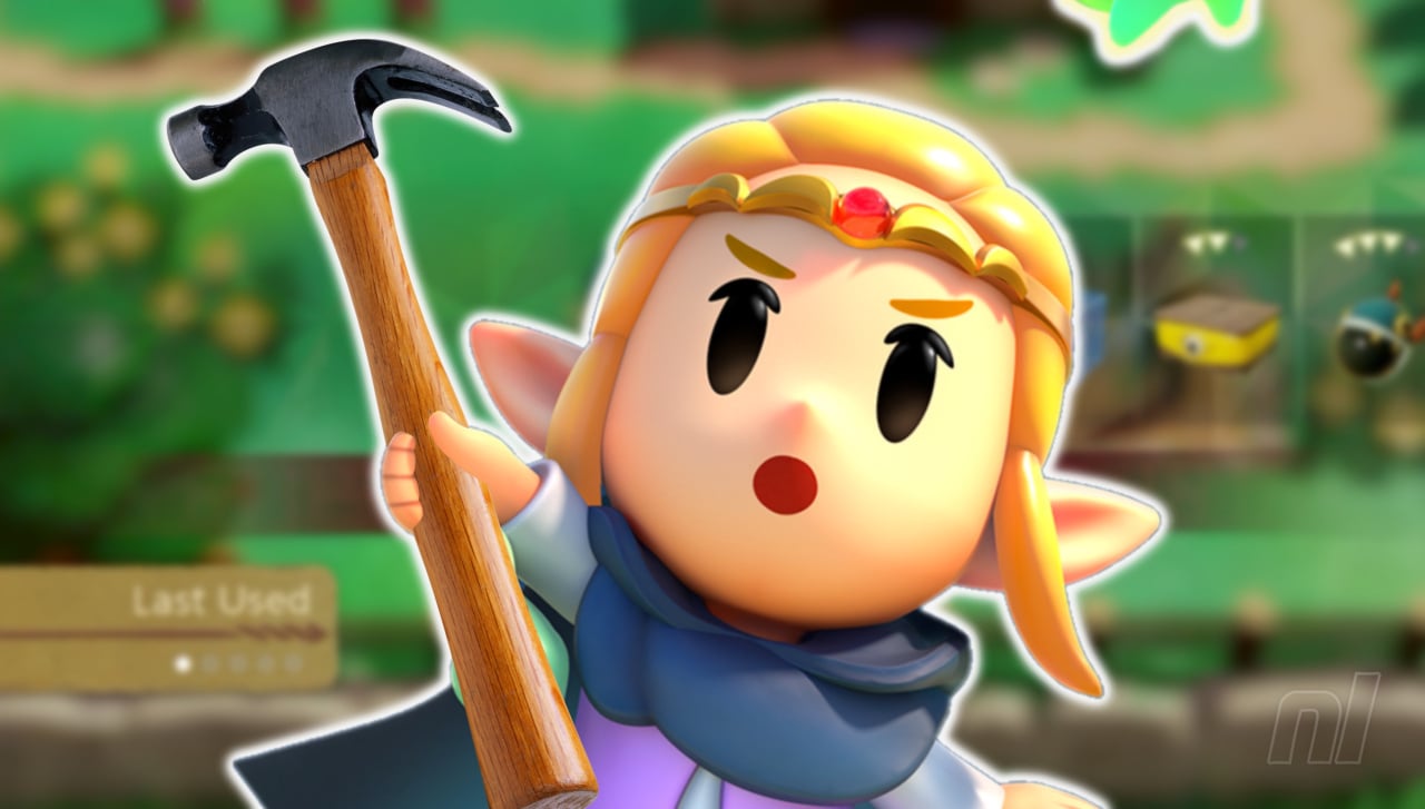
One of the biggest criticisms we, and indeed the Zelda community at large, had with Echoes of Wisdom was its awful UI design for the echoes.
It’s a rare blip in what is otherwise an exceptionally well-crafted Zelda title in which you’re presented with a single row of echo abilities that simply widens further and further as you accumulate more during your playthrough.
Locating the one you want is a needless exercise in patience, and although you can sort the echoes to gain quicker access to your favourites, many folks would actually rather pause the game entirely and use the main menu instead.
So, in an effort to ‘fix’ Echoes of Wisdom’s UI, YouTube channel Game Maker’s Toolkit has taken to Unity to provide a few nifty alternatives.
First up, an attempt is made to simply add a bit of acceleration to the existing UI, allowing you to locate your desired echo in a slightly speedier manner. If this isn’t different enough, you might like the cross-media toolbar approach, as seen on the PS3. Here, enemies and items are categorised, letting you keep the horizontal bar, but have it splinter off into vertical sections.
Next up, we have the option of a simple grid system with tabs/pages, before moving onto an elegant radial menu approach. This, however, would likely be limited to a ‘favourites’ function due to the sheer number of echoes available in the game.
To alleviate this, then, a spiral design is offered up that’s similar in approach to Ubisoft’s Beyond Good and Evil. It’s a cool alternative, and we kinda wish that Grezzo and Nintendo had gone with something like this. Or maybe we’ve just read too much Uzumaki.
Regardless of which approach you personally prefer, we have to applaud Gamer Maker’s Toolkit for taking the time to explore new options for Echoes of Wisdom’s dire UI design. It’s not going to be officially changed now, let’s be honest, but you can at least try out these new options for yourself via itch.io.
One of the biggest criticisms we, and indeed the Zelda community at large, had with Echoes of Wisdom was its awful UI design for the echoes.
It's a rare blip in what is otherwise an exceptionally well-crafted Zelda title in which you're presented with a single row of echo abilities that simply widens further and further as you accumulate more during your playthrough.
Locating the one you want is a needless exercise in patience, and although you can sort the echoes to gain quicker access to your favourites, many folks would actually rather pause the game entirely and use the main menu instead.
So, in an effort to 'fix' Echoes of Wisdom's UI, YouTube channel Game Maker's Toolkit has taken to Unity to provide a few nifty alternatives.
First up, an attempt is made to simply add a bit of acceleration to the existing UI, allowing you to locate your desired echo in a slightly speedier manner. If this isn't different enough, you might like the cross-media toolbar approach, as seen on the PS3. Here, enemies and items are categorised, letting you keep the horizontal bar, but have it splinter off into vertical sections.
Next up, we have the option of a simple grid system with tabs/pages, before moving onto an elegant radial menu approach. This, however, would likely be limited to a 'favourites' function due to the sheer number of echoes available in the game.
To alleviate this, then, a spiral design is offered up that's similar in approach to Ubisoft's Beyond Good and Evil. It's a cool alternative, and we kinda wish that Grezzo and Nintendo had gone with something like this. Or maybe we've just read too much Uzumaki.
Regardless of which approach you personally prefer, we have to applaud Gamer Maker's Toolkit for taking the time to explore new options for Echoes of Wisdom's dire UI design. It's not going to be officially changed now, let's be honest, but you can at least try out these new options for yourself via itch.io.