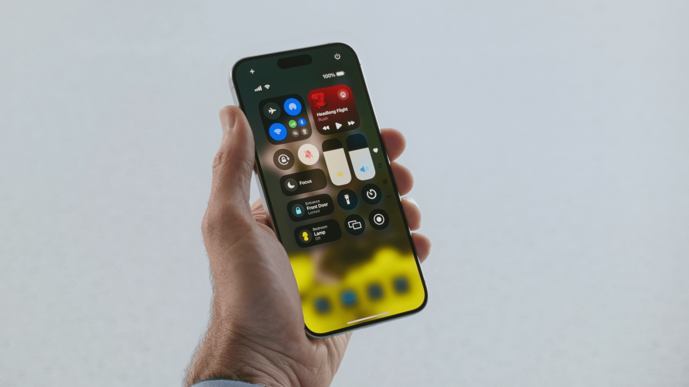
Apple continues to release iterations of its iOS 18 Beta to developers and testers. The latest is the third beta installment which adds a few notable changes, including dynamic wallpapers and some touches to the original features that debuted with the previous beta releases. Here’s what’s new in this update.
Color-changing wallpaper
Along with a major overhaul to the home screen and Control Center, Apple introduced a new set of wallpapers in iOS 18. With iOS 18 Beta 3, it added a new “Dynamic” option for these wallpapers.
From what we know, selecting the dynamic wallpaper option offers color-changing wallpapers that change based on the time of the day. However, the styling or color appears to be random at best, with the only noticeable major effect of darker colors being applied at night.
Darker app icons
In iOS 18, it is possible to change the styling and color of its app icons, with an option to apply dark mode to these icons, which is primarily available for official Apple apps. Now, the latest beta further expands the availability of dark mode to include more third-party applications such as Tesla, Discord, and YouTube, among others.
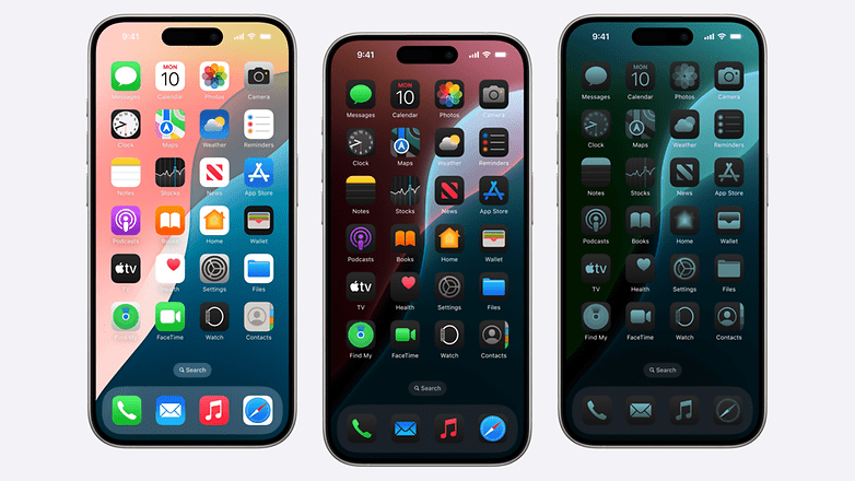
Users can still customize these app icons and select automatic color effects for supported app icons or manually pick dark, light, or tinted shades. For most first-party apps like Apple Maps, their icons automatically change depending on the color mode (day or night) of your entire system.
Reorganized stickers and emoji section
The iOS keyboard is getting a minor tweak, where calling up the emoji keyboard will now include memojis in the recent emoji sections. At the same time, both static and live stickers can now be sent in the same line similar to texts or emojis. Overall, emojis and memojis are bigger than before.
Photos app will get better
Apple gave the Photos app the biggest interface change seen in many years with the iOS 18 update. However, early feedback from users was mixed, with some describing the app as convoluted and it takes time to get used to compared to the old version.
Fortunately in iOS 18 Beta 3, Apple has addressed some of these complaints, which include a Select button being permanently added on the top menu beside the search button. Plus, browsing individual photos now shows the actual rectangle shape of the photo whereas before the corners were cropped and don’t occupy the edges of the screen when viewed.
Beefier flashlight app
While a concentrated change, Apple will also change how the built-in flashlight app appears. In beta 3, launching the flashlight app presents a larger animation box. At the same time, intensity and angle controls are better represented visually. For instance, this shows the equivalent LED light beam into the flashlight icon in the box.
Other changes in iOS 18 Beta 3
Among the minor changes in iOS 18 Beta 3 are the enhanced readability for colored icons and buttons in the Control Center, which are now more vibrant than ever. Meanwhile, the plain buttons have slightly more transparent borders. In addition, some individual shortcuts in connectivity like AirDrop and Wi-Fi will get sub-menu options, reducing the extra step of accessing each shortcut settings.
Are you enrolled in Apple’s Developer Program? Have you found other changes not mentioned here? We’re glad to hear your suggestions.


