Be sure to cast your votes in the poll below; but first, let’s check out the box art designs themselves.
North America
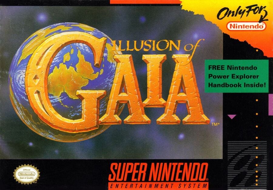
So the North American release of Illusion of Gaia probably contains the most recognisable box art. It’s a spin on what other SNES RPGs have done by making sure the title itself is the main focal point. It’s a lovely design and we love that the capital ‘G’ almost fills the planet in the background.
UK / Belgium / Netherlands
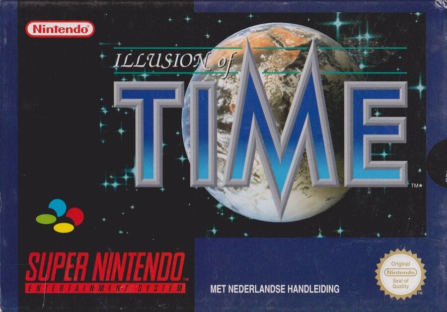
The box art for these particular European countries is probably the closest in design to the North American version, but of course, the change in name is the biggest factor here. It’s a darker and, dare we say, more sci-fi take on the design, with the capital ‘M’ in Time now taking centre stage against the planet.
Germany
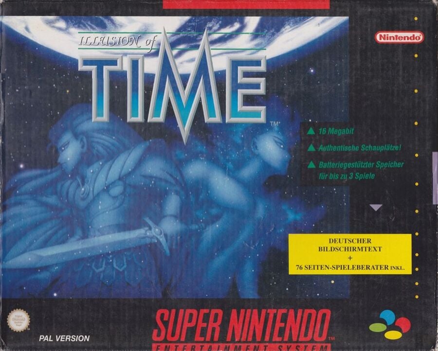
Germany’s box art uses the same logo as the other European designs but makes it smaller and features two rather impressive character depictions in the centre of the image. It looks quite grand in its composition and works remarkably well in drawing the viewers’ eyes.
Spain
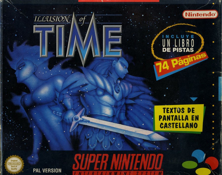
What’s going on here? While this is certainly similar to Germany’s design in terms of composition, the actual execution is, uhh… well, not great. It looks like a cheap knock-off, no?
Japan
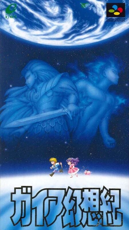
Oooh, this is lovely. Similar in design to Germany’s variant, the Japanese version makes full use of the vertical space and even throws in a couple of pixel-art characters too. It looks great!
Thanks for voting! We’ll see you next time for another round of the Box Art Brawl.
Be sure to cast your votes in the poll below; but first, let’s check out the box art designs themselves.
North America
So the North American release of Illusion of Gaia probably contains the most recognisable box art. It’s a spin on what other SNES RPGs have done by making sure the title itself is the main focal point. It’s a lovely design and we love that the capital ‘G’ almost fills the planet in the background.
UK / Belgium / Netherlands
The box art for these particular European countries is probably the closest in design to the North American version, but of course, the change in name is the biggest factor here. It’s a darker and, dare we say, more sci-fi take on the design, with the capital ‘M’ in Time now taking centre stage against the planet.
Germany
Germany’s box art uses the same logo as the other European designs but makes it smaller and features two rather impressive character depictions in the centre of the image. It looks quite grand in its composition and works remarkably well in drawing the viewers’ eyes.
Spain
What’s going on here? While this is certainly similar to Germany’s design in terms of composition, the actual execution is, uhh… well, not great. It looks like a cheap knock-off, no?
Japan
Oooh, this is lovely. Similar in design to Germany’s variant, the Japanese version makes full use of the vertical space and even throws in a couple of pixel-art characters too. It looks great!
Thanks for voting! We’ll see you next time for another round of the Box Art Brawl.