Be sure to cast your votes in the poll below; but first, let’s check out the box art designs themselves.
Europe
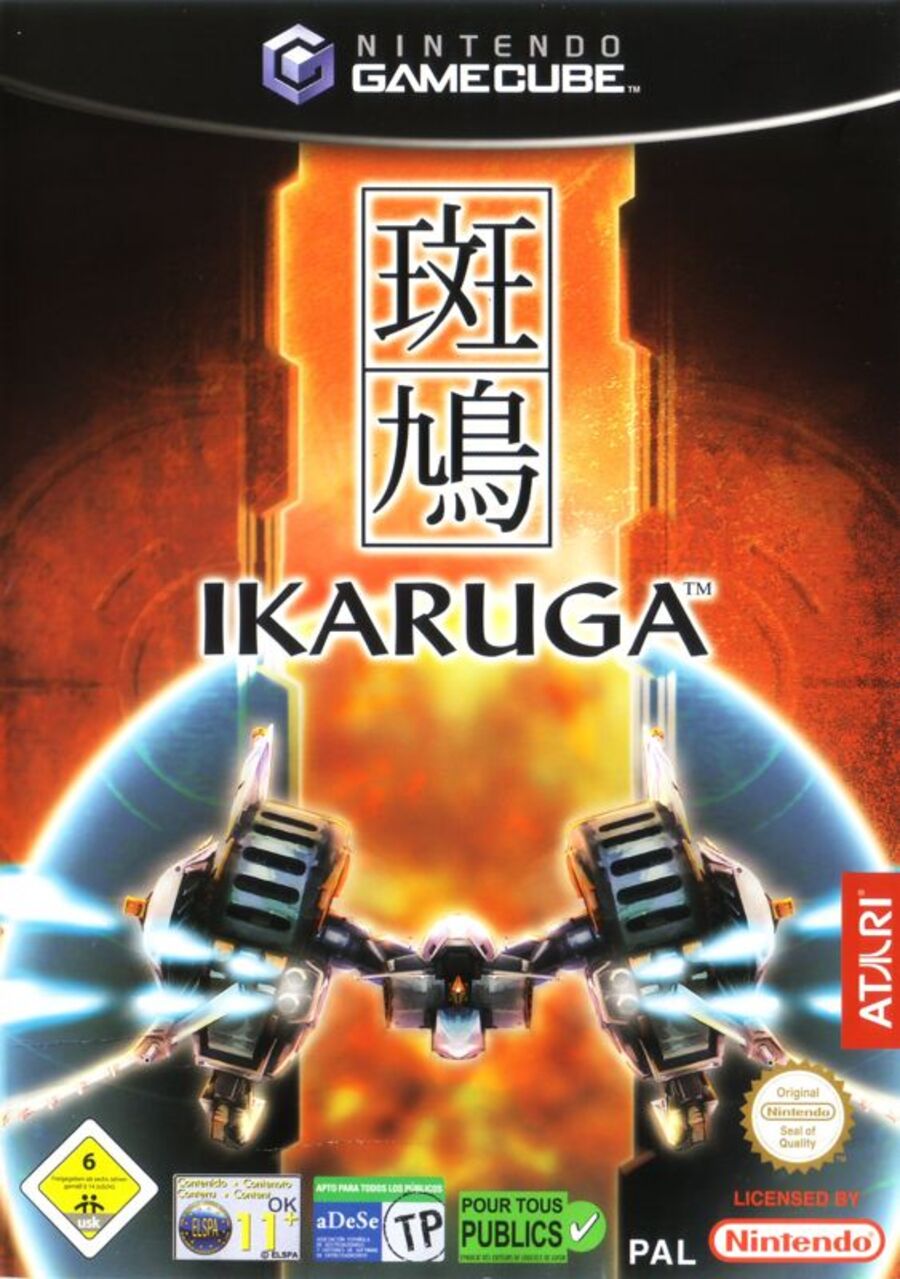
We won’t lie, the composition for both the European and Japanese variants is simply excellent. The ship at the bottom, the title in the middle with the Japanese characters above. It just works so well. The colour palette here is significantly warmer than Japan’s, with a distinct orange glow highlighting the text and background.
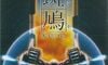
Japan
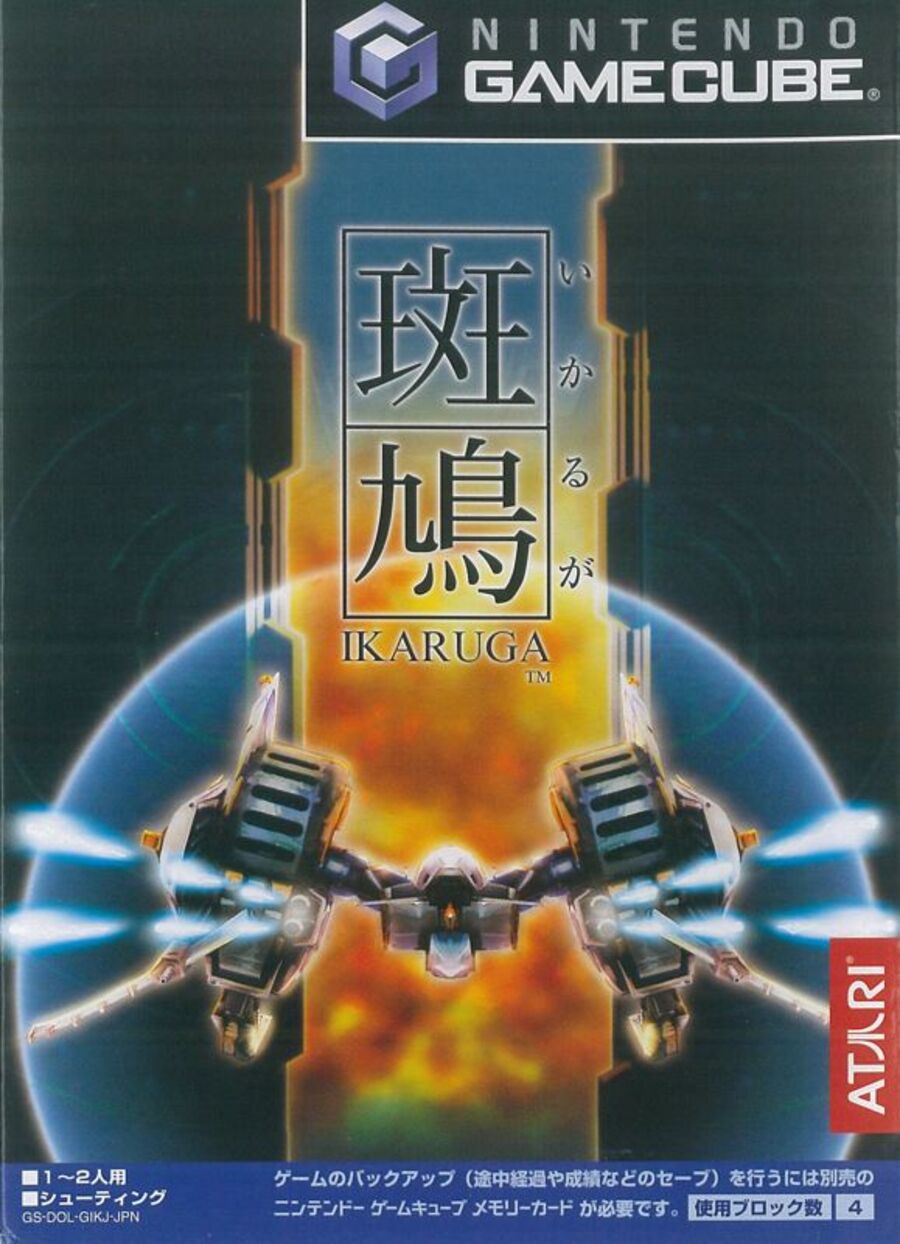
Not a great deal to say here that hasn’t already been said, but the colour palette for Japan’s variant is definitely a bit cooler, focusing more on blue with a hint of orange in the center. The black background definitely makes the rest of the image stand out, but we’re not sure it’s quite as striking as the European version.
The text itself is also a bit smaller here, which adds a certain elegance to the image, but again, might not be as eye-catching as its European counterpart.
North America
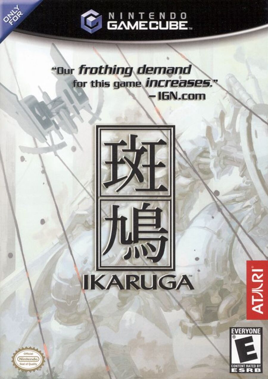
“Our frothing demand for this game increases”.
Is there really anything else that needs to be said?


Thanks for voting! We’ll see you next time for another round of the Box Art Brawl.
Be sure to cast your votes in the poll below; but first, let’s check out the box art designs themselves.
Europe
We won’t lie, the composition for both the European and Japanese variants is simply excellent. The ship at the bottom, the title in the middle with the Japanese characters above. It just works so well. The colour palette here is significantly warmer than Japan’s, with a distinct orange glow highlighting the text and background.
Japan
Not a great deal to say here that hasn’t already been said, but the colour palette for Japan’s variant is definitely a bit cooler, focusing more on blue with a hint of orange in the center. The black background definitely makes the rest of the image stand out, but we’re not sure it’s quite as striking as the European version.
The text itself is also a bit smaller here, which adds a certain elegance to the image, but again, might not be as eye-catching as its European counterpart.
North America
“Our frothing demand for this game increases”.
Is there really anything else that needs to be said?
Thanks for voting! We’ll see you next time for another round of the Box Art Brawl.